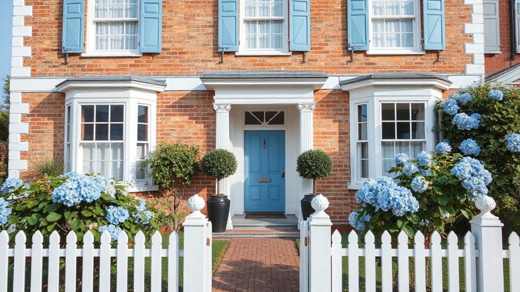
Blue and white schemes excel in period homes by highlighting architectural details with crisp contrast. You’ll balance practical navy, cornflower, and in-between tones to define moldings and paneled walls, while white finishes brighten spaces and reveal cornices and textures. Layered textures and subtle patterns keep the look authentic, supported by intentional lighting, hardware, and period fabrics. The result is a cohesive, timeless elegance that invites further refinement—and a clearer path to achieving it.
Key Takeaways
- Blue, used on trim and doors, adds depth while white provides a neutral, cohesive backdrop for period authenticity.
- Navy creates authoritative contrast and hides wear; cornflower or mid-blue offer crisp accents without overpowering.
- White finishes with matte or eggshell sheens delineate moldings and paneling, reducing glare and preserving ornament clarity.
- Texture and pattern layering anchor walls, floors, and fabrics, guiding visual flow with era-appropriate rhythm.
- Soft, dimmable lighting and authentic hardware enhance restoration, while balanced blues and whites preserve the architectural details.
Why Blue and White Win in Period Homes
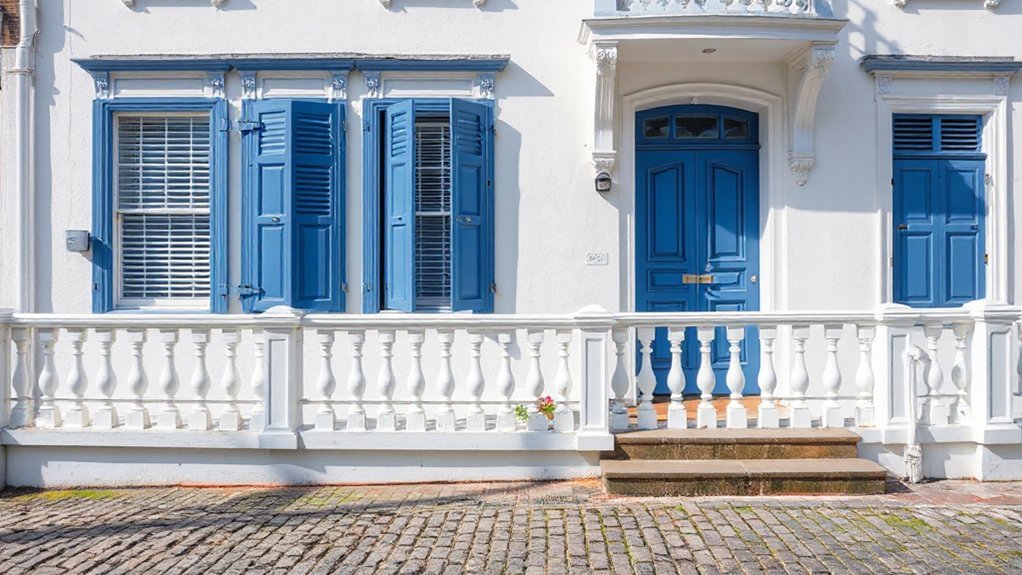
Blue and white palettes excel in period homes because the combination reinforces architectural details while remaining adaptable to historical context. You’ll notice that blue provides depth to trim, cornices, and door surrounds, while white offers a neutral field that clarifies ornament.
This pairing supports historic authenticity by preserving legible sightlines and authentic material contrasts, avoiding overstatement or anachronistic gloss. Color harmony emerges through controlled saturation and tonal progression, ensuring hues respect era-specific palettes without dominating proportion or period rhythm.
You engage a disciplined palette strategy: test light reflections, align undertones with plaster or brick, and maintain consistent white bias across rooms for cohesion. The result is precise, legible detailing that reads as intentional craft rather than fashionable intervention, reinforcing architectural intent and enhancing perceived value.
Choose Your Blue: Practical Navy, Cornflower, and In-Between Tones
When selecting a blue for period interiors, consider how each hue interacts with light and surrounding materials. You’ll balance depth, brightness, and historical authenticity to achieve practical, durable finishes.
The following guide helps align color harmony with architectural legibility:
- Navy: wraps structural details in authoritative contrast, preserving historical accuracy while hiding wear.
- Cornflower: provides crisp accent against white trim, enhancing period proportions without overpowering rooms.
- In-between tones: mid-blues offer versatile field walls that read as traditional yet contemporary in open plans.
- Finish and sheen: select low to eggshell sheens for wall surfaces, preserving legibility of millwork and cabinetry.
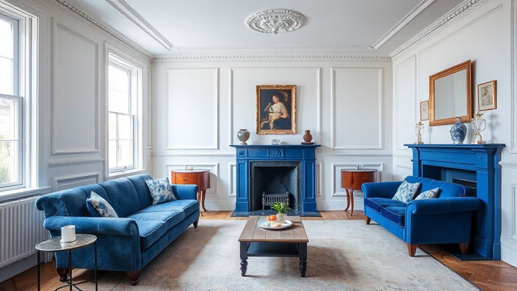
White Finishes That Elevate Architectural Details
White finishes do more than brighten spaces; they delineate architectural details with clarity and restraint. You’ll leverage crisp white surfaces to emphasize moldings, cornices, and paneled walls without overpowering blue accents. Use a matte or eggshell sheeny finish to reduce glare while preserving legibility of ornament.
Historical accuracy guides your choice of trim widths and profile; thin, proportionate profiles read more authentically than heavy, modern interpretations. Color coordination centers on contrast, ensuring white surfaces deepen blue elements rather than compete with them.
Apply consistent white for ceilings and major trims, reserving subtle warmth-infused whites for galleries and living rooms to avoid starkness. Precision in joins, caulking, and surface prep matters to maintain a cohesive, period-appropriate ambience.
Layer Textures and Patterns That Respect the Era
Layer textures and patterns thoughtfully to honor the era while preserving clarity and legibility against blue and white schemes. You’ll balance tactile surfaces with controlled motifs to maintain legibility and architectural precision. Focus on material honesty, scale, and subtle contrast to avoid visual clutter while enriching the palette. Implement technical checks that quantify pattern density and textural depth, ensuring coherence across spaces.
Key is purposeful layering: add depth without diminishing readability of primary features.
- Textural contrasts anchor walls, floors, and fabrics, guiding the eye without overpowering motifs.
- Pattern layering introduces hierarchy, using secondary motifs to complement, not compete with, main elements.
- Material pairings emphasize durability and period accuracy while reducing glare.
- Alignment and repetition govern rhythm, sustaining a disciplined, era-appropriate cadence.
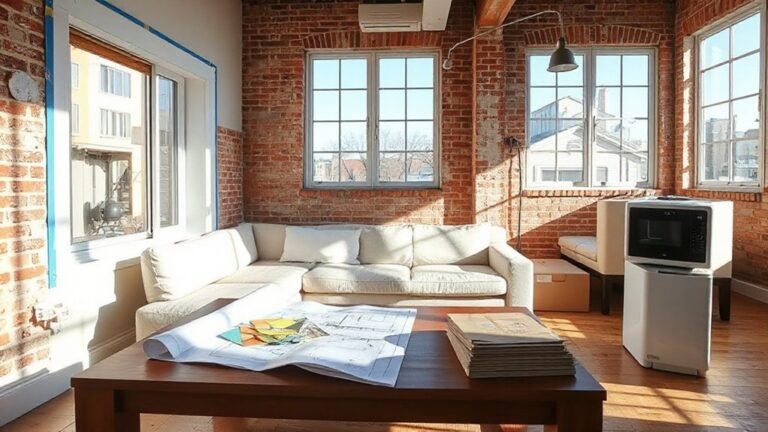
Room-by-Room Application: Lighting, Restoration Tips, and Pro Tips
In this room-by-room guide, you’ll apply the blue-and-white palette with lighting, restoration tactics, and pro techniques that preserve period integrity while ensuring modern usability.
Begin with lighting plans that emphasize soft, even illumination to highlight architectural details without glare. Use dimmable fixtures and color-rendering LEDs to maintain true hues on vintage furniture and antique accessories.
For restoration, prioritize original finishes, matching patina, and authentic hardware, while repairing joints and consolidating plaster where needed.
Spatial rhythm matters: balance bold whites with restrained blues, preserving ornamentation and moldings.
Integrate vintage furniture in focal zones and align upholstery to period-accurate fabric weight.
Finally, document procedures and maintenance intervals to sustain performance.
This disciplined approach yields durable, authentic interiors that feel both timeless and liveable.
Frequently Asked Questions
How Do Blue and White Palettes Affect Room Acoustics in Period Homes?
Blue and white palettes don’t inherently change room acoustics, but surface finishes influence sound. You’ll notice lower intelligibility if walls are highly reflective, while matte or fabric surfaces absorb sound.
To optimize your space, use a balance of hard and soft materials, and position panels to manage early reflections. This yields Acoustic enhancement through controlled Sound reflection, reducing flutter and echoes.
In period homes, you can preserve aesthetics while achieving clearer dialogue and more comfortable reverberation times.
Are There Regional Color Traditions That Influence Blue Choices?
Regional traditions influence blue choices, shaping hues, saturations, and pairings you’ll encounter across regions. Cultural influences steer palette decisions toward historically resonant tones, from coastal blues to inland indigos.
This validates region-specific accents. You’ll observe how local crafts, materials, and lighting conditions push you toward particular blues.
This regional variation, grounded in Cultural influences, informs your selection process, ensuring color decisions harmonize with architectural heritage while preserving authentic atmosphere and provenance.
What Maintenance Avoids Yellowing of White Finishes Over Time?
Regular white finishes resist yellowing best when you choose high-quality paint formulations with UV blockers, and you maintain a disciplined cleaning routine.
In fact, a 30% reduction in yellowing occurs when you follow recommended cleaning routines and use low-oxide whiteners.
To protect longevity, avoid harsh solvents, ventyclic moisture, and overcleaning.
Your approach should emphasize one consistent cleaning routine and a paint formulation designed for durability, film integrity, and minimal pigment degradation.
Can Blue-And-White Schemes Coexist With Original Wallpapers?
You can pair blue-and-white schemes with original wallpapers, provided you manage balance and preservation.
For compatibility, apply wallpaper restoration techniques that respect age and texture, and use color matching techniques to harmonize hues between new elements and the historic prints.
Carefully document the restoration process, then test samples in lighting.
Maintain transparency about repairs, and avoid overprinting.
When executed correctly, the result preserves provenance while delivering a cohesive, authoritative interior.
Which Era Authentically Inspires Blue and White Combinations Today?
The Renaissance and Classical periods authentically inspire blue and white combinations today. You should consider Historical symbolism and Cultural significance as core drivers, shaping palette choices and motif interpretation.
You’ll find that Delft-inspired azures and Greco-Roman white backgrounds carry formal credibility, while modern restorations emphasize accuracy through documentation.
You’ll also evaluate pigment behavior and glaze longevity, ensuring technical fidelity.
This approach yields a historically informed, visually disciplined result that respects period conventions and contemporary viewing expectations.
Conclusion
You’ll see why blue and white win in period homes, with each hue reinforcing details and shaping light. Choose your navy, cornflower, or intermediary tones to echo era architecture, then lift moldings and paneling with precise white finishes. Layer textures and patterns that honor the era, while tuning lighting and hardware for authentic warmth. This approach keeps provenance intact and elevates the space to timeless clarity—arguably the most elegant monochrome rebellion in history. You’ll thank yourself a thousand times.