Studies show homes using muted countryside palettes can feel up to 20% calmer. You’ll find soft sky blues paired with chalky whites create breathable spaces, while moorland greens add earthy depth without glare. Warm harvest golds bring subtle warmth, riverbank reds offer quiet drama, and brick hues anchor areas with restraint. Keep textures natural and finishes matte, then consider how these tones translate to kitchens and wardrobes, inviting you to explore how far the countryside palette can take you.
Key Takeaways
- Soft Sky Blues and Chalky Whites create calm, daylight-rich spaces with gentle contrasts and natural textures like linen and wood.
- Moorland Greens offer serene backdrops using muted greens paired with warm neutrals and subtle botanicals.
- Harvest Golds and Wheat Beiges layer warm neutrals for sunlit, cozy interiors with linen, timber, and soft wool textures.
- Riverbank Reds and Brick Hues add subtle drama through restrained reds balanced with slate and greens, finished in matte textures.
- Coastal-Cottage blends moody blues with sandy neutrals, drifting textures, and practical florals for cohesive, timeless appeal.
What the Countryside Palette Teaches Designers
The countryside palette teaches designers to prioritize harmony, restraint, and texture over flashy color moments. You approach each project with an eye for balance, letting nature guide your decisions rather than trends.
Embrace nature inspired color harmony to create spaces that breathe, where muted greens, earthy browns, and soft stone hues interact without shouting. The Rural landscape influence informs your material choices, guiding you toward natural textures, matte finishes, and organic patterns that wear well over time.
You build palettes from subtle contrasts—cool shadows against warm daylight, textured fabrics beside smooth surfaces—so the room feels coherent at every hour. By aligning design with field-tested cues, you craft environments that stay fresh, timeless, and truly grounded.
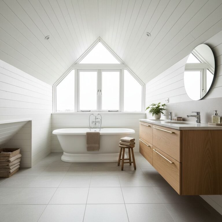
Soft Sky Blues With Chalky Whites for Calm Spaces
Soft sky blues paired with chalky whites create calm spaces that feel open and breathable; they invite daylight to pool gently across walls and furnishings. You’ll achieve balance by reserving the brightest white for ceilings or trims, letting the blues do the tonal lifting.
Choose a mid-tone sky as the primary wall color to prevent flatness, then layer with chalky whites in cabinetry, textiles, or tile.
Historical influences appear in soft, saturated hues that echo cottage porches and seaside towns, while color psychology guides you toward serenity and focus.
Keep contrast explicit but gentle: edge corners with pale blue instead of stark black, and introduce natural textures—linen, wool, wood—for depth.
The result is practical calm, visually expansive, and unmistakably timeless.
Moorland Greens for Quiet, Restful Rooms
Moorland greens create a calm, earthy backdrop that supports quiet, restful spaces. You’ll see how muted moss and slate tones combine to soften lighting and reduce visual noise.
Start by pairing a dominant moorland green with warm neutrals to craft a serene, purposefully understated room.
Soothing Moorland Greens
For color accents, opt for deep teal or charcoal as anchors, never competing with the main greens. Incorporate Wildflower meadows as a visual reference through botanical prints or handwoven textiles, keeping patterns understated.
Misty mountain hues appear in gradients from pale stone to muted slate, guiding your lighting choices and layering. Aim for cohesive harmony: a calm palette that supports reflection, reading, and quiet conversation.
Quiet, Restful Rooms
Use understated textures: matte plaster, linen, and soft wool to maintain quietude without heaviness. Introduce rustic charm with timber accents—slim shelves, oak framing, or a simple beam—kept lightweight and unpolished.
Colors stay restrained: sage, moss, and pebble gray prime the palette, while small accents in charcoal or antique brass offer quiet contrast. Choose simple furnishings with clean lines to preserve airiness, and limit ornament to a single focal piece for balance.
These tranquil retreats invite ease, depth, and a sense of calm throughout everyday life.
Harvest Golds and Wheat Beiges for Warmth
Warmth blooms when you layer harvest golds with wheat beiges, creating a cozy, sunlit foundation. Use this palette as a calm backdrop for textures—linen, timber, and soft wool—to keep rooms inviting, not overpowering.
Start with a neutral wall and weave in warm accents to highlight the Harvest-Hued Warmth, Wheat-Beige Accents, and Cozy Countryside Palette.
Harvest-Hued Warmth
Harvest hues bring a comforting glow to interiors, pairing golden yellows with wheat-beige neutrals to create instant warmth without overwhelming the space. You’ll notice how Autumn harvest textures add tactile depth, from linen’s soft drape to a tweed’s subtle scatter.
Favor rustic colour combinations that stay grounded: warm ochres with stone, honey with clay, and soft sand for balance. Use the palette to guide lighting and furniture decisions—keep metals warm-toned, while timber accents echo the countryside’s richness.
Textiles should reinforce warmth without heaviness; opt for breathable weaves and muted patterns. Implement contrast sparingly: let a single wheat-beige sofa anchor a room, then layer in small pops of harvest gold through cushions or a throw.
This approach yields inviting, balanced rooms.
Wheat-Beige Accents
Consider Seasonal colour variations: in spring and summer, these hues brighten with softer tints; in autumn, they deepen subtly, enhancing seasonal light without heaviness.
Historical influences on palette choices guide your pairing—almond browns, oat whites, and barley accents nod to traditional countryside interiors while remaining modern. Keep contrast intentional, adding charcoal or forest accents only where you want a visual focus.
This approach yields versatile, timeless warmth.
Cozy Countryside Palette
Begin with warm neutrals as base—soft wheat beige walls, oat linens, and muted creams—so you can layer richer accents without crowding the room. Introduce farming traditions through practical, durable fabrics and simple patterns that endure.
Rustic architecture-inspired details—exposed timber, plaster, and stone—anchor the palette, while harvest golds appear in textiles, ceramics, and lamp light to evoke late-afternoon hedgerows.
Use this scheme to enhance spaces that invite restful gatherings. Keep contrast subtle: couple light woods with deeper bronze or charcoal accents for definition and cohesion.
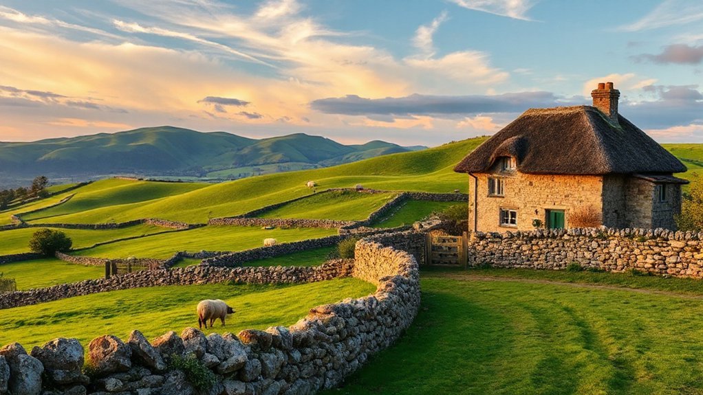
Riverbank Reds and Brick Hues for Subtle Drama
Riverbank reds and brick hues bring quiet drama to your palette, grounding light surfaces with earthy depth. You mix restrained brick with warm riverbank tones to create a calm focal point without shouting. Use a restrained red as an accent wall or upholstery, paired with creamy neutrals to preserve clarity.
Introduce brick dust into textiles and ceramics to echo aged masonry, then balance with cool greens and slate for contrast. This approach yields rustic charm and countryside elegance, while staying adaptable across rooms.
Apply matte finishes to deepen color without glare, and layer with natural textures—linen, cotton, stone—for tactile refinement. Keep furniture silhouettes simple and proportional, letting color nuance do the expressive work.
The result feels timeless, grounded, and quietly sophisticated.
Hedgerow Greens With Sage Accents in Gardens
You’ll notice how hedge rows anchor the garden with a calm, verdant backbone.
Add sage hues as quiet accents to create depth, texture, and a fresh, domestic palette.
Think practical plant pairings and easy maintenance that keep the space feeling timeless and orderly.
Hedge Rows, Sage Hues
Hedge rows bring a natural framework to the garden, with hedgerow greens acting as a muted backdrop and sage accents adding calm, earthy notes. You’ll choose dense, native shrubs for structure, allowing open understory for movement and light.
Favor traditional hedgerow planting with layered textures: hornbeam or hawthorn for form, elder for soft contrast, and a low groundcover to suppress weeds.
Sage hues in floral arrangements introduce restraint, so keep foliage dominant and use sage as an accent rather than a crowding color. Pair pale greens with muted sage enough to maintain cohesion.
Prune to maintain a tidy line, ensuring visibility of pathways.
Use natural materials—timber, stone, and brick—to reinforce that countryside sensibility without overshadowing the plants.
Garden Sage Accents
Sage accents in a hedgerow garden brighten the greens without stealing the show, letting muted olive and moss hues stay foreground. You’ll pair sage with soft textures and crisp lines, creating a calm, cohesive scene.
Use compact evergreen shrubs as a backdrop and sprinkle herbaceous perennials where you walk or prune, so your palette feels considered rather than fleeting. In practice, limit metallics and embrace matte finishes to emphasize natural tones.
For a practical touch, label pots and planters with simple typography, reinforcing the rustic kitchen vibe. This approach offers herb garden inspiration through restrained color and texture, guiding you to design spaces that feel intentional.
The result supports rustic kitchen accents while maintaining garden-forward serenity.
Verdant Pathway Palettes
Implement rustic pathway motifs with stone pavers set irregularly, allowing gaps for thyme and low clover to peek through. Keep contrasts minimal: pair dark greens with lighter sage to preserve depth and readability as you stroll.
Introduce Wildflower inspired color schemes through deliberate pops of amber, lilac, or soft pink in small borders beside the walkway, ensuring they don’t overpower the greens. Test balance under varying light; adjust foliage density so the path remains clearly defined yet naturally inviting.
This approach yields timeless, garden-forward movement.
Misty Purples and Lilacs for Depth in Textiles
Mist and lilac tones add surprising depth to textiles by layering cool purples with subtle grays. You approach depth through controlled contrast, using Misty purples to anchor shadows and lilac to highlight midtones.
Begin with a base of cool gray or taupe to prevent color clash, then apply delicate overlays to create atmosphere without overpowering the weave. In practice, Textile dye techniques can yield soft gradients, while Colour layering methods help you maintain balance across fabrics with different textures.
Opt for fibers that accept dye evenly, then test washes to ensure stability. Keep edges soft and gradual shifts, avoiding hard blocks of color. The result is refined nuance: fabrics that read quiet, dimensional, and versatile in both apparel and home textiles.
Stone and Concrete Neutrals With Textured Accents
Stone and concrete neutrals act as a quiet backbone for textiles, grounding color with clean, mineral warmth. You’ll layer Textured stone finishes with restrained patterns to add depth without overwhelm, letting textures speak.
Concrete neutral tones keep palettes cohesive across furniture and walls, while soft sheen creates subtle contrast in daylight.
- Emphasize tactile contrasts by pairing ribbed fabrics with smooth, matte surfaces
- Use mineral-inspired hues as a base for throws, cushions, and rugs
- Introduce natural textures like linen, wool, and jute for warmth
- Balance with understated metallic accents to echo countryside machinery and stonework
Moody Coastal Blues for Seaside Rooms

Could moody coastal blues transform a seaside room into a calm, immersive retreat? Yes, with deliberate layering and restrained contrast.
Start with a base of coastal blues on walls, then introduce sandy neutrals in textiles and surfaces to warm the scene. Pair deeper midnight or navy accents with softer sky tones to create depth without overwhelming light.
Use matte finishes for walls and gloss limited to hardware or a single focal piece to keep the room breathable. Incorporate seaside-inspired color schemes through natural materials: driftwood, linen, and ceramic textures that reflect shorelines.
Limit saturated punches to cushions or throws, letting textures do the talking. This approach delivers a calm, cohesive space, where coastal blues and sandy neutrals harmonize for a restful, coastal mood.
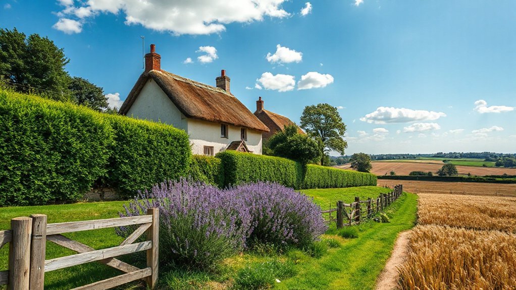
Cottage Garden Florals: Berries, Ferns, and Greens
Cottage garden florals bring a lively mix of berries, ferns, and greens into the home with practical charm. You’ll notice how berry clusters punctuate stems, while fern textures add delicate depth to arrangements and upholstery alike.
Keep palettes cohesive with natural greens and soft neutrals, letting the berries provide focal pops.
- Berry clusters create instant focal points without overpowering spaces
- Fern textures lend movement and airiness to shelves and tabletops
- Greens ground the look, supporting both small and large room scales
- Practical finishes like matte ceramics echo garden tones
Use these elements to craft rooms that feel cultivated yet effortless, where every surface reflects a cottage garden’s quiet energy.
Mixing Countryside Palettes for Living Spaces
Mixing countryside palettes in living spaces is about harmonious contrast and cohesive texture. You’ll balance warm, earthy tones with softer pastels to avoid heaviness while keeping the room inviting.
Start with a neutral base—cream, sand, or dove—then layer with rustic color schemes in accents like cushions, throws, and artwork.
Introduce durable finishes that echo farmyard life without shouting; think linen, exposed wood, and stone textures.
Use Farmhouse decor cues sparingly: a vintage lamp, braided rug, or a distressed cabinet can anchor the scheme.
Control saturation by pairing bold hues with lighter neutrals, so rooms feel airy rather than crowded.
Keep palette continuity from walls to accessories, ensuring the segue feels intentional rather than random.
The result is calm, timeless, and versatile.
Translate the Countryside Palette to Clothes and Kitchens
You’ll harness color psychology to evoke calm, comfort, and accessibility, while recognizing Cultural influences that shape how spaces and garments are interpreted across communities.
- Base neutrals (creams, taupes) for versatility and longevity
- Earth-toned accents (terracotta, olive, sand) to ground looks and surfaces
- Soft pastels (sage, blush, powder blue) to brighten without overpowering
- Texture and finishes (linen, matte ceramic, wood) to reinforce breathability and tactility
Use these elements sparingly, balance bolds with neutrals, and let natural light guide your choices.
Frequently Asked Questions
How to Balance Bold and Soft Countryside Colors in One Room?
To balance bold and soft countryside colors, you pair high-contrast accents with gentle neutrals, using Farmhouse charm to anchor rooms and Rustic elegance for depth.
Start with a calm base—soft whites or greige—and introduce bold, earthy hues in a few statement pieces.
Mix textures: wood, linen, and wool.
Use layered lighting to adapt mood, and keep patterns restrained.
You’ll achieve cohesive, inviting spaces that feel purposeful, lively, and timeless.
Which Palettes Suit Small Spaces and Natural Light?
For small spaces with plenty of natural light, go light, airy palettes like soft greens, warm neutrals, and pale blues. You’ll maximize brightness with Eco friendly paints and keep walls feeling expansive.
Add contrast through wood tones and crisp white trim. Bring in Vintage accessories sparingly to avoid clutter while boosting character.
Choose finishes with low sheen to reflect light softly, and layer textures—linen, jute, and woven accents—for a calm, practical, aesthetic look.
What Finishes Best Complement Countryside Tones Indoors?
Finishes that best complement countryside tones indoors are warm woods, matte neutrals, and textured surfaces. You’ll want flooring in oak or pine, walls in soft creams or sage, and ceilings that echo the sky.
Use farming motifs and rustic textures in natural fibers and stone accents to tie rooms together. You’ll feel calm and grounded.
Opt for brushed metals and weathered brass for hardware, and introduce terracotta or olive accents for a cohesive, timeless look.
How to Maintain Color Harmony Across Seasons?
To maintain color harmony across seasons, you should plan seasonal color switching that respects countryside color symbolism.
Start with a stable base of muted neutrals, then layer in spring and summer accents that echo hedgerows and skies, and ease into autumnal tones without abrupt shifts.
Use consistent undertones (warm or cool) across fabrics and finishes, and keep larger furniture pieces neutral.
You’ll preserve cohesion while still celebrating seasonal shifts in a precise, aesthetic way.
Can These Palettes Influence Outdoor and Interior Transitions?
Yes, these palettes can guide outdoor and interior progressions. You’ll pair rustic charm with pastoral elegance to create cohesive shifts as seasons change.
Start with a soft, weathered base and layer with muted greens, ochres, and stone grays. Use outdoor textiles that echo interior tones, then carry plants, furniture, and accents across spaces.
You’ll notice rhythm, continuity, and a unified mood, even as light, texture, and use differ.
Conclusion
You’ve picked the countryside palette like a grown-up treasure hunt, right? Soft blues and chalky whites promise calm, moorland greens whisper restfulness, and harvest golds pretend to warm the room while quietly stealing the spotlight. Reds and bricks add drama, as if you meant to. Mix florals, ferns, and textures, and call it “cohesive.” Sure, you’ll nail it — just ignore the messy reality of real life and elegant, farm-to-table chaos. Irony: perfection is already here.