You’re steering 2026 color trends that fuse earthy neutrals with layered textures, crafted into room-specific stories. You’ll see mood-boosting hues anchored by sustainable materials like linen, wool, and textured ceramics, all balanced by light and material interaction. Each space—halls, living rooms, kitchens, nooks—gets a distinct palette, while digital tools and eco-conscious choices refine the look. The result is vibrant yet restrained, and the next step hinges on how you align light, texture, and intent.
Key Takeaways
- Core 2026 palettes hinge on cohesive color systems with stable base hues, accents, and neutrals grounded in psychology and cultural nuance.
- Mood-boosting neutrals layered with textures (linen, wool, cotton, ceramics, wood) create warmth while preserving balance.
- Room-by-room color stories prioritize movement, focal points, durability, and restrained repeats to maintain cohesive identities.
- Light and materials define color perception, emphasizing translucency, finishes, and calibrated lighting for palette accuracy.
- Mood boards and eco-friendly tools drive sustainable, reproducible choices with transparent sourcing and daylight-focused design.
Lock In Your Core 2026 Color Palette
To lock in your core 2026 color palette, start by defining a cohesive set of base hues, accent tones, and neutrals that align with your design goals and client brief. You’ll establish a stable framework to guide selections across materials, finishes, and lighting.
Ground choices in color psychology to evoke intended emotions and behaviors, ensuring perceptual harmony in spaces of varying function. Consider cultural influences that shape perception of hue relationships, contrast, and symbolism, then test palettes against real-world contexts.
Document color roles, interaction rules, and accessibility criteria to prevent drift during project execution. Maintain a defensible rationale for every choice, with versioned references for stakeholders.
This disciplined approach yields a scalable, client-aligned palette ready for application across environments and campaigns.
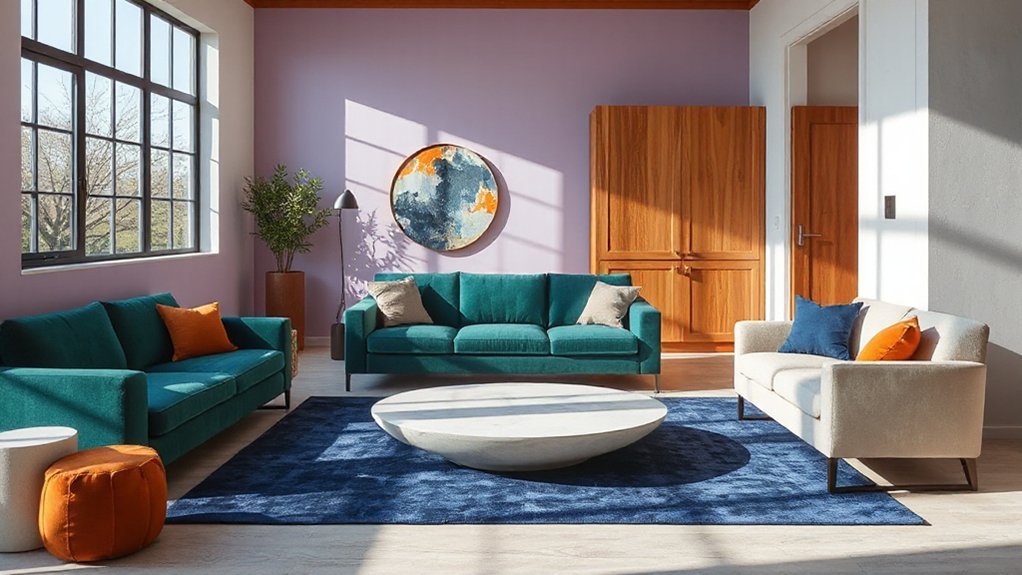
Mood-Boosting Neutrals With Layered Textures
Mood-boosting neutrals can be elevated by layering textures that engage touch and light, creating a sense of warmth and energy without overwhelming the palette. You achieve this by combining matte renderings with tactile fabrics, giving the space depth through subtle sheen, ribbing, or boucle.
Texture variation directs visual weight, while controlled contrast preserves neutrality. Color psychology informs material choices; warm undertones promote comfort, cooler accents sharpen focus, and layered textiles reinforce emotional resonance without distraction.
Prioritize natural fibers—linen, wool, cotton—to sustain airiness, then add textured ceramics and wood for grounded measurements. Maintain balance by limiting tonal shifts to a cohesive range, enabling soft passages.
Document the palette with swatches and lighting tests, ensuring the neutrals sustain mood across times of day and activity.
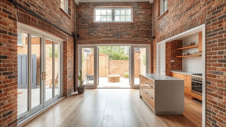
Room-by-Room Color Stories: Halls, Living Rooms, Kitchens, Nooks
Room-by-room color stories translate a cohesive neutrals palette into functional, time-tested schemes. In halls, you anchor traffic zones with warm neutrals and subtle contrast, reducing visual fatigue while guiding movement.
Living rooms benefit from layered tones that support seating focal points, with accent characters drawing attention to architectural details. Kitchens require durable, easy-to-clean palettes; pair light cabinets with mid-tone walls to keep conversations vibrant without visual clutter.
Nooks invite intent color moments—think restrained repeats or small-scale contrast to create intimacy. Throughout, you harness artistic expression through deliberate swatches and tactile finishes, balancing bold statements with restraint.
Cultural influences surface in texture and motif choices, ensuring room identities feel rooted, not generic. The result is cohesive, flexible, and visually coherent across the entire home.
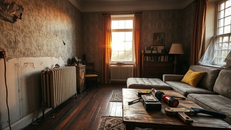
See Color Through Light and Materials
Light and materials don’t just carry color—they reveal it. You explore how light interaction defines perception, not merely hue. In practice, you test how light reflection shifts tone across surfaces, revealing subtle chroma shifts from different angles and intensities.
You prioritize materials with controlled translucency, because material transparency influences color depth as viewers move through a space. You assess specular highlights, diffuse absorption, and how finishes alter perceived saturation under varying daylight and artificial sources.
You calibrate lighting plans to disclose intended palettes, ensuring color consistency from seat to silhouette. You document how finish topology, texture, and depth interact with light to produce cohesive atmospheres.
You translate observations into precise specifications, guiding suppliers, installers, and clients toward predictable outcomes.
Mood Boards, Tech Tools, and Eco-Friendly Choices
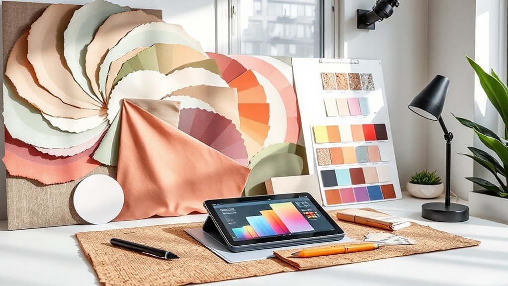
Mood boards streamline decision-making by consolidating color ideas, materials, and textures into a single, actionable reference. You’ll pair these boards with digital planning tools to compare options rapidly, ensuring consistency across schemes.
Tech tools accelerate iteration: you can import samples, test lighting, and simulate finishes in real time, reducing physical swatches and waste.
Prioritize eco-friendly choices by embedding biophilic design principles—natural textures, plant-inspired patterns, and daylight emphasis—while evaluating lifecycle data for each option.
When sourcing, favor sustainable materials with transparent supply chains and verified certifications.
Cloud collaboration enables stakeholders to review updates concurrently, maintaining alignment from concept to execution.
Document decisions within your mood boards to create a reproducible framework for future projects, ensuring efficiency, traceability, and responsible design outcomes.
Frequently Asked Questions
How Will Color Trends Adapt to Small-Space Living in 2026?
Color trends for small spaces in 2026 prioritize light, reflective hues and strategic contrast to expand perception. You’ll see palettes favor subtle neutrals accented by saturated, purposeful pops.
You’ll also rely on color psychology to reduce hazards and boost calm, energy, or focus where needed.
Material influence matters, as textures like matte stone or warm wood interact with color, guiding surface choices.
You’ll maximize perceived space by scale, repetition, and controlled luminance shifts.
Do Color Forecasts Account for Sustainable, Low-Emission Pigments?
Color forecasts do account for sustainable pigments. They prioritize eco friendly pigments and low emission dyes to reduce environmental impact while preserving performance.
You’ll see metrics on VOCs, lifecycle considerations, and sourcing transparency guiding selections.
Forecasts compare pigment compatibility, durability, and color fastness with low-emission materials.
You’ll choose within technical constraints, balancing color stability and sustainability.
In practice, this means informed, rigorous testing and clear documentation to verify eco claims.
Which Shades Pair Best With Vintage or Retro Interiors?
You should pair vintage palettes with warm neutrals and muted jewel tones, letting retro accents anchor contrast. Opt for olive greens, burnt oranges, and dusty teals against creamy beiges.
Then punctuate with brass or wood textures. Balance saturation carefully to preserve authenticity, and use metallics sparingly for depth.
Guarantee lighting highlights depth without washing colors out. This approach sustains cohesion across vintage interiors while delivering crisp, durable performance in high-traffic zones.
Retro accents should remain deliberate, not overwhelming.
How Soon Do Trends Typically Shift Across Different Regions?
Trends spread at varying paces, but regional influence typically accelerates within 6–12 months of initial breakout, then stabilizes as trend longevity becomes clear.
You’ll notice fast shifts in metropolitan hubs and slower adoption in rural areas. You should monitor regional media, retailer rollouts, and trade shows to gauge momentum.
In practice, expect a lag of several months between regions, with trends converging over 1–2 years as global influence strengthens.
Can Color Influence Mood Without Changing Furniture or Layout?
Color can influence mood without rearranging furniture or redrafting layouts. You can leverage color psychology to shape atmosphere through walls, accents, and lighting.
Focus on psychological impact: cooler tones calm, warmer hues energize, muted shades reduce contrast, saturated shades elevate focus.
You’ll create intentional mood shifts by consistent color palettes, textures, and lighting scenes. This technical approach guarantees predictable outcomes, supports function, and reinforces brand identity, all while maintaining layout stability.
Conclusion
You’re not chasing mere trends; you’re validating a theory: color’s power rests on context. Lock in a core 2026 palette, then tailor mood-boosting neutrals to each room, weaving light and texture to shape perception. As you test digital tools and sustainable materials, you’ll see how lighting shifts hue accuracy and material tactility, reinforcing a cohesive narrative. The truth: thoughtful color storytelling—layered, room-specific, and eco-conscious—delivers both emotional resonance and measurable design precision.