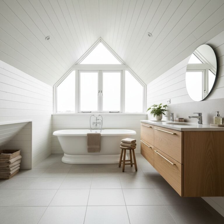
The room greets you with a soft, layered hush of surfaces you can almost feel—stone cool under your fingertips, linen whispering at your ankles, wood-soft and alive under light. You’ve already started the texture conversation with tone and balance, but the real depth comes from deliberate contrasts and thoughtful placement that highlight architectural shadows. There’s more to uncover about building warmth without losing calm—so you’ll want to keep exploring the approach.
Key Takeaways
- Layer varied textures (stone, plaster, wood, metal) within a restrained palette to add depth without clutter.
- Pair tactile elements with neutral bases and use subtle sheen, matte weaves, and different pile to enhance shadow play.
- Introduce natural fibers (linen, jute, wool) and varied yarn thicknesses to create tactile contrast and visual interest.
- Use layered lighting (ambient, task, accent) and strategic shadowing to reveal surface variation and texture rhythm.
- Plan durable, timeless textures and modular textiles for easy updates and long-term maintenance.
What Texture Can Do for Neutral Interiors
Texture is the spark that prevents neutral interiors from feeling flat. When you introduce texture, you guide perception and mood, leveraging color psychology to craft atmosphere without overwhelming tone.
You’ll notice how tactile surfaces influence warmth, contrast, and light reflection, shaping how a room reads from entry to seating. Texture also interacts with architectural features, highlighting volumes, edges, and shadows that define space.
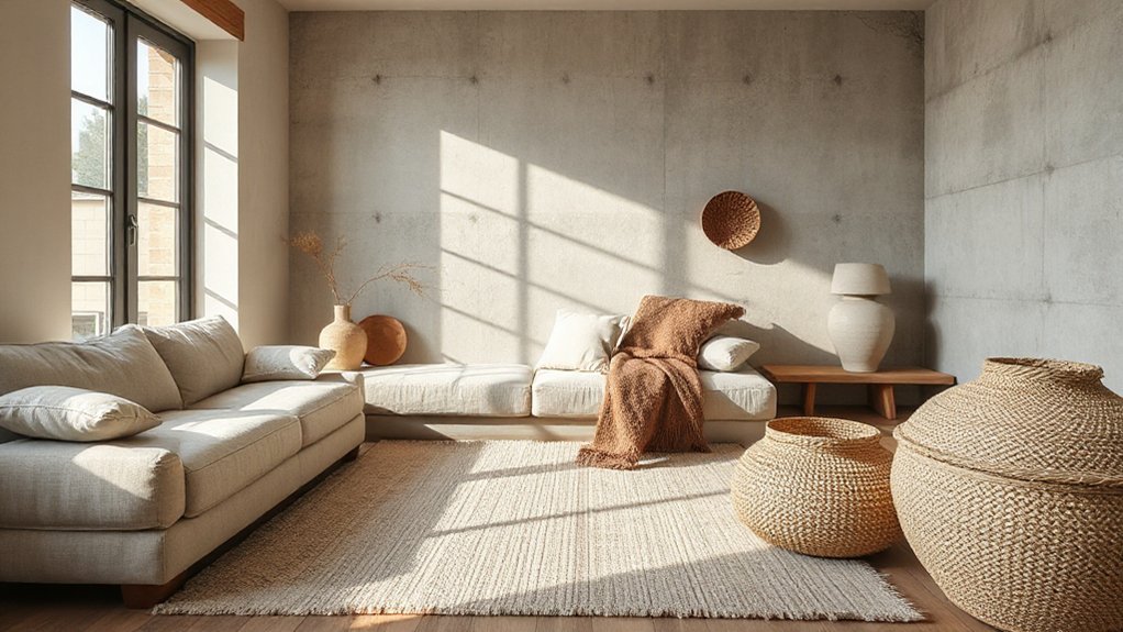
By layering varied textures—stone, plaster, wood, metal—you create depth that enriches neutrals rather than competing with them. The result is a cohesive, curated look where details serve function and feel.
You maintain restraint while allowing subtle complexity, ensuring your neutral palette remains sophisticated, inviting, and visually engaging through purposeful texture.
Layer With Textures: Fabrics, Textiles, and Surfaces
To layer with fabrics, textiles, and surfaces, start by pairing tactile elements with your neutral base to create depth and warmth. You’ll balance color and texture across textiles, upholstery, and surfaces to avoid flatness.
Choose fabrics with subtle sheen, matte weaves, and varied pile to cast soft shadows and highlight contours. Integrate color contrast through throws, cushions, and window treatments, ensuring hues complement your overall palette rather than compete.
Pay attention to furniture arrangement: position pieces to reveal each texture’s moment, creating purposeful sightlines and rhythm.
Use surfaces—laminate, wood, or stone—in different finishes to catch light at varied angles.
Maintain cohesion by repeating a few textural notes and edge details, so your layered textures feel intentional, not scattered.
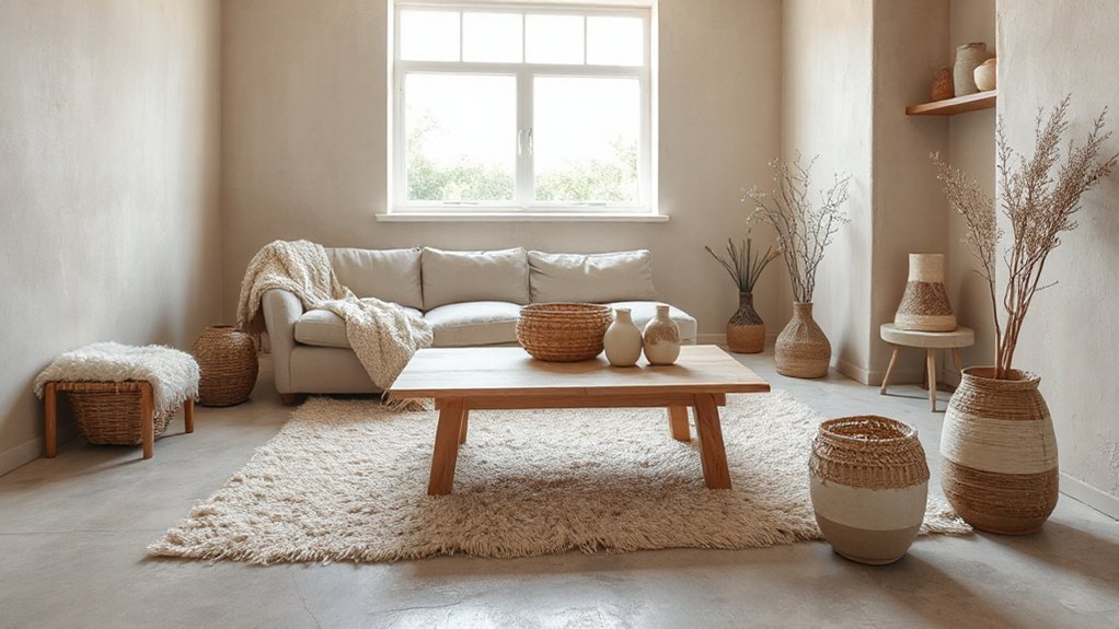
Bring in Natural Fibers for Warmth
Natural fibers bring immediate warmth to neutral interiors, enriching the space with tactile honesty. You’ll introduce material contrasts that read as purposeful rather than decorative, elevating the calm palette with grounded texture.
Seek fibers with subtle color variations to avoid flatness while keeping the overall serenity intact. The goal is tactile balance: pair rugged textures with smooth surfaces for visual interest, not clutter.
- Embrace varied natural fibers (linen, jute, wool) to create layered warmth
- Highlight color variations in weaves and finishes for depth
- Use proportion and placement to control contrast without overpowering the room
Varied Weaves and Surfaces for Depth
Varied weave textures and surface layering create instant depth in neutral rooms. You’ll mix tactile fibers with overlapping surfaces—think linen over bouclé, or a smooth velvet under a textured rug—to add contrast without color.
This approach builds dimensionality through subtle shifts in texture, guiding the eye and enriching the space.
Varied Weave Textures
Texture adds dimension to neutral interiors, and varied weave textures do exactly that by introducing depth through surface complexity. You’ll experience tactility and visual interest without breaking the calm. Embrace multi-directional patterns that catch light differently, creating subtle shifts in tone. This approach highlights Textile innovations and modern weaves, keeping the palette cohesive while adding character.
- Mix warp-faced and pile textures to create tactile contrast.
- Layer tweed, bouclé, and satin weaves for rich surface movement.
- Choose textiles with varied yarn thicknesses to enhance shadow and depth.
When selecting textiles, prioritize durability and finish compatibility with your space’s lighting. Balance foreground textures with quiet backdrops, ensuring each weave earns its place. You’ll achieve a sophisticated, polished neutral environment that feels thoughtfully engineered and intentionally calm.
Surface Layering Ideas
Curating surface depth starts with smart pairings of textures and finishes that play across light and shadow. You mix varied weaves with tactile surfaces to sustain visual interest without clutter.
Start with wall treatments that add dimension—think linen-look textiles on panels, matte plaster, or subtle beadboard—so light diffuses softly across edges. Pair these with natural textures: a wool rug, flax drapery, and a woven cushion to create layered warmth.
Introduce artistic finishes on cabinetry or accents—faint metal patina, creamy limewash, or glaze detailing—to sharpen depth while remaining cohesive. Keep scale in mind: large, smooth planes balance intricate surfaces.
Avoid competing patterns; instead, let texture shifts guide the eye. Finish with a restrained palette to preserve serene neutrality while preserving tactile richness.
Layer Lighting to Bring Texture to Life
Layer lighting patterns sculpt texture by casting subtle shadows and highlighting surface variation.
Use lamps to add tactile depth, pairing ambient, task, and accent layers for dimension.
Keep the focus on how light reveals texture, not on the fixtures themselves.
Layer Light Patterns
Layering light patterns adds depth by inviting surfaces to reveal their nuances as you move through a space. You control texture without altering color by guiding where, when, and how illumination lands. Use pattern contrast to emphasize subtle surface features, letting shadows reveal grain, weave, or plaster relief.
Shadow play creates motion across a neutral palette, giving rooms a tactile rhythm that changes with your footsteps and time of day. Focus on layering: overhead ambient, targeted accent, and sconces behind furnishings to sculpt definitions and create pockets of interest.
- Emphasize contrast between matte and slightly reflective finishes
- Position fixtures to cast deliberate shadows without harsh glare
- Align light direction with surface textures for dynamic depth
Texture Through Lamps
Lamps can sculpt texture without changing color, turning flat surfaces into tactile focal points. You’ll use lamps to add depth by pairing materials—uncovered brass, frosted glass, woven shades—with neutrals, so shadow and glow define form.
Choose lamp styles that complement room geometry: tall architectural lamps for vertical emphasis, low-slung sconces to reveal wall texture, and shaded table lamps to soften edges without overpowering.
Vary light temperatures and intensities to reveal surface detail; consider warm ambient glow for coziness and cooler accents to sharpen texture.
Lighting techniques like uplighting, grazing, and indirect diffusion create sculpted surfaces that feel richer. Place luminaires where textures naturally occur—e.g., textiles, plaster, wood grain—to maximize tactile perception.
Maintain balance to avoid visual overload while enhancing perceptible texture.
Subtle Motifs on Neutral Palettes
- Introduce a discreet pattern across a single accent like a throw or cushion, then echo it sparingly in art frames.
- Pair motifs with solid surfaces to maintain balance, ensuring color accents stay intentional rather than decorative.
- Layer textures that share a common tonal range, reinforcing the motif through surface variation rather than loud contrast.
This approach delivers refined depth, clarity, and cohesion.
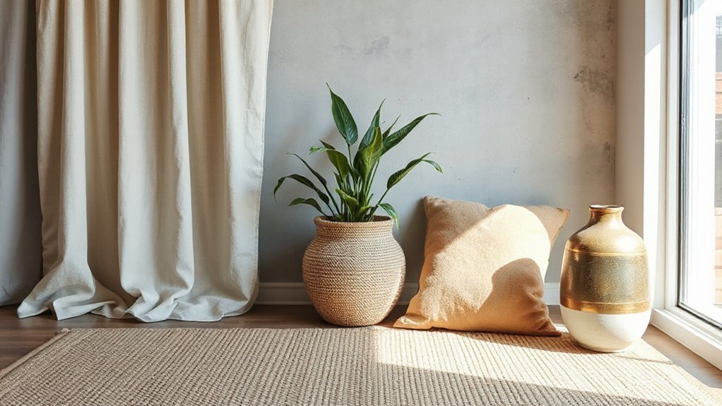
Texture in Small Details and Accessories
Subtle texture in small details can transform a neutral room without overpowering it; choose accessories that add tactile interest while staying cohesive with the overall palette.
In practice, select items with deliberate texture cues—woven throws, ceramic vases with subtle relief, and linen cushions.
Prioritize contrast through pattern rather than scale; pattern contrast creates visual depth without loud color shifts.
Layer textures at varying heights to guide the eye and prevent flatness.
Introduce color variation within a restrained range to maintain harmony, using slightly tinted threads, glaze, or finishes that echo the core neutrals.
Keep hardware and framing consistent to unify disparate textures.
Avoid overloading surfaces; curate a concise scattering of textured pieces that reinforce the room’s calm, refined character.
Budget, Longevity, and Practical Considerations
Balancing budget, longevity, and practicality is the backbone of a cohesive neutral scheme. You’ll maximize texture without overextending costs by prioritizing durable, washable surfaces and timeless patterns that resist fad. Consider how material choices influence maintenance and replacement frequency, and choose options that age gracefully.
Plan for durability considerations—seams, finishes, and wear zones—so your investment pays off over time.
- Cost effective strategies emphasize core pieces, not trends, and favor mid-priced, resilient materials.
- Durability considerations guide you to sealed surfaces, washable textiles, and reinforced stitching for longevity.
- Practical layout decisions reduce repeated substitutions by balancing function, texture variety, and ease of care.
Texture Implementation: A Step-by-Step Guide
Texture is introduced through a deliberate sequence: select a core, durable base and layer in tactile accents that you can wash, repair, or replace with minimal disruption.
Begin with a neutral foundation—appliances, upholstery, or wall finishes—that resist wear and maintain form.
Introduce texture through purposeful contrasts: a chunky weave, a nubby linen, or a ribbed velvet.
Guarantee color relationship supports the base; use Color contrast to highlight depth without overwhelming the palette.
Plan furniture placement to maximize light, airflow, and tactile variety—group seating to emphasize scale and accessibility, then anchor with a rug or throw.
Treat textiles as modular accents rather than permanent commitments, enabling adjustments as you refine style.
Prioritize durability, washability, and repairability to sustain the look with minimal disruption.
Frequently Asked Questions
What Textures Pair Best With Cool Neutrals?
Textured fabrics like boucle, tweed, and velvet pair beautifully with cool neutrals. For textural contrast, mix wool throws, linen drapes, and a nubby rug with metal or glass accents to keep visual interest.
Incorporate wood grains and matte ceramics to soften austerity while preserving polish. Use high-contrast stitching or piping to heighten the effect.
You’ll achieve a refined, balanced look that feels tactile yet cohesive, with clear visual interest and well-defined structure.
How to Test Textures Before Committing Financially?
You can test textures before committing financially by using fabric swatch testing and careful sample placement techniques.
Start with small, representative swatches laid where you’ll engage with them daily, then observe under both natural and artificial light. Rotate placements to assess durability and mood.
Compare fibers side by side, note lint or sheen, and track impressions on walls, rugs, and furnishings.
Document results with photos and a quick rating system for confidence before purchase.
Which Fabrics Hold Color Best Over Time?
Stating a standout stat first: after 5 years, fabric durability often drops 15–20% for high-use textiles.
You want fabrics that hold color best over time. For color fade resistance, choose materials with tight weaves and stable dyes.
You’ll notice wool and acrylic blends perform well, while untreated cottons fade quicker.
Prioritize performance labels, test with light exposure, and opt for solutions dyed fabrics to maximize fabric durability and color fade resistance.
Can Texture Layering Affect Room Acoustics?
Yes, texture layering can affect room acoustics. You’ll improve sound absorption by incorporating porous materials, rugs, and upholstered surfaces, which dissipate mid and high frequencies.
You’ll also achieve acoustic enhancement through directional textiles and diffusive panels that scatter sound waves without dulling ambiance. Use varied textures to balance reverberation, ensuring comfortable speech clarity.
In practice, mix fiber density and surface geometry to optimize Sound absorption while maintaining a refined, tactile aesthetic.
Are There Low-Maintenance Textured Options for Busy Homes?
Yes—there are low-maintenance textured options for busy homes. You’ll want durable wall treatments like vinyl-wrapped panels or high-performance textured paints that wipe clean.
Plus, quick-install decorative accents such as woven baskets and ceramic add-ons. These choices stay looking fresh with minimal upkeep, while still adding depth.
Think of texture as a whisper, not a shout, so you preserve calm. You’ll achieve warmth and interest without heavy maintenance or constant replacement.
Conclusion
Texture is your quiet orchestra, playing softly beneath a neutral stage. Picture a stone wall as a steady drum, linen drapes as fluttering flutes, and warm wood as a grounding cello—each note distinct, together creating depth without shouting. As you layer fibers, surfaces, and light, the room reveals its character in shadows and touch. Follow this path: balance, restraint, texture in small details, and timeless materials. The result: calm, refined warmth that ages gracefully with you.