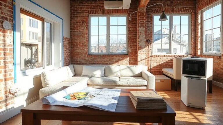
An odd room is a puzzle that can reveal surprising flow once you map the basics: doors, windows, and any alcoves shape the path you’ll walk through every day. You’ll start by pinning constraint points, then sketch zones with multifunctional furniture that flex as needs change. The goal: a clear focal point, a cohesive palette, and layered lighting so every corner feels intentional. Want to see how these moves unfold in practice? Keep going.
Key Takeaways
- Map constraints like doors, windows, outlets, and radiators to create a practical furniture footprint plan.
- Zone the room with flexible, multifunctional furniture to maintain flow and adapt to awkward angles.
- Establish a flexible focal point to guide movement and visually anchor the room.
- Unify color and texture across zones, layering textures and echoes to unify the space.
- Layer lighting (ambient, task, accent) and maximize natural light to expand perception and function.
Identify Your Room’s Constraint Points
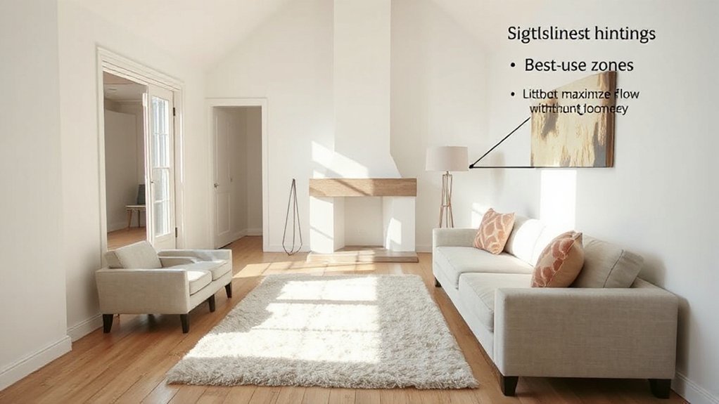
Identifying your room’s constraint points starts with a clear map of the space’s limits: doorways, windows, outlets, and built-in features like alcoves or columns. You note every obstruction and opportunity, then translate that into a practical plan. Mark traffic paths so you don’t block flows, and identify focal walls for visual anchors.
Consider ceiling height, radiator placement, and awkward angles that distort furniture scale. By detailing each constraint, you create a baseline for space maximization without overcrowding. Use measurements and a simple grid to compare furniture footprints against available floor area.
Your approach should emphasize functional zones that suit daily use, while preserving aesthetic balance through proportional shapes, colors, and textures. This disciplined scan helps you place pieces confidently, avoiding clutter and enhancing usability.
Zone the Room With Smart Furniture Placement
Think in flexible furniture zones so each area serves a clear purpose without crowding.
Use pieces that double in function to keep pathways flowing and sightlines open.
Start with a main seating cluster and let nearby zones support traffic flow, keeping the layout flow-friendly and intentional.
Flexible Furniture Zones
To make awkward layouts work, start by grouping pieces into dedicated zones that flow naturally from one another. In Flexible Furniture Zones, you design each area to serve multiple purposes without crowding the room.
Think multifunctional furniture: an ottoman that acts as a coffee table and extra seating, a storage bench that doubles as a console, or a sofa bed tucked into a quiet corner for guests.
Use adaptable zones to subtly guide traffic, placing seating to create intimate nooks while leaving clear pathways. Mirror light with transparent pieces and foldable surfaces that can expand or collapse as needs shift.
Label zones by use—reading, snacking, working—and keep color and texture cohesive to unify the space while preserving flexibility.
Flow-Friendly Layouts
Start with a central axis: place a sofa or console to anchor traffic flow, then situate chairs or ottomans to frame spaces without blocking passages.
Prioritize scale: choose pieces that fit with room width and door swings, and leave at least 2 feet of walking space around tables.
Add interest with artistic accents that pull the eye along the intended route, not against it.
Bring in natural elements—plants or wood textures—to soften angles and cue a calm rhythm.
End with lighting zones that reinforce flow, not fatigue.
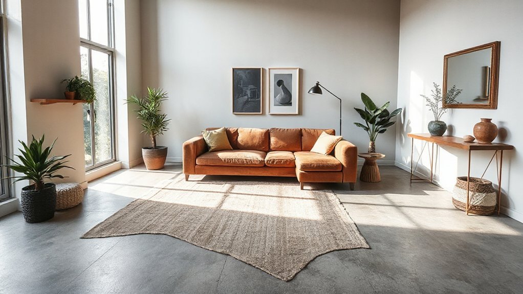
Create a Flexible Focal Point to Guide Flow
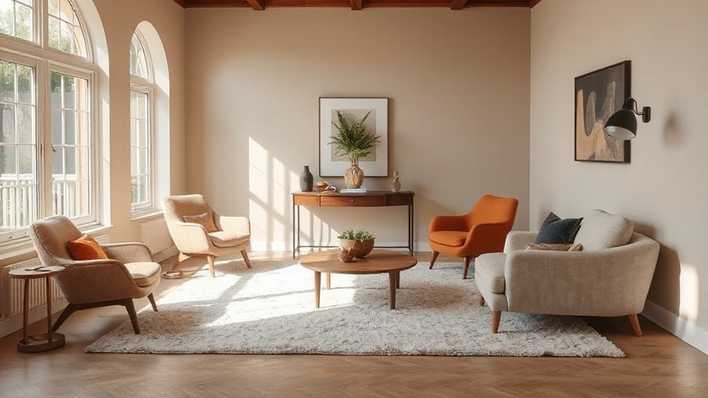
In spaces with awkward layouts, a flexible focal point acts like a compass that guides movement and sightlines, not a fixed statue to chase around the room. You’ll create a dynamic center that adapts as furniture shifts, people enter, or tasks change.
Start with a visually bold anchor—an art piece, a sculptural lamp, or a curved sofa—that draws attention without overpowering other zones. Surround it with complementary textures, lighting, and height variance to steer flow naturally toward seating, work areas, and pathways.
Use recurring shapes or colors to reinforce the intended path. Remember, Creative focal points and Visual anchors aren’t static; they reorient as you rearrange. Test from multiple angles, adjust proximity, and guarantee the rhythm remains welcoming and clear.
Unify Color and Texture for Cohesive Space
Color and texture should weave together like a single fabric, tying disparate zones into a seamless whole. You’ll create rhythm by repeating a core color across furniture, textiles, and accents, then add depth with varied textures.
Aim for color harmony through balanced saturation, not identical hues. Layer texture intentionally: pair glossy surfaces with matte upholstery, and introduce tactile elements like wool, linen, or woven rattan to ground each area.
- Repeat a unifying color across at least three texture types
- Alternate sheen levels to avoid flatness
- Introduce tactile fabrics (wool, velvet, jute) for cohesion
- Use subtle pattern echoes to tie different zones
- Vary scale of textures to preserve interest and flow
Optimize Lighting to Expand Perception and Function
Strategic lighting can visually expand a room and boost usability, especially in awkward layouts. You’ll start with layered lighting: ambient, task, and accent to avoid dark pockets and dead corners.
Use wall wash or ceiling fixtures to soften sharp angles, then add a couple of directional lamps to highlight focal areas. Place task lighting near desks, tables, and reading nooks, ensuring adjustable brightness for versatility.
Favor Natural light where possible by sheer curtains or placement that doesn’t block windows; it reduces reliance on artificial sources during the day and pairs well with color schemes that reflect more light.
Choose cool whites for narrow spaces and warm tones for cozy corners, balancing contrast and depth without visual clutter. Label switches for quick, intuitive control.
Plan Scale and Clearance for Awkward Alcoves
When planning for awkward alcoves, start by mapping the space and measuring clearance to avoid cramped paths and blocked doors. You’ll choose scale that fits without crowding; think low-profile furniture and slim profiles to preserve flow.
Visual balance matters: align focal pieces with natural sightlines and allow generous walkways. Plan decorative accents and color accents to unify the nook with the room, rather than clash with awkward angles.
Use proportional rugs to anchor zones and create perceived depth. Consider vertical elements to draw the eye upward, freeing floor space.
Keep margins on doorways and furniture at least a few inches away from walls to prevent sticking.
- Map dimensions and doorway clearances
- Select appropriately scaled furniture
- Anchor zones with rugs
- Use vertical accents
- Coordinate decorative and color accents
Add Smart Storage and Surface Variety
To keep awkward alcoves functional and visually cohesive, add smart storage and surface variety that fits the scale and flow you’ve planned. Opt for modular shelves or slim cabinets that tuck into alcove recesses without crowding sightlines. Choose storage with doors or baskets to hide clutter, keeping daily essentials accessible but discreet.
Pair closed storage with open surfaces for display, so you don’t lose personality. Use decorative accessories to personalize the space without overpowering it, and vary surfaces with a mix of wood, lacquer, and tempered glass to catch light differently.
Wall treatments, like soft matte paint or subtle texture, can unify disparate elements. Keep cords concealed with cable channels or floor basings, and test height and depth against your furniture layout before committing.
Test and Tweak: Practical Checks Before Committing
Before you commit, test and tweak with practical checks that you can actually act on. You’ll verify flow, scale, and lighting in real-time, not in theory, so these steps stay actionable. Assess furniture paths, then simulate movement with tape on the floor. Check color contrasts and decorative accents at eye level; compare samples under both daylight and artificial light. Confirm storage gains feel intuitive, not intrusive. Measure wall art distance and rug placement before finalizing.
- Test traffic patterns with temporary markers
- Compare color contrasts under different lighting
- Preview decorative accents at reachable heights
- Rehearse opening and closing doors around focal points
- Confirm switch and outlet access remains convenient
Frequently Asked Questions
How Can I Measure Traffic Flow Around Unusual Room Corners?
To measure traffic flow around unusual room corners, you’ll set up simple probes: count paths, time durations, and note bottlenecks.
Use tape marks to map common routes, then track how often people pass through each area over peak periods.
Apply traffic pattern analysis to reveal high-traffic corridors.
Try furniture arrangement strategies that minimize hindrance, like jog-free angles and clear sightlines.
Record results, adjust, remeasure, and iterate until circulation feels smooth and intentional.
What Budget-Friendly Rug Sizes Suit Tight or Irregular Spaces?
A budget-friendly rug size that fits tight or irregular spaces is a 5×8, 4×6, or a large runner, depending on the nook. You’ll maximize coverage without crowding by placing it under key zones.
Color coordination keeps the risk of clashing low, while texture mixing adds depth. Pair the rug with a few coordinating cushions and throws.
Measure clearance, align edges, and test traffic flow to guarantee practical, creative, balanced movement throughout the room.
Which Doors or Windows Should Influence Furniture Placement First?
When you plan, door placement and window positioning should guide first, so your furniture settles into natural flow.
Start by anchoring the dominant seating to a central focal point, then align key pieces away from swing zones and glare.
Consider traffic paths and sightlines from every doorway.
Place sofas and storage to frame traffic routes, not obstruct them.
Use the windows to frame views, not dominate walls, letting light define zones and rhythms.
How Do I Hide Odd Wiring or Radiators Without Clutter?
Hidden wiring, radiator concealment: you hide cords behind cable channels, paintable trunking, or flexible conduit so they vanish into walls.
You mount slim radiators with cabinetry fronts or radiator covers that match trim, adding ventilation grates.
You route wires along crown molding or under baseboards, secured neatly.
You create a focal point elsewhere, using furniture offsets to disguise odd lines, keeping surfaces clear and clutter-free with strategic storage and cable management.
Can Reflective Surfaces Compensate for Limited Natural Light?
Yes, reflective surfaces can help. You place a mirror opposite a window to catch light, then angle it to bounce brighter, not glare.
Use multiple smaller mirrors or one oversized piece for strategic Light reflection, avoiding dead spots.
Position mirrors at eye level and consider vertical panels to widen the space.
Keep frames slim and cohesive with your furniture.
Test with daylight; adjust for the strongest reflected glow throughout the room.
Conclusion
Tackling an awkward layout isn’t a drag—it’s a design treasure hunt. You’ll carve pathways, nestle smart furniture, and coax every alcove into usefulness, like turning a maze into a calm, lived-in ballet. With a flexible focal point, unified color, and layered lighting, you’ll feel the room expand—without moving a wall. Storage that disguises itself becomes magic, and scale checks become your backstage pass to effortless flow. You’ll finish with a space that thinks ahead, stays cozy, and somehow feels brilliantly inevitable.