Start with a dominant material that defines the room’s mood, then layer supporting textures that contrast or boost its scale, sheen, and warmth. Pair rough with smooth, warm with cool, and repeat cues of color and edge to keep cohesion. Use lighting to highlight the relief of surfaces and the quiet rhythm of patterns. You’ll see the space tighten as edges align and finishes unite, but the best part is what you notice next when the texture conversation starts to evolve.
Key Takeaways
- Start with a dominant material to anchor the space, then layer supporting textures in contrasting scales for depth.
- Map texture patterns by zone to convey mood, ensuring each surface type remains distinct and legible.
- Use deliberate contrasts or echoes in color, weight, and sheen to unify diverse textures.
- Balance warmth and coolness and employ layered lighting to emphasize texture depth.
- Check edges, seams, and durability, and adjust patterns or finishes to maintain tactile harmony.
How Texture Sets the Mood in a Room
Texture does more than decorate a space; it communicates mood at a glance. You feel a room’s tone as you enter: plush velvets soften the air, linen cools the skin, and polished concrete alerts the eye. Texture guides perception, creating visual harmony that your brain reads instantly. You’re not just decorating; you’re shaping experience.
When you layer materials with intention, you craft a sensory experience that supports function and emotion. A rough weave adds grit to focus; a glossy surface lifts energy, clarifying space. In quiet rooms, subtle textures invite calm; in lively spaces, varied surfaces spark curiosity.
You choose tactile cues that align lighting, color, and layout, so texture becomes an intentional ruler of atmosphere.
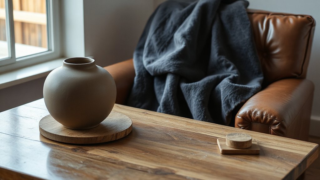
Pair Fabrics, Woods, Metals, and Stones for Cohesion
Pair fabrics, woods, metals, and stones to create a unified feel, rather than a collage of looks. You’ll balance texture and tone by aligning weight, sheen, and color across materials, so contrast serves cohesion.
Start with a dominant material, then echo its character in the others to keep the space calm and purposeful.
Cohesive Material Pairings
To create cohesion across fabrics, woods, metals, and stones, you pair materials with deliberate contrasts or harmonious resemblances that travel through color, weight, and texture.
You’ll prioritize material durability and surface patterns to guarantee a lasting, unified feel, not a fleeting look. When you combine, aim for a rhythm: matte textures with subtle gloss, warm woods against cool metals, and granular stones with smooth fabrics. The goal is a coherent narrative that reads as one space, not a collection of parts.
- Pair durable fabrics with contrasting surface patterns to emphasize tactility
- Match wood tones to metal undertones for a cohesive luminance
- Use stone textures as visual anchors to stabilize softer materials
- Balance weights so heavy elements don’t overwhelm lighter ones
- Introduce subtle color echoes to unify disparate textures
Texture and Tone Balance
You balance fabrics, woods, metals, and stones by guiding contrasts and echoes that travel through color, weight, and texture.
Texture and tone balance hinges on deliberate pairing: pair a tactilely diverse material with a smoother counterpart to carve rhythm, then repeat with a lighter element against a deeper base.
Aim for material harmony by aligning saturation, sheen, and scale, not just color.
Let tactile diversity guide focal points—a rugged stone against sleek metal draws the eye without shouting.
Maintain cohesion by repeating textures in varied intensities across rooms or vignettes, creating a quiet through-line.
Avoid competing focal points; let one material command attention while others support.
Your space should read as unified, refined, and deliberately calm.
Use Color Temperature to Balance Warmth and Cool
Color temperature is your tool to balance warmth and cool with intention. Consider how warmth reads in perceived mood, and how cool tones sharpen focus and clarity.
Use lighting and material choices to steer temperature perception, so your space feels welcoming yet precise.
Warmth-Cool Balance
Balancing warmth and cool by color temperature is a practical, precise way to harmonize a space.
You’ll tune each element by shade, aiming for a deliberate dialogue between warm (yellow-red) and cool (blue-green) tones. Use this interplay to reinforce fabric layering and material harmony, not clash.
Consider lighting as the conductor: warm bulbs under a cool fabric set feel lively yet balanced, while cool lighting can calm a bold texture. Keep midtone neutrals as anchors to prevent drift.
Notice how color temperature alters perceived texture depth and material richness, guiding you to mix glass, wood, and textiles with confidence. Your goal is cohesion through temperature, not sameness.
- Start with a warm anchor and cool accents
- Pair fabrics with complementary undertones
- Let lighting shift emphasize texture
- Use neutrals to ground contrasts
- Test swatches in real sightlines
Temperature Perception Tricks
Color temperature shapes how warmth and coolness read in a space, making perception of texture and depth feel tangible rather than abstract. You’ll balance surfaces by pairing warm-toned finishes with cooler accents, guiding the eye and your tactile instincts.
In practice, aim for a deliberate contrast: plaster with amber glow, steel with pale blue, or walnut with graphite. This calibration alters tactile sensations, so you feel softness, hardness, and density more distinctly.
Use light to reinforce, not overwhelm; avoid muddy blends that dilute material symbolism. Document how each finish responds under typical daylight and artificial sources, then fine-tune until the textures read as a cohesive chorus rather than a random assortment.
The result: a controlled, immersive environment where color temperature clarifies texture and depth with precise intention.
Lighting Affects Mood
Ever wonder how a room’s glow shapes how you feel when you step inside? Lighting sets mood by color temperature, guiding perceived warmth or coolness. Use warm temps to soften spaces, inviting conversation and comfort; switch to cool temps to sharpen focus and energize.
Balance is key: too much warmth can dull texture; too much coolness can feel clinical. Achieve ambient ambiance with layered lighting—overhead, task, and accent—to sculpt shadow play and depth. Monitor reflections off surfaces to avoid glare and harsh contrasts.
Seek continuity between fixtures and materials to maintain harmony. Dimmers, color-tunable LEDs, and strategic placement empower you to tailor atmosphere in real time.
- Warmth vs. coolness calibration
- Layered lighting for depth
- Shadow play management
- Surface reflection control
- Dynamic programming with dimmers
Create Contrast That Feels Intentional, Not Clashing
When you mix textures and materials, you’re aiming for contrast that reads intentional, not accidental. You curate differences with purpose, not noise. Start by pairing a dominant material with a complementary support, then test the cadence—hard with soft, glossy with matte, rough with smooth.
Layered patterns create depth, but keep them restrained: repeat a motif across surfaces to read as a cohesive decision, not a collision. Build tactile contrasts by balancing temperature and weight—cool stone beside warm wood, velvet beside linen, metal beside ceramic.
Guarantee edges and seams align logically, so transitions feel deliberate rather than arbitrary. Document your choices: note why each texture reinforces the whole.
When done, the room reads as curated, confident, and deliberately textured, not cluttered or chaotic.
Lighting, Scale, and Finish to Unite Textures
Lighting, scale, and finish are the crafters that unite textures into a coherent whole: the right glow highlights grain, the right scale lets patterns breathe, and the final sheen ties rough and smooth into one seamless surface.
- Ambient glow elevates subtle textures without overpowering them, guiding the eye across contrasts.
- Material harmony emerges when finishes align light reflection with tactile expectations.
- Scale choices amplify or mute patterns, preventing discord between bold and delicate surfaces.
- Finish progression ensures rough luster and polished areas read as a unified set.
- Subtle reflections create depth without sacrificing legibility of form or detail.
Step-by-Step: The Texture-Forward Styling Checklist
Now you’ll put those ideas into action with a texture-forward checklist you can follow step by step. Begin with a core palette and map texture patterns to each zone, labeling surfaces by mood: tactile, visual, or both.
Select one dominant material as the anchor, then layer two supporting textures with contrasting profiles to avoid sameness. Test durability first: prioritize material durability where high wear occurs, and reserve delicate textures for lower-traffic vignettes.
Align pattern scale so close elements echo the room’s rhythm, not compete with it. Verify contrast in light, shade, and color to preserve the legibility of rough, smooth, and woven surfaces.
Finally, review balance: ensure every piece supports the narrative of tactility without overcrowding the eye.
Troubleshooting Common Texture Mixes and Quick Fixes
Texture conflicts are common, but they’re fixable with a calm, targeted approach: identify the culprit (overwhelming scale, clashing finishes, or competing patterns), then swap one element or adjust balance to restore harmony.
- Check fabric durability first: replace fragile textiles with sturdier options to prevent wear from undermining texture depth.
- Tweak sheen levels: dial back gloss or matte contrasts to avoid visual ADHD.
- Isolate dominant texture: reduce one pattern or finish so others can breathe.
- Proactively plan material maintenance: pair high-pile with tight weaves to balance texture while extending life.
- Test light interaction: view under multiple sources to confirm true harmony before committing.
This method keeps your composition precise and durable, avoiding unnecessary fuss.
Frequently Asked Questions
How Do You Layer Textures Without Overdoing It?
To layer textures without overdoing it, you balance scale and color first. Start with a unifying palette that coordinates color coordination across fabrics, wood, and metal.
Vary textures in focal areas, like a plush rug against sleek upholstery, then keep others subtle.
Prioritize material durability for essential surfaces and mix finishes sparingly. You’ll create depth without clutter, guiding the eye with rhythm, contrast, and purposeful repetition, so each piece feels intentional.
Which Textures Read as Formal Versus Casual?
Formal reads come from refined fabrics—silk, wool, tweed, and satin—while casual leans on cottons, jersey, denim, and linen. You’ll spot the difference in weight, sheen, and drape, not just price tags.
In fabric comparison terms, formal textures project polish; casual textures invite ease. You consider material durability, too: sturdy tweed or denim outlast fragile silks.
You’ll choose based on context, balancing crispness with comfort, ensuring you never overload the room with stiffness or slouch.
Can You Mix Textures in a Small Space Effectively?
Yes, you can mix textures in a small space effectively. Use cohesive color palettes to unify disparate surfaces, then layer with varied materials to add depth.
Optimize lighting techniques—warm walls, focused task lighting, and reflective accents—to expand perceived space. Keep scale proportional and repeat a signature texture or color for continuity.
Choose furniture with clean lines, and let textiles be the bolders. You’ll create dimension without clutter, and the room will feel intentional and bright.
How Do You Test Texture Combinations Before Committing?
You test texture combos by staging samples in your space, moving light around, and auditing how they feel at eye level.
Start with color contrast and pattern pairing on a small board, then simulate real life: place fabrics, finishes, and surfaces together, observe under the actual lighting, and tweak.
Use swatches to compare scale, sheen, and tactility.
Decide if the mix reads coherent, then test one element at a time until the composition feels deliberate.
What Are Easy Fallbacks if a Texture Clashes?
If a texture clashes, use easy fallbacks like neutral fabrics, subtle weaves, or a unifying color. You’ll keep balance with fabric pairing that includes a quiet textile in the same family and a restrained color coordination scheme.
When in doubt, introduce a calm, matte surface to anchor the look, then layer with a small, glossy accent. You’ll preserve interest without shouting, guiding the room with deliberate texture and color choices.
Conclusion
Texture is the heartbeat of a room. When you mix it well, you orchestrate a symphony of touch and sight that feels inevitable, not accidental. Think of your dominant material as the bassline, with others weaving in like melodies to support it. Use lighting to sculpt texture, repeat elements for cohesion, and balance warmth with cool tones. Trust deliberate contrast over clash, and you’ll craft spaces that feel intentional, alive, and utterly grounded in texture.