You can style shelves like a pro by defining a clear goal, then building a cohesive color story, textures, and a thoughtful balance of scale. Use intentional grouping to avoid clutter, and let light highlight focal points. Keep decor purposeful and refreshed with seasonal or meaningful pieces. Ready to shape a polished display that reflects your space and personality—and uncover the exact moves that make it feel effortless.
Key Takeaways
- Define clear styling goals and a cohesive color plan with 2–4 anchor tones, ensuring up-to-date, easily refreshable displays.
- Curate a polished look by limiting decor, using vertical height, and balancing texture with deliberate contrast.
- Create visual cohesion through a texture-light approach, using natural materials and negative space to prevent clutter.
- Build engaging shelves with a focal piece, themed micro-stories, and seasonal rotations for freshness.
- Use lighting strategically, vary scale, and place items to emphasize depth and mood while maintaining deliberate wording and placement.
The Shelf Styling Problem: What Readers Want to Achieve
People read about shelf styling to solve a simple problem: how to make a display feel cohesive, purposeful, and easy to update. You seek clarity, not clutter, and you want results you can trust.
The shelf styling problem centers on defining a target vibe and delivering it with restraint. You’ll prioritize items that earn their place, balancing function with form.
Vintage accents contribute character without overwhelming modern lines, while a Minimalist approach keeps contrasts deliberate, spaces intentional, and attention on what matters.
Your aim isn’t a gallery; it’s a usable, breathable display that adapts over time. Measure success by how quickly you refresh, how smoothly you rotate pieces, and how the overall scene communicates your intended mood without guesswork.
Precision in selection and placement yields consistency you can maintain.
Set a Cohesive Color Story Across Your Shelves
To create a cohesive color story across your shelves, start with a unifying palette that reflects the room’s mood and your daily routine. Build around a core Color palette you can repeat in varying intensities, rather than matching every item exactly. Choose 2–4 anchor tones and 1 or 2 supporting hues, allowing neutrals to breathe. Limit metallics and bold accents to deliberate spots to avoid clutter.
Map your items by tone, not color alone, grouping objects with shared warmth or coolness. Consider lighting, since mood enhancement hinges on subtle shifts from daylight to lamp glow. Maintain consistency in textures and finishes within each color subset to strengthen the narrative.
Review seasonal swaps thoughtfully, preserving the overarching palette for a polished, professional shelf presentation.
Texture Without Clutter: Which Surfaces Actually Work
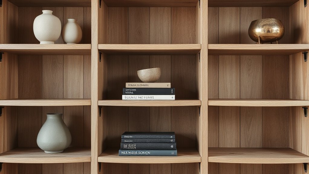
Texture matters, but clutter destroys it: focus on surfaces that add texture without overcrowding the shelves. You’ll choose surfaces that read as tactile accents, not visual noise. Natural textures—think wood grain, stone, linen, and woven fibers—deliver depth without bulk when kept in moderation.
Favor clean edges and restrained finishes to avoid busy backgrounds that compete with objects. Mixed materials work best when one element remains dominant, with the other acting as a quiet counterpoint. For example, pair a matte ceramic with a wooden slice or a metal frame against a soft textile backdrop.
Keep repetition to a minimum; variation should feel intentional, not chaotic. Prioritize surfaces that contribute warmth and nuance while preserving negative space for breathing room.
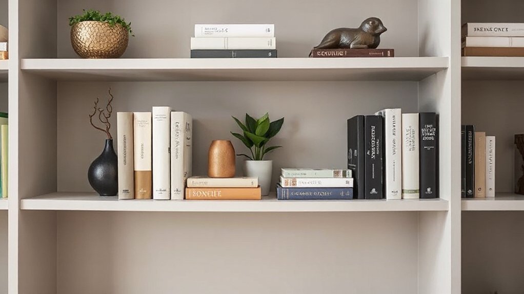
Balancing Books, Art, and Greenery With a Visual Triangle
To master balance, place books, art, and greenery along a simple visual triangle: one corner anchors the weight with books, another showcases a striking art piece, and the third hosts a touch of greenery.
You’ll create rhythm by alternating heights and textures within that triangle, ensuring no single element dominates.
Start with a focal book stack, then pair a bold artwork for contrast, and finish with a small plant to soften the scene.
Balance Books With Art
Balancing books, art, and greenery creates a visual triangle that guides the eye and keeps shelves from feeling crowded. You anchor the trio by alternating book spines with art frames, ensuring each element earns breathing room.
Prioritize color coordination across books and prints to unify the display, then introduce deliberate material contrast—glossy covers next to matte frames, metal bookends against wood shelves.
Position taller pieces toward the center or back to create depth, while shorter accents occupy the foreground to maintain balance. Vary book heights and widths to avoid a monotonous line, but keep a cohesive rhythm by repeating a small number of tones.
Leave white space around the arrangement so the triangle remains legible and purposeful.
Greenery Through Visual Triangle
Greenery introduces a new anchor to the visual triangle, reinforcing balance without crowding. You place plants with intent, aligning height, texture, and color to echo books and art.
Use a clear vertical rhythm: tall stems, mid-height foliage, and lower ground covers, so greenery anchors the shelf without overpowering other elements.
Focus on plant placement that complements the color harmony already established by books and art, repeating hues or contrasts to unify the display.
Choose pots that echo shelf tones or introduce a subtle accent, but avoid competing patterns.
Prune for clean lines and breathable spacing, letting negative space define each cluster.
When in doubt, swap a plant or move a piece to restore balance, keeping the trio cohesive and visually calm.
Layering Techniques That Look Intentional, Not Crowded
Layering shelves succeeds when you build depth with purpose: place a few larger objects toward the back, then layer in smaller pieces in front to guide the eye. You create intentional depth by varying scale, position, and spacing, avoiding clutter.
Start with a strong anchor, then stack height and width in measured steps. Color coordination matters: choose a cohesive palette that unifies disparate items, preventing visual chaos.
Use texture mixing to add interest—pair matte and glossy surfaces, woven with metal, wood, or ceramic finishes. Mind negative space; don’t cram every shelf.
Alternate front-facing and angled placements to imply balance without crowding. Group objects in odd numbers for rhythm, and keep a clear focal point at eye level.
This disciplined layering yields a polished, professional look, not a crowded display.
Objects That Tell Your Space’s Story
Curate storytelling objects that reflect you, not just what looks good.
Build layered arrangements that guide the eye and reveal how you lived with each piece.
Prioritize personal meaning moments—items that carry memory, emotion, or purpose, so your shelves speak with intention.
Curate Storytelling Objects
To tell your space’s story, choose objects with meaning and provenance—items you genuinely connect with or that reflect a moment, place, or person. Curate storytelling objects by selecting pieces that communicate you: a vintage watch, a travel postcard, a handmade ceramic, or a family heirloom. Let each item anchor a memory or intention, creating a narrative arc across shelves.
Avoid clutter; let purposeful objects breathe within negative space. Integrate these guidelines:
- Prioritize vintage accessories that shape character.
- Pair with minimalist decor to keep focus on meaning.
- Group items by theme or origin for coherence.
- Rotate pieces seasonally to refresh the tale.
Your shelves, quietly compelling, reveal your style without shouting.
Layered Object Arrangements
Objects that tell your space’s story come alive when you layer them with intent. Layering creates depth, guiding the eye through height, texture, and scale. Start with a core piece—an architectural object or a bold decorative accessory—as the anchor.
Build around it with a mix of sizes: tall, mid, and small, arranged in staggered steps rather than a straight line. Use color coordination to unify disparate pieces; repeat a dominant hue across objects to signal cohesion. Incorporate texture contrasts—matte, glossy, woven—to add tactile interest without visual clutter.
Maintain negative space to prevent overcrowding; each item should breathe. Group secondary items in odd numbers to reinforce balance, then prune periodically to preserve relevance. This disciplined layering communicates intentionality and elevates shelves as curated storytelling surfaces.
Personal Meaning Moments
1) Choose a focal piece that speaks to you, then build around it with complementary pieces.
2) Group items by theme or era to create readable micro-stories.
3) Rotate objects seasonally to keep the display fresh and meaningful.
4) Use scale and negative space to emphasize intended memories without clutter.
Keep wording deliberate, and avoid filler. Your shelves become a living archive, a visual autobiography that stays legible at a glance.
This approach invites introspection and reinforces the space’s personality.
Built-Ins vs Freestanding Units: Arranging for Your Setting
Built-in shelves create a seamless, integrated look, but freestanding units offer flexibility if you’re renting or planning future updates. Choose based on your setting’s rhythm: built-ins enforce a cohesive line, while freestanding pieces introduce movable focal points and easier reconfiguration.
Prioritize material contrast to define zones—pair wood with metal or glass to create visual interest without clutter. For vertical alignment, align horizontals with ceiling lines or crown molding to read as deliberate, not incidental.
Use asymmetry deliberately: a single tall bookcase opposite a low cabinet can anchor the space without crowding it. Consider depth variation to add depth without crowding.
In tight spaces, mirror a vertical element on one side to balance weight. This approach yields clarity, control, and a polished, professional result.
Lighting and Scale: Make Every Shelf Glow
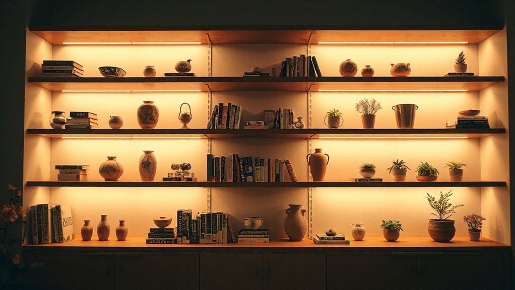
Lighting isn’t an afterthought on shelves; it’s the tool that shapes perception. You’ll use ambient illumination to create depth, highlight focal pieces, and control mood. Keep scale contrast in mind: vary item sizes so large accents anchor the shelf while small curios print texture and rhythm.
- Position lighting to emphasize the largest item first, then layer in smaller sources.
- Use warmer temps for cozy zones and cooler temps for display pieces that benefit from clarity.
- Place lights high and angled to avoid glare and cast subtle shadows.
- Dimmers deliver precision, letting you adapt scenes from bright daytime to intimate evenings.
Quick, Budget-Friendly Swaps to Elevate Any Shelf
If you want a quick upgrade without breaking the bank, start with swapping in affordable centerpiece pieces, like a bold vase or sculptural object, to anchor the shelf and set the tone.
Then layer in vintage accents sparingly to create focal points without clutter. Choose items with a shared hue or texture for cohesion, and let negative space guide the display.
Favor vertical height to add dimension without crowding surface area. Swap bulky picture frames for slim, high-contrast frames that echo your color story, or replace generic accessories with purposefully chosen pieces.
Embrace minimalist decor principles: limit excess, curate a small, intentional group, and rotate seasonal items. The result is a polished, professional look that feels curated, not bought.
Frequently Asked Questions
How Do I Measure Shelf Depth for Décor Balance?
To measure shelf depth for décor balance, you’ll use the rule of thirds: place decorative accessories in front of the back panel and test two–three inches of clearance behind them.
Aim for a staggered, layered Shelf arrangement with varied heights, ensuring taller pieces don’t overwhelm shorter ones.
Balance weights and textures, and leave space for movement.
Use decorative accessories sparingly, rotate seasonally, and keep the overall depth cohesive across shelves for harmony.
Which Heights Should Vary for Optimal Viewing?
The heights should vary: place a tall piece higher, medium pieces at eye level, and a low cluster near the base for balance.
You’ll optimize viewing by staggering objects in height and depth, not stacking them.
Aim for color coordination and deliberate accessory grouping to unify the display.
Start with a bold anchor, then sprinkle complementary tones.
This keeps the shelves dynamic yet cohesive, guiding the eye fluidly through the arrangement.
Can I Mix Vintage and Modern Without Clash?
Yes, you can mix vintage and modern without clash. Start with a cohesive foundation, then use Vintage pairing and Modern integration to guide balance.
Choose a unifying color or material, layer textures, and repeat a few shapes across styles. Keep one dominant era, then sprinkle the other in curated accents.
Avoid overcrowding; let negative space breathe. You’ll achieve harmony by pairing sleek lines with warm, nostalgic pieces, creating a timeless, intentional display.
How Many Pieces per Shelf Create Rhythm?
You should place 3–5 pieces per shelf to create rhythm. Start with a feature item, build with supporting pieces, and finish with a lighter, balanced accent.
Use color coordination across shelves to unify the display, and aim for an asymmetrical arrangement that feels intentional, not random.
Vary heights and depths, but keep the palette cohesive. This keeps your shelves dynamic yet cohesive, avoiding clutter while maintaining visual interest and balance.
What Are Quick Fixes for Odd-Sized Spaces?
You fix odd-sized gaps with quick, practical moves: fill verticals with decorative accessories, stack books, and use risers for instant height. You trim clutter, then blend textures for cohesive color coordination.
You swap in a matching tray or baskets to compact stray space, and hang a slim, framed piece to draw the eye. You test lighting, letting brighter accents guide attention.
You keep edges sharp, rhythm deliberate, and space feels intentional, not crowded.
Conclusion
You’ve learned the rhythm of a professional shelf: a quiet color story, textures that breathe, and objects that speak your space’s history. Like a well-told rumor, the eye moves in triangles, not clutter, guided by lighting that makes everything glow. Keep it purposeful, leave pockets of negative space, and swap seasonally to keep the room fresh. Remember: balance is a conversation, not a collection—each piece earns its spot, and the shelf tells your story with restraint and polish.