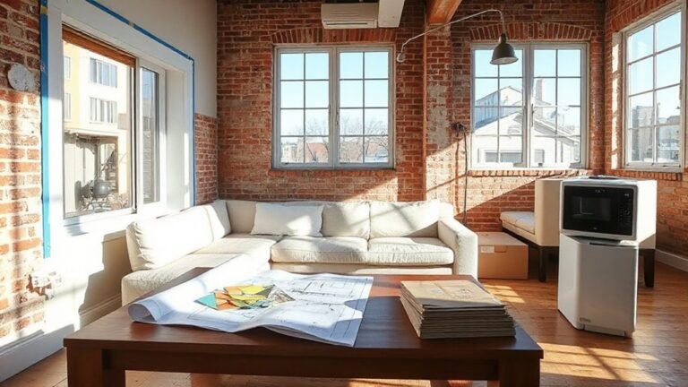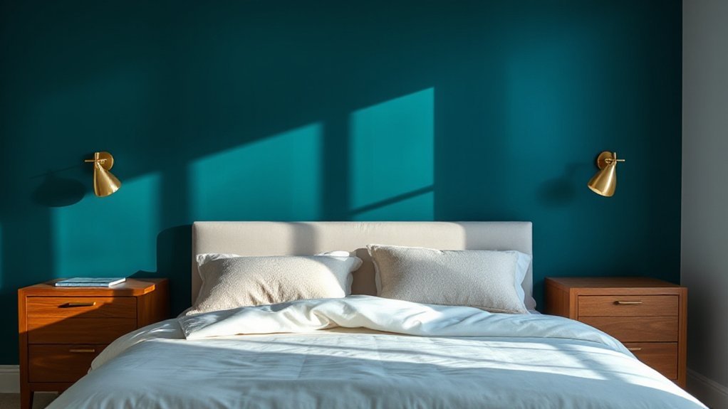
Choosing an accent wall in a bedroom starts with the wall that naturally draws attention, like behind the headboard or at the entry. You’ll balance color, texture, and pattern with the room’s scale, ensuring the feature remains integrated rather than overpowering. Layer lighting to reveal depth, keep furniture in proportional harmony, and anticipate how the wall will evolve with changes in decor. There’s a precise approach here that invites you to proceed with intention.
Key Takeaways
- Establish a focal wall by choosing a strong surface near entry or seating, ensuring clean lines and balanced lighting.
- Use a neutral base with 1–2 accent colors to maintain harmony and reduce visual clutter.
- Consider wall proportion; align accent wall size with ceiling height and surrounding furniture for balance.
- Apply textures or patterns that complement other materials, using lighting to reveal depth and shadow.
- Ensure transitions are seamless with aligned edge treatments and proportional visual weight across the room.
Why an Accent Wall Transforms a Bedroom
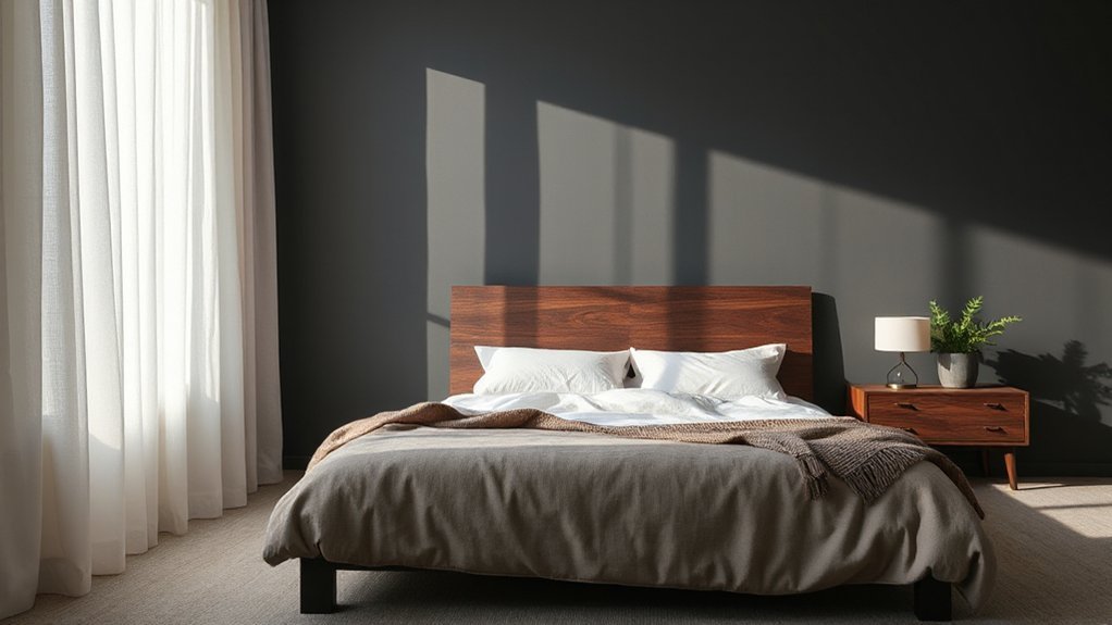
An accent wall transforms a bedroom by establishing a focal point that guides the room’s visual rhythm. You determine the wall’s impact by contrast, texture, and color saturation, optimizing balance with adjacent surfaces.
The concept relies on intentional emphasis rather than saturation for its own sake, creating a stable hierarchy that informs furniture placement and lighting cues. Understanding Accent wall history helps you weigh longevity versus trend, ensuring the chosen feature remains coherent with broader design goals.
You’ll assess proportion, ensuring the accent occupies a suitable fraction of wall area to avoid visual overload. Cultural influences inform material choices, patterns, and finish, aligning the feature with personal heritage or aesthetic.
Informed decisions reduce rework, delivering predictable, durable spatial differentiation.
How to Pick the Wall to Feature
To choose the wall that will anchor your accent, start by analyzing traffic, sightlines, and furniture layout. Evaluate which wall receives the strongest visual attention from entry points and seating areas, then identify potential focal point choices that won’t clash with architectural features.
Prioritize walls with clean, uninterrupted surfaces and minimal doors or abrupt shifts, as these reduce distraction. Consider lighting—natural and artificial—to guarantee the feature wall is illuminated evenly without glare.
Avoid walls that contain outlets, switches, or built-in shelves that complicate the finish. For wall selection, align the chosen surface with your room’s primary function and scale, affirming the accent remains intentional rather than overpowering.
Maintain consistency with the overall design scheme and guarantee the focal point choices support cohesive aesthetics.
Mood-Boosting Color Palettes for Bedrooms
What mood do you want your bedroom to convey, and how can color choices support that intent? In mood-boosting palettes, you align hue families with psychological effects to optimize rest and focus.
Begin with neutral bases to stabilize contrast when introducing an accent wall, then layer with purposeful saturation. Color psychology guides selections: cool tones reduce stimulating signals, warm tones promote coziness, and muted chroma balances energy with serenity.
Use strategic contrast to define zones without visual clutter. Consider paint finishes that affect perceived depth and light reflection—matte or eggshell for a soft backdrop, satin for subtle sheen on the accent wall.
Limit the palette to three to four core hues, and reserve the strongest color for the featured wall to maximize impact.
Texture and Material Options for Depth
Texture and material choices establish depth by combining tactile surfaces with light reflectance. You’ll evaluate textured wall treatments alongside a material variety guide to balance durability, acoustic performance, and visual interest.
Start with clear criteria for when to use raised panels, brick-like textures, fabric, or wood veneer to achieve your desired mood and scale.
Textured Wall Treatments
Faux finishes provide convincing surface simulations—stone, plaster, or concrete—without excessive cost or weight, while maintaining durability and cleanability. Texture depth is achieved through layering, embossment, or micro-relief, coordinated with lighting design to maximize shadow play at different times of day.
Wall murals may be incorporated as a focused texture element, generating intentional variation under indirect illumination. Guarantee installation tolerances are controlled, edge conversions are seamless, and substrate flatness is verified to prevent micro-cracking.
Finally, prioritize maintenance access and material compatibility to sustain texture integrity over time.
Material Variety Guide
Material variety is essential for achieving depth without overwhelming the space; you can mix textures, finishes, and substrates to create a layered, cohesive look. In this section, you evaluate texture as a design tool, not decoration.
Prioritize controlled combinations: matte vs. glossy surfaces, smooth vs. embossed patterns, and rigid vs. pliable substrates. For material variety, base your choices on lighting, scale, and architectural lines to maintain balance.
Consider fabric options for tactile contrast and warmth without reducing legibility of the focal wall. Pair with durable wall coverings that resist wear in high-traffic zones while preserving mood.
Document material performance in humidity, cleaning, and abrasion tests. Finally, align each element with your color plan to guarantee a unified, resilient accent wall.
Lighting Techniques to Highlight Your Wall
Effective lighting is essential to emphasize an accent wall without overpowering the room. To achieve precise emphasis, implement layered lighting that combines ambient, task, and accent sources while avoiding glare on wall murals. Control intensity with dimmers and calibrate color temperature to complement paint tones and textures.
Position lighting to sculpt depth and draw the eye toward focal elements without creating hot spots around the mural.
- Choose energy-efficient fixtures with adjustable beam angles for targeted wall illumination
- Use wall wash or grazing techniques to reveal texture without flattening details
- Integrate accent lighting that complements wall murals and artwork
- Pair dimmable LEDs with smart controls for scene customization
- Verify wall reflectance and shadow distribution at seated and standing viewpoints
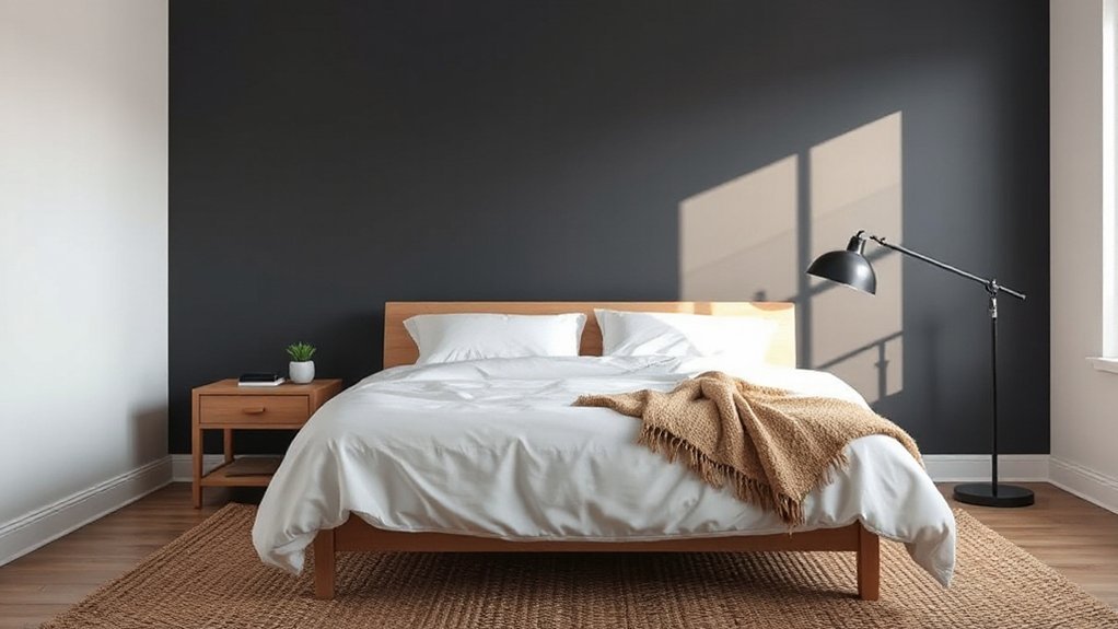
Pairing Furniture and Accessories With the Wall
Start with the dominant piece; guarantee its width and visual weight align to the wall’s center or a major axis. Accessories—lamps, artwork, textiles—should repeat references from the wall to reinforce unity without crowding.
Maintain negative space to preserve breathing room, preventing clutter from eroding the wall’s impact. Use consistent finishes or tones across furniture and accents to avoid friction.
Verify proportions in elevation and depth, adjusting placement to sustain balance and intentional contrast.
Budget-Smart Ways to Look Premium
Budget-smart design hinges on maximizing perceived quality with deliberate choices that don’t break the bank. You’ll elevate the room by focusing on finish, proportion, and texture rather than cost alone.
Wall murals provide a bold impact without custom carpentry, while ceiling accents draw the eye upward for a premium feel. Precision placement and balanced contrast ensure a cohesive aesthetic, not a gimmick.
- Select wall murals with subtle scale and durable vinyl for long wear
- Pair muted mural tones with crisp white or charcoal trim for clarity
- Use ceiling accents to create depth without overcrowding the space
- Opt for matte finishes to minimize glare and perceived refinement
- Invest in quality lighting to enhance texture and color fidelity
Common Accent-Wall Mistakes and Fixes
Common color missteps, improper proportion, and scale errors can undermine a focal wall if you don’t align hue with room values and furniture size. You’ll fix these by testing swatches in natural light, matching accent-wall color to the overall palette, and selecting a proportion that echoes the room’s dimensions.
We’ll also address improving visual flow with furniture placement and a restrained, coherent shift to adjacent surfaces.
Common Color Missteps
One of the most frequent missteps in selecting an accent-wall color is choosing a hue that clashes with the room’s lighting or existing finishes, which can make the wall feel either flat or dissonant rather than deliberate. You should evaluate hue against daylight, artificial light, and adjacent materials to guarantee color saturation remains balanced across conditions.
Avoid overpowering the space with saturated tones that reduce perceived room size. Instead, select colors that enhance contrast without shouting.
- Assess light quality before finalizing
- Prioritize balanced color saturation over bright, isolated pops
- Test in multiple lighting scenarios
- Align with existing finishes, not imitate them
- Limit pattern mixing to support the accent wall
This approach preserves clarity, precision, and visual harmony.
Proportion and Scale Errors
How you size an accent wall matters more than you might assume: improper proportion and scale disrupt the room’s balance, making the wall feel either overwhelming or inconsequential. To avoid this, establish proportional relationships between wall area, furniture footprint, and ceiling height before choosing finish density.
A wall that dominates with excessive width or height will undermine scale harmony, while an undersized panel fails to anchor the space. Use geometric checks: compare wall surface area to total wall area, and verify that the accent portion sits within a rational fraction of the room’s horizontal and vertical dimensions.
Prefer restraint: select textures and patterns that complement, not amplify, surrounding elements. Achieve proportion balance by aligning edge-to-edge measurements with key furniture cues, ensuring cohesive visual weight.
Visual Flow Fixes
Even with proper proportion, visual flow can stumble if the accent wall interrupts natural sightlines or clashes with adjacent surfaces. The fix is to align shifts from the accent to surrounding walls, ceilings, and furnishings so the eye moves smoothly across the space.
You’ll implement controlled pattern mixing and calibrated wall art placements to preserve rhythm without fragmentation, ensuring color transitions read as a single continuum.
- Align edge treatments to echo ceiling line and adjacent wall plane
- taper color saturation from accent to bordering surfaces
- stagger pattern scales between the wall and artwork
- center wall art to maintain focal alignment with furniture
- limit competing textures to support cohesive flow
Apply these checks to maintain uninterrupted sightlines and compositional balance.
Frequently Asked Questions
How Long Do Accent Walls Typically Last in a Bedroom?
Accent walls typically last 5 to 15 years, depending on color durability and wall maintenance. You’ll maximize life by choosing high-quality, fade-resistant paints or coatings, and sealing surfaces where moisture or humidity fluctuates.
Regular maintenance—cleaning, patching chips, and touching up scuffs—extends this window. If you notice yellowing, cracking, or edge peeling, you should repaint.
You’ll also benefit from matte or satin finishes that resist wear while maintaining color integrity.
Can an Accent Wall Influence Sleep Quality?
Yes, an accent wall can influence sleep quality. Color psychology shows cooler, muted tones promote relaxation, aiding sleep onset.
While high-contrast or overly bright accents may disrupt sleep cycles. For sleep enhancement, choose balanced hues and matte finishes to minimize glare.
Keep lighting soft around the accent wall and avoid celestine or saturated reds near the bed.
This approach leverages color psychology to optimize rest, using a precise, evidence-based technique.
Is Wallpaper a Better Option Than Paint for an Accent Wall?
Wallpaper isn’t categorically better; it depends on your priorities. In a hypothetical study, a vinyl wallpaper held up five years with minimal peeling while nearby paint required touch-ups after humidity.
You’ll weigh wallpaper durability against paint texture options, which offer more tactile variation. You choose wallpaper for durability and pattern continuity, or paint for varied texture and easier repairs.
Consider performance specs, room humidity, and maintenance expectations before deciding.
How Do I Repaint or Remove an Accent Wall Easily?
To repaint or remove an accent wall easily, you’ll first prep the area, protect floors, and test paint compatibility.
If repainting, you’ll strip glossy layers, sand, and prime for color matching, then apply evenly.
If removing texture, use a scraper gently and address any drywall damage with filler.
For both, consider Texture options and verify color matching across adjacent walls.
You’ll finish with a clean sealant and touch-ups for a seamless result.
What Ceiling Lighting Works Best With Dark Accent Walls?
Ceiling lighting that complements dark accent walls should balance brightness and contrast, like a lighthouse guiding the room. Use warm, dimmable LEDs to soften the intensity.
Choose ceiling color close to the wall shade to avoid harsh edges, or go lighter for contrast if you prefer.
Incorporate multiple lighting fixtures—recessed cans for even coverage, a dimmable chandelier or flush mount for focal glow.
Guarantee lighting fixtures align with room size and ceiling height.
Conclusion
In sum, you’ll elevate your bedroom with a carefully chosen accent wall that complements scale, lighting, and furniture. By selecting the right wall, color, texture, and finishes, you create a cohesive focal point that reads as premium rather than flashy. An interesting stat: rooms with a well-defined accent wall report perceived depth increases of up to 15%, enhancing spaciousness without expanding the room. Apply layered lighting and avoid overload to preserve balance and clarity in the design.