Think of color as a room’s quiet conductor: a study shows blues can boost focus, while greens ease tension, shaping how you move through spaces. You’ll notice color shifts with light and purpose, and those shifts change mood and performance. As you plan, you’ll balance tone, saturation, and contrast to support sleep, work, and relaxation. Keep an eye on cultural cues and personal associations—the best palettes invite comfort and intention, but they also demand careful testing and adjustment.
Key Takeaways
- Color psychology guides interior design by linking hues to emotional responses to support space function and daily tasks.
- Harmony and contrast are tested across lighting and materials to create cohesive palettes with intentional focal points.
- Lighting profoundly affects color perception; test samples under daylight and artificial light to ensure color fidelity.
- Cultural, regional, and personal associations shape color meaning, requiring adaptation to ensure appropriate interpretation and mood.
- Building palettes involves balancing tone, saturation, and contrast, documenting decisions, and tracking responses to promote well-being.
How Color Psychology Informs Real-World Design Decisions
Color psychology guides decisions by linking hues to specific responses, then applying those links to spaces, rather than relying on trends or personal taste alone. You assess function, traffic, and lighting first, then map color roles to outcomes.
Color symbolism guides choices about walls, cabinetry, and accents, ensuring each hue reinforces intended behavior. You consider emotional responses as data points: calm offices for focus, inviting hues for hospitality, energetic tones for activity zones.
You translate research into palettes that support daily tasks while resisting fashion-driven shifts. You test contrasts for readability, accessibility, and flow, documenting how color changes interaction and perception.
You revise schemes based on usage patterns, durability, and maintenance, not whimsy. The result is purposeful, measurable design that aligns color with outcomes and brand or message.
Color and Mood: What to Expect at Home and at Work
While the mood of a room is shaped by more than its palette, color plays a decisive role in how you feel and behave at home and at work. You’ll notice color influences attention, pace, and collaboration, guiding daily routines and interactions.
In practice, use color symbolism to align spaces with intended functions: calming blues for focus, energizing reds with caution, and supportive greens in shared areas. Consider temperature and saturation to modulate intensity without overwhelming occupants.
For mood management, pair hues with purposeful lighting and materials so emotional responses align with tasks—quiet corners receive softer tones; social zones adopt warmer accents. Be deliberate about contrast to maintain clarity and reduce cognitive load.
Track responses over time, adjusting schemes to sustain productive, harmonious environments.
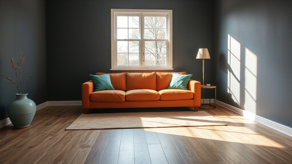
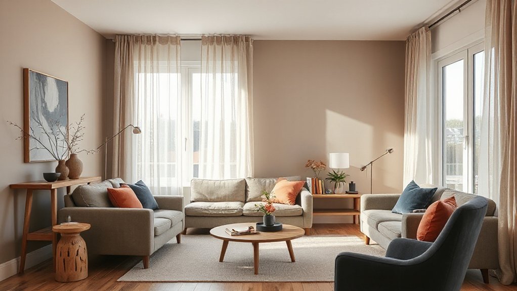
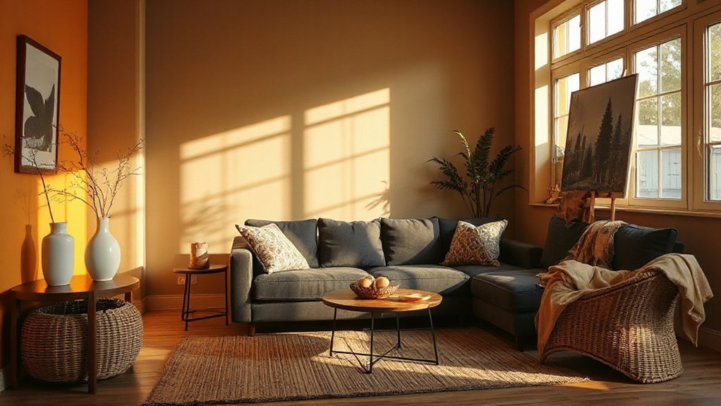
How Daylight and Lamp Light Shift Color Perception
Natural daylight shifts color perception over the day, while artificial lamp light can anchor colors to a fixed mood. You’ll notice whites warm under sunrise and cool under noon sun, while your lamps push tones toward consistent warmth or neutrality after dark.
Natural sunlight renders true hues more reliably, revealing subtle undertones as it travels across the sky. In contrast, artificial illumination often exaggerates warmth or coolness, depending on bulb type and placement.
To manage perception, sample color selections under both conditions: daylight and artificial illumination. Favor neutrals with balanced undertones and test swatches near windows and away from fixtures.
Dimmer settings can mellow contrasts, while brighter settings enhance sharpness. Align room finishes with your lighting plan to preserve intended color integrity throughout the day.
Culture, Context, and Personal Color Associations
Cultural color norms shape how your spaces are read by different audiences, so you must consider regional meanings and shared associations when selecting tones.
Personal color meaning matters too, since your own experiences influence what feels comforting or energizing in a room.
Context matters—lighting, purpose, and audience all shift color perception and should guide your decisions.
Cultural Color Norms
Color meanings aren’t universal; they hinge on culture, context, and personal experience, so what feels calming in one setting may feel energizing in another. In practice, you’ll map cultural color norms before selecting palettes, ensuring rooms communicate appropriately across regions.
Recognize that historical color symbolism shapes expectations: red can signal vitality in one culture and danger in another; white may denote purity or mourning, depending on tradition. When you design for diverse audiences, compile cross-cultural color meanings for target clients, then adapt shades to align with shared interpretations while preserving brand voice.
Avoid assuming universality; test combinations in context, consider ceremonial associations, and document any color sensitivities. This disciplined approach yields rooms that feel respectful, legible, and psychologically coherent across cultural frames.
Personal Meaning, Context
Individual color meaning lives in the viewer, not the swatch. You bring personal associations to every space, shaping how color is perceived beyond objective tones.
Context matters: culture, environment, and daily routines filter emotional responses and assign significance to hues differently from room to room.
When you choose color, acknowledge that meanings shift with purpose—calm in a bedroom, focus in a study, celebration in a living area.
Your background, memories, and intentions drive interpretation as much as light and material do.
Use this awareness to align color with desired experiences, not just trends.
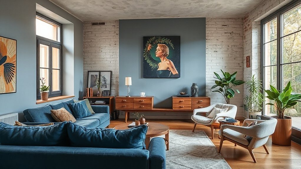
Building Palettes: Tone, Saturation, and Contrast for Well-Being
When building palettes for well-being, start by balancing tone, saturation, and contrast to guide mood and function. You determine tone first: choose mid-range base colors to provide stability, then adjust saturation to modulate energy levels without overwhelming the room.
Use higher contrast sparingly, reserving it for focal zones to avoid visual fatigue. Consider color harmony by selecting adjacent or complementary hues that support your intended function, ensuring *flow* feels seamless.
Calibrate saturation to reflect activity: bolder tones wake spaces, muted ones soothe. Test light and material context; daylight shifts perception, artificial light can alter warmth.
Track emotional resonance: the palette should feel intentional, not arbitrary, reinforcing calm, focus, or *essence*. This disciplined approach yields environments that support well-being through deliberate color balance.
Room-By-Room Guidance for Sleep, Focus, and Relaxation
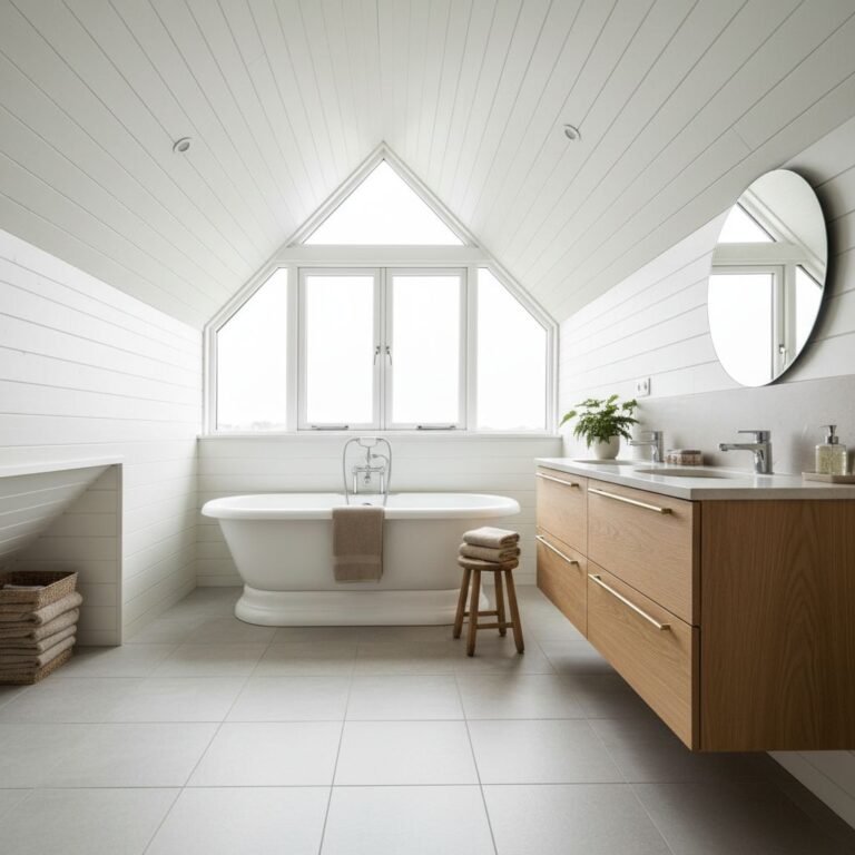
To optimize sleep, focus on each room’s dominant function and align its color and lighting with that purpose. In bedrooms, choose cool neutrals with low-saturation accents to reduce stimulation; let lighting soften as you wind down.
For focus zones, employ crisp whites or pale grays paired with task lighting that’s bright but not harsh, supporting sustained attention.
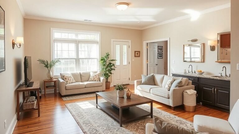
Living spaces benefit from balanced color that combines warmth and clarity, aiding relaxation without dulling alertness.
Color therapy informs mood shifts: limit high-contrast schemes in intimate areas, and favor harmonious palettes that promote emotional resonance.
Use controlled lighting temperature to cue routines—cool for alert preparation, warm for winding down.
Step-By-Step Testing Methods to Implement Color Schemes
You’ll start with Color Sampling Protocols to ground your choices in real samples, compare swatches in context, and confirm you’re reading true hues.
Next, run Palette Compatibility Tests to make certain your selected colors work together across surfaces, textures, and lighting.
Finally, track Lighting Influence Metrics to see how time of day and artificial light shift perception, adjusting your scheme before finalizing.
Color Sampling Protocols
Place swatches on large, representative surfaces at eye level, and observe them at different times of day to capture natural and artificial light shifts. Document each hue’s behavior under true exposure, noting how it reads beside existing finishes, textiles, and architectural details.
Create a controlled comparison framework: rotate swatches weekly, label positions, and record any color drift or moiré effects. Use standardized notes and photos to guide final choices, ensuring decisions hinge on perception, context, and durability rather than trend alone.
Palette Compatibility Tests
- Define color harmony thresholds and test for palette contrast in various lighting.
- Compare fabric, paint, and accessory swatches under real room lighting.
- Track perceptual changes when you scale from swatches to full fixtures.
- Record final decisions with rationale and reproducible steps.
Lighting Influence Metrics
Lighting shapes color perception. You’ll measure how different light sources modify hue, warmth, and contrast, then translate findings into actionable steps.
Begin with a baseline assessment of your space using a neutral white light, documenting perceived color shifts on key materials.
Introduce calibrated test lamps to compare incandescent, LED, and daylight spectra, noting how each affects color symbolism for your scheme.
Track color fidelity with color rendering indices and sample panels under each setting, recording time of day and room function.
Evaluate lighting ergonomics by mapping glare risk, distribution, and task contrast; adjust layouts to balance ambiance with visibility.
Conclude with a documented protocol you’ll reuse, ensuring consistency across projects.
Troubleshooting Color in Imperfect Lighting and Common Pitfalls
Even with perfect swatches, imperfect lighting can skew color perception, so start by evaluating your space under the exact lighting you’ll use most. You’ll quickly notice how color shifts with different sources, intensities, and angles, which underscores the importance of testing swatches in situ. Focus on color saturation and how it changes with glow, glare, and shadows, then adjust the palette before committing.
Predictable pitfalls include relying on daylight-only tests, ignoring painting finishes, and mismatch between task and ambient light. Use consistent lighting temperatures to verify true hues, and document any adjustments for future updates. A deliberate approach prevents costly rework and keeps your scheme cohesive.
- Test swatches under all intended light sources and times
- Compare finishes (matte, satin, gloss) for true color accuracy
- Note how lighting shadows alter perceived tones
- Create a simple ruleset to avoid repeat mistakes
Frequently Asked Questions
How Does Color Affect Appetite in Dining Spaces?
Color can influence appetite by using warm, inviting hues and balanced contrasts. You’ll notice meals feel more satisfying when dining spaces lean toward reds and oranges, tempered with neutrals.
Leverage color symbolism and cultural perceptions to tailor effects for your guests.
Avoid overly saturated palettes in intimate settings, which can suppress appetite. Instead, pair warm tones with functional lighting and textures, guiding focus to the plate while supporting comfort and perceived abundance.
Can Color Choices Reduce Eye Strain in Screens-Heavy Rooms?
Color choices can reduce eye strain in screens-heavy rooms. Studies show that balanced color saturation lowers perceived glare and fatigue, helping you stay focused.
Aim for muted saturation on walls and furnishings, and use cool tints for ambient lighting. Manage light reflection by keeping screens angled away from windows and using matte finishes.
You’ll notice sharper contrast and steadier viewing, especially after long work sessions; this keeps you comfortable and alert.
Do Personal Color Preferences Override Psychology in Design?
Personal expression matters, but it doesn’t override design psychology. You’ll benefit when you balance preferences with proven responses to space, light, and flow.
Use colors that support mood and function, then layer in personal choices as accents. Cultural influences shape how you perceive hue, so test palettes in context and adjust.
You monitor outcomes, not just opinions, ensuring you create spaces that feel true to you while maintaining coherence and usability.
How Do Climate and Outdoor Views Alter Color Impact?
Climate and outdoor views shift color impact: you should prioritize climate adaptation, choosing hues and finishes that reflect heat, cold, or humidity levels while maintaining legibility from outside.
Emphasize outdoor harmony by aligning interior palette with exterior scenery, improving coherence and perceived space.
Use lighter tones to reflect heat in hot climates and cooler neutrals to anchor mountain or water views.
Balance saturation to avoid glare, and test lighting at different times of day.
What Colors Support Concentration in Children’s Study Areas?
You should use soft, muted colors like pale blues, greens, and warm neutrals to support concentration in a study area. Color psychology suggests these tones reduce visual noise and promote focus.
While doing so, avoid overly bright hues that stimulate. Create a calm study environment with consistent lighting and minimal clutter.
Use accent colors sparingly to guide attention without distraction. Your goal is a serene, practical study environment that sustains attention and clarity for children.
Conclusion
Color shapes comfort. By now, you’ve learned how hues nudge mood, focus, and rest, and how daylight, lamp light, and culture shift perception. Apply tone, saturation, and contrast deliberately, test in real lighting, and adjust room by room for sleep, work, and relaxation. Don’t fear iteration—refine until it feels right. Remember: slow and steady wins the race, and “the color of a room is the mood you invite.”