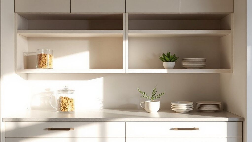
You probably don’t realize how a cohesive collection can transform open shelves from display to design, even with a small rotation of pieces. You’ll want to layer by height and group like items to create rhythm, then pull in a restrained color palette and uniform textures to keep clutter at bay. There’s a precise balance to strike between practicality and polish, and a few mindful moves can lead you to a calmer, more inviting kitchen—if you’re ready to apply them, the next steps await.
Key Takeaways
- Start with a cohesive color palette using neutral bases and 1–2 accent hues that echo hardware and cabinetry.
- Layer items by height and texture, grouping related objects to create rhythm without crowding.
- Use consistent shapes and materials, alternating repeats to maintain coherence and avoid monotony.
- Integrate shelf lighting and select ballast, practical decorative items to highlight focal pieces while keeping clutter minimal.
- Implement quick-clean routines: label essentials, group by function, rotate shelf spots, and maintain a daily wipe-down.
Build a Cohesive Open-Shelf Collection
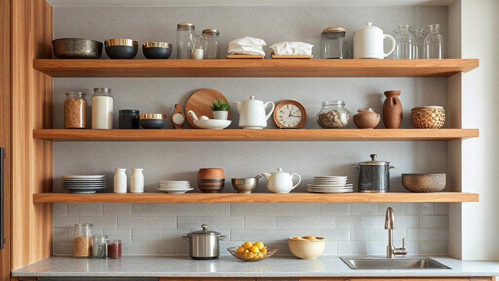
To build a cohesive open-shelf collection, start with a unifying color palette and finish each piece with clean, simple lines. You’ll create visual harmony by pairing neutral bases with one or two accent hues that echo your cabinetry and hardware.
Prioritize consistent shapes—rounded bowls, straight-edged glasses, and uniform storage canisters—to minimize noise while maximizing impact. Curate a thoughtful mix of everyday essentials and decorative accessories that read as intentional design rather than random clutter.
Integrate shelf lighting to highlight focal items and deepen color depth without glare. Group objects in triads and stagger heights for steady rhythm, ensuring every item earns its place.
Maintain simplicity; let a few well-chosen elements anchor the display.
Layer and Group for Visual Rhythm
Layering and grouping create visual rhythm by assigning each item a purposeful place within the arrangement. You’ll layer by height, texture, and finish, ensuring dominant pieces ground the shelf while smaller accents create cadence.
Group related items—plants with greens, bowls with ceramics, glassware with reflective pieces—so collections read as intentional clusters rather than random assortments.
Use layered distances: foreground items slightly forward, midground objects angled for depth, and back items receding to fade softly.
Maintain visual balance by distributing weight across the shelf, avoiding concentration on one side or tier.
Alternate materials and colors in repeats to reinforce coherence without monotony.
Prioritize functional display: keep frequently used pieces accessible, reserving decorative rounds for focal points.
Layering techniques cultivate rhythm, guiding the eye with disciplined, stylish restraint.
Create a Pristine Color Palette
A pristine color palette starts with a restrained base—think cool neutrals like bone, dove, and alabaster—then adds measured accents to elevate the kitchen’s mood. You curate a calm canvas, then introduce color contrast to sharpen lines and guide the eye.
Choose accent tones that echo hardware, cabinetry edges, or glassware silhouettes, ensuring harmony without crowding. Keep saturation intentional: avoid competing hues, favor subtle shifts that read as one cohesive space.
Balance light and shadow with soft whites against warmer neutrals to preserve airiness. The result: a curated, clutter-free backdrop that enhances openness and focus.
- Balanced neutrals as the foundation
- Subtle accent tones for depth
- Color contrast to define zones
- Consistent hue families across objects
- Purposeful brightness shifts for clarity
Mix Texture With Natural Elements for Warmth
As you shift from a pristine, neutral canvas to warmth, mix textures and natural elements to add tactile interest without disrupting the calm. Embrace varied surfaces: matte glaze, woven accents, and wood grain create subtle contrast that reads as intentional, not busy.
Place decorative vases in trio heights to anchor shelves without crowding them, letting negative space breathe around each piece. Pair textured ceramics with mineral-inspired tones to reinforce a cohesive palette, then mix in tactile materials like cork coasters or raffia liners for everyday warmth.
Balance is key: reserve bold textures for a few anchor items, and keep the rest streamlined. This approach preserves open-shelving clarity while inviting touch and visual depth, aligning with a modern, serene kitchen rhythm.
Quick-Clean Routines to Stay Clutter-Free
Quick-clean routines keep open shelving feeling calm and usable, so you can actually cook without chasing dust or rogue utensils. You’ll implement tight systems that prevent clutter from forming, using clear steps and repeatable habits. Focus on fast, repeatable actions, anchored by two anchors: Organizational labels and Cleaning schedules. You’ll see steady payoff in visibility, access, and reduced anxiety around mess.
- Label ingredients and tools with concise, legible tags for instant recognition
- Schedule daily wipe-downs and weekly dusting to stop buildup
- Group items by function to minimize rummaging and misplacement
- Test a rotating “new-to-you” shelf spot to avoid stagnation
- Create a quick checklist to maintain consistency and accountability
Frequently Asked Questions
How Do I Hide Unsightly Cords on Open Shelves?
Yes, you can hide unsightly cords on open shelves by using cable concealment strategies and deliberate cord management. Start with a slim power strip mounted under the shelf, keeping outlets off-display.
Bundle cords with reusable wrap and route them along the back edge, securing with cable clips. Use decorative cord covers that match your shelf color, or install hidden conduits inside a shallow trough.
Tie excess length, label sections, and maintain a clean, tech-forward aesthetic.
What Height Should Shelves Be Installed for Accessibility?
Cozy coincidences often reveal the truth: shelves should run at eye level for you, roughly 48 to 54 inches, with a comfortable 12 to 15 inches of frame below for reach.
You’ll notice Shelf spacing matters, keeping items within easy reach without crowding. Align to Accessibility standards, designating taller sections for tall items and lower ones for daily dishes.
You’ll enjoy practical reach, precise installation, and a cleaner, trend-aware kitchen workflow.
Which Colors Pair Best With Stainless Steel in Kitchens?
You’ll pair tones that keep stainless steel looking sharp: consider blues, charcoal, and warm neutrals that echo metallic sheen. Color coordination matters, so choose hues that complement the cool chrome without competing with it.
Use material contrast—wood or matte black accents against stainless—to add depth. You’ll notice brighter whites brighten the space, while darker accents enhance contrast.
This approach stays precise, trend-aware, and detail-focused, ensuring a cohesive, modern kitchen vibe.
How Often Should I Rotate Items to Maintain Balance?
You should rotate items every few weeks to maintain balance, keeping a fresh, cohesive look. Focus on shelf organization by varying heights, textures, and colors, and place decorative accessories thoughtfully to avoid visual clutter.
Rotate your most-used pieces toward the center and lighter-weight items toward the edges for balance. Use a deliberate cadence: swap 20–30% at a time, reassessing weekly.
This keeps trends intact while ensuring practical accessibility and a polished, current kitchen display.
Can I Use Rugs or Mats on Open-Shelf Zones?
Can you place rugs or mats on open-shelf zones? Yes, but choose low-profile, non-slip options to protect surfaces and keep airflow.
You’ll want decorative accents that complement your shelves, and consider shelf liners under any fabric rug to prevent dust and moisture buildup.
Keep it precise: pick neutral tones, avoid overpowering prints, and guarantee mats don’t cover essential items.
This balances texture with practicality while staying trend-aware and calm.
Conclusion
Your open shelves become calm, studio-like still lifes in a busy kitchen. Juxtapose pristine glass with textured ceramics, light with shadow, uniform shapes with the occasional sculptural piece. You’ll see cohesion emerge from deliberate repetition, yet personality peeks through as you mix metals and warm woods. The result feels planned and effortless, like a tidy showroom that’s actually lived in. Stay disciplined and playful: curate, layer, and wipe—then let the clutter-free glow whisper through every countertop, every glance, every bite.