You may not realize how much patina signals authenticity and value in vintage pieces more than brand-new replicas do. You’ll want a cohesive palette with era-appropriate tones, restrained contrasts, and natural wear that’s preserved, not erased. The approach is technical: assess materials, lighting, scale, and flow, then curate textures and accents that reinforce a nostalgic yet functional space. If you apply disciplined maintenance and careful placement, you’ll uncover details that invite closer inspection and decision on future swaps.
Key Takeaways
- Emphasize authentic patina and wear: preserve age markers and use conservative restorations to maintain history without overdoing it.
- Build a cohesive vintage palette: choose a calm core color with 2–3 complementary accents and test against lighting.
- Curate period-signaling accents: select a few clocks or keepsakes, group by era, and highlight patina with focused lighting.
- Layer lighting for texture: combine ambient, task, and accent lighting to showcase surfaces, wood grain, and metal finishes.
- Plan layout for flow and function: respect sightlines, keep pathways clear, and anchor groups with a mix of vintage and modern elements.
What Vintage Style Really Means for Modern Homes
Vintage style in modern homes blends nostalgia with practicality. You assess how historical cues translate to daily use, prioritizing function alongside form.
Define vintage as a layered concept: period-specific details, durable materials, and preserved patina, not a costume. You map each element to your space’s rhythms, ensuring alignment with a coherent architectural language.
Implement antique typography in lighting, signage, or cabinetry cues to convey lineage without overstatement. Evaluate scale, balance, and contrast to avoid clutter and preserve legibility of lines.
You integrate retro gardening motifs where appropriate, using planters and textures that echo era sensibilities while meeting contemporary maintenance standards.
Maintain precision in finishes, hardware, and joinery, ensuring consistent aging cues and a restrained palette to reinforce timeless adaptability.
Create a Vintage-Style Palette: A Step-by-Step Guide
Start by defining a vintage palette with clear, restrained guidelines for color categories and undertones.
Next, select timeless hues that pair well across periods, then map cohesive accents to guarantee consistency throughout the space.
This step-by-step framework keeps the palette unified while enabling accurate, repeatable application.
Define Vintage Palette
To define a vintage palette, start by identifying the era you’re drawing from and then select base, accent, and accent-light colors that reflect that period. You’ll codify these choices with precise swatches, ensuring tonal harmony across surfaces, textiles, and finishes.
Establish a core base—neutral or muted—to ground the room, then push deliberate accents to cue era-specific mood. Accent-light hues should illuminate focal points without overpowering the base, maintaining legibility and balance.
Consider color psychology when pairing hues to evoke intended responses, such as calm in midcentury schemes or vibrancy in Art Deco domains. Document cultural significance by cross-referencing period materials, patterns, and manufacturer palettes.
This method yields a reproducible framework, facilitating consistent, era-faithful decisions while supporting future adjustments and accessory integration.
Choose Timeless Hues
Begin by selecting a core base hue that remains calm and versatile across lighting conditions, then pair it with time-tested neutral and muted tones to form a stable foundation.
You’ll design a vintage palette by mapping undertones to room function, ensuring legibility under varied daylight. Choose Antique color as a primary anchor and align it with Classic shades to preserve historical resonance while maintaining modern readability.
Maintain contrast through value differences rather than saturation spikes, preventing visual fatigue.
Implement a controlled hierarchy: base, secondary, and accent layers, each limited to a small, repeatable swatch set.
Test swatches on furniture tops and fabrics under different light, documenting how color shifts influence perceived era.
Document decisions to facilitate future refinements, and avoid trends that compromise timelessness.
Create Cohesive Accents
Craft cohesive accents by selecting a concise, repeatable set of accent hues that complement your base Antique and Classic shades. You’ll apply a disciplined palette: limit to three to five hues, each chosen for contrast, temperature, and resonance with the room’s geometry.
Begin with a dominant neutral, then introduce two complementary tones and a targeted accent. Guarantee harmony by testing saturation against lighting, surfaces, and textures. Maintain consistency across textiles, art, and hardware, so transitions remain seamless.
Prioritize Antique lighting as a unifying element, using warm metals or aged finishes to anchor the palette. Incorporate Retro textiles strategically to reinforce period intent without overpowering vintage motifs.
Document color codes and finish notes for staging. Reassess weekly, adjusting accents only when you observe visual fatigue or imbalance.
Mix Textures for Warmth and Depth in Vintage Spaces
When you mix textures in vintage spaces, you create visual interest and tactile depth that elevate the era’s character. You should implement deliberate textural layering to control light, shadow, and perception of space.
Begin with foundational surfaces—leather, wood, or stone—graded in matte to soft gloss, then introduce textiles that complement those tones. Fabric pairing requires a disciplined palette: choose one dominant texture and one or two supporting fabrics to avoid visual clutter.
Prioritize contrast in weave, weight, and pattern to reinforce focal points without overwhelming structural details. Use understated metallics or glass as neutral accents to reflect light and unify disparate textures.
Maintain proportional scale so each element contributes, not competes, ensuring the vintage narrative remains cohesive and legible.
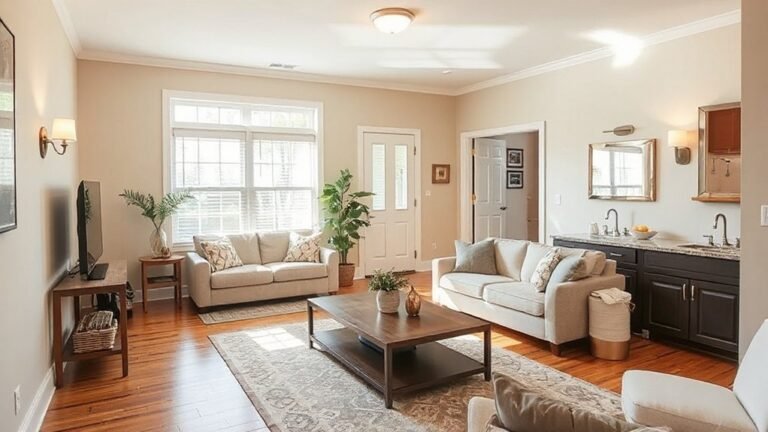
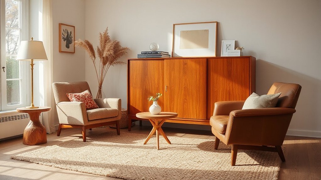
Balancing Scale: Pair Old Pieces With Modern Comfort
Pairing old pieces with modern comforts starts with scale: identify where a vintage item’s footprint feels dominant and offset it with streamlined, contemporary seating or surfaces.
Maintain balance by matching proportions—console height to sofa, chair scale to room width—and let modern pieces provide visual relief without overpowering the antique.
This approach establishes a clear hierarchy that enhances usability while preserving character.
Mix Old With Modern
To balance old pieces with modern comfort, start by identifying a few anchor items that define the room’s character and function. You then map those anchors to contemporary necessities, ensuring every antique element supports daily use without visual competition.
Prioritize clean sightlines and proportional harmony: pair a substantial vintage sofa with streamlined, ergonomically scaled chairs; locate storage that preserves lines while offering today’s reach and organization. When selecting finishes, prefer neutral palettes with subtle contrasts to keep the room legible and cohesive.
Incorporate Antique lighting as focal points that complement modern task lighting, and integrate Retro textiles for texture without crowding space. Maintain consistent rhythm through size, era hints, and material logic, so the old remains legible yet integrated within current comfort standards.
Balance Scale, Modern Comfort
Achieving balance between vintage elements and modern comfort hinges on deliberate scale, clear proportions, and purposeful placement. You assess each piece by proportion, mass, and silhouette, then align them to a unified rhythm.
Begin with antique pairing decisions that respect functional use, not just aesthetics, guaranteeing seating, tables, and storage read as a cohesive group. Maintain scale harmony by pairing bulky relics with lean, contemporary forms that absorb light and feet and maintain sightlines.
Prioritize symmetry only when it serves function; otherwise, use deliberate asymmetry to create dynamic tension without crowding. Guarantee upholstery and finishes anchor the room, balancing patina with pristine surfaces.
Validate choices with ergonomics: reach, height, and clearance must support daily activity, preserving comfort alongside heritage.
Curate With Patina: Choosing Pieces That Show History
Curating with patina starts by prioritizing provenance over polish, selecting pieces whose wear tells a story rather than merely filling space. You assess construction, joints, and hardware for original integrity, noting evidence of previous use rather than cosmetic masking.
Focus on patina preservation as a guiding criterion: consistent wear, depth of tone, and natural gloss maps material history without introducing fresh finishes. You evaluate tone harmony across pieces, ensuring patina ranges cohere with room lighting and furniture scale.
Historic charm emerges when you balance contrast between aged surfaces and clean lines, avoiding over-restoration. Document provenance details, maintenance needs, and ethical sourcing to support informed purchases.
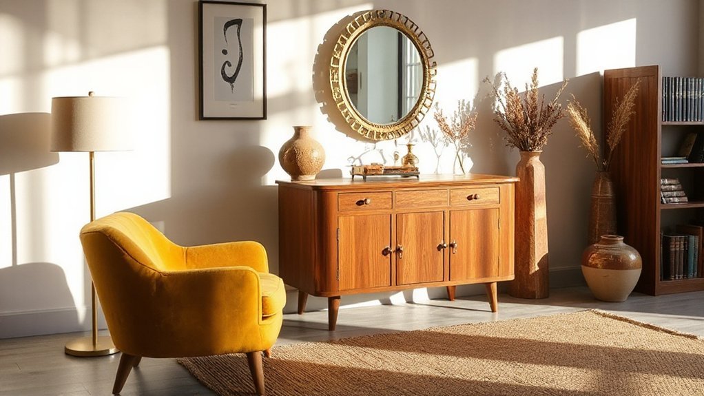
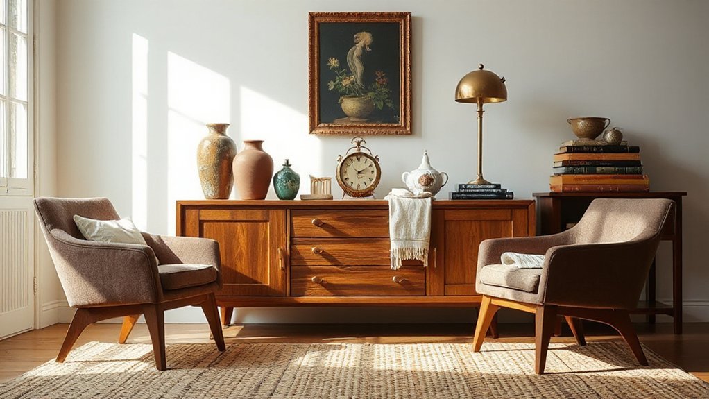
Accents That Signal Time and Taste in Vintage Rooms
You approximate a room’s era by pairing Timeless Tones with appropriate Textures, ensuring finish and fabric read as intentional rather than accidental.
Curated Clocks and Keepsakes act as anchors, signaling period, provenance, and taste without shouting. Use these accents to map the room’s narrative, balancing function with stylistic cues to guide the eye and define rhythm.
Timeless Tones and Textures
Subtle contrasts—matte plaster walls with polished wood, or worn leather against aged brass—establish depth without discord. Texture variety matters: weave, grain, patina, and fabric weight interact to convey period sensibility.
When selecting fabrics, prioritize authentic finishes and loom traditions to reinforce authenticity. For wood, favor timbers with natural aging signs and restrained gloss, avoiding ultralight or lacquered surfaces that disrupt tone harmony.
Incorporate antique charm and rustic elegance through purposeful accessories and furniture lines that reinforce the era without overcrowding sightlines or overwhelming focal pieces. Precision in detailing sustains cohesive vintage storytelling.
Curated Clocks and Keepsakes
Clocks and keepsakes serve as precise anchors in vintage interiors, signaling era without dominating sightlines. You curate them to convey taste through measured contrast, not clutter. Precision placement matters: align scales, group them by era, and guarantee lighting highlights mechanism detail and patina.
- Assemble a short, deliberate rotation of pieces (antique jewelry cases, vintage postcards, enamel clocks, porcelain keepsakes) to avoid visual fatigue.
- Pair metals and woods with consistent undertones to maintain cohesion.
- Use display vessels that respect provenance, enabling quick dating cues without overstatement.
- Maintain functional emphasis—let timepieces read clearly while keepsakes complement rather than compete.
Your goal is clarity, not spectacle; let intent, provenance, and craft drive the room’s measured narrative.
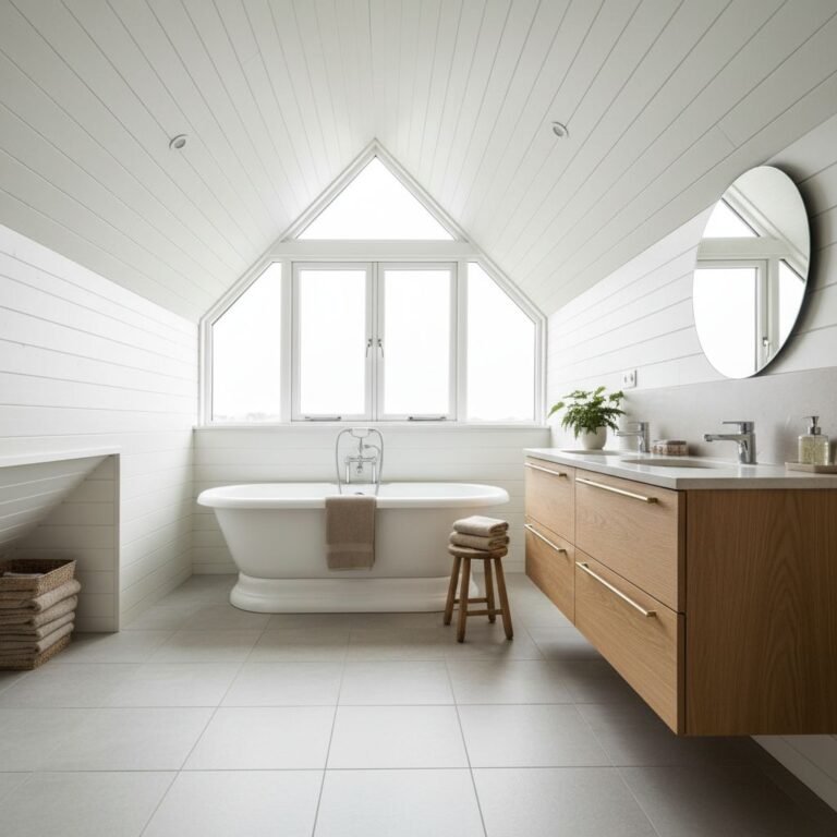
Vintage-Feel Fabrics and Upholstery for Modern Homes
When selecting fabrics for a vintage-inspired interior, prioritize textures, patterns, and color palettes that evoke period aesthetics while meeting current performance standards. You’ll evaluate fiber content, abrasion resistance, and colorfastness to guarantee lasting appeal in daily use.
Choose fabric patterns that reproduce era-appropriate motifs without compromising modern stain resistance or washing requirements. For seating, apply upholstery techniques that balance old-world construction with contemporary durability, such as reinforced frame joinery, serpentine springs, and double-stitched seams.
Consider medium-weight upholstery fabrics for sofas and chairs to maintain form over time. Color stories should pair muted neutrals with accent tones drawn from vintage textiles, ensuring contrast without visual noise.
Document performance data for interoperability with smart-room maintenance plans. This approach delivers authentic character while preserving practicality and longevity.
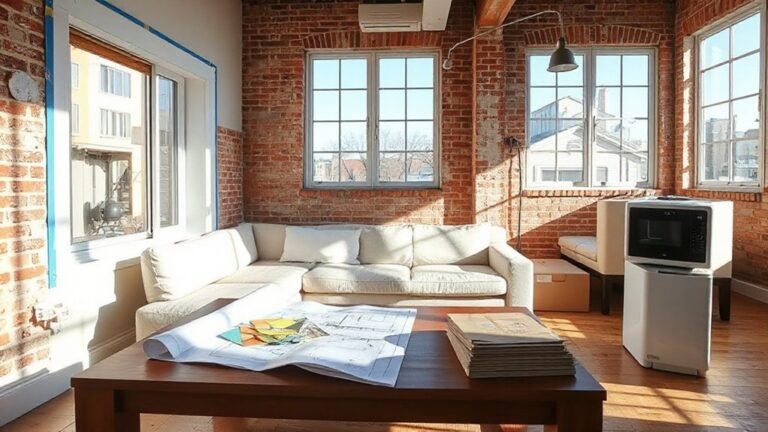
Place Vintage Pieces for History and Flow
To place vintage pieces for history and flow, evaluate sightlines, scale, and architectural cues as you arrange them within the room. You’ll optimize balance by pairing focal antique furniture placement with surrounding modern elements, ensuring continuity and purpose. Maintain clear pathways and avoid overcrowding, preserving historic decor integration without dominance.
- Assess sightlines first, locating primary viewpoints and entryways.
- Align scale by sizing a dominant piece to anchor groups, then subordinate items around it.
- Respect architectural cues—ceiling height, trim, and window placement—to guide placement decisions.
- Test circulation and adjust to preserve functional zones while sustaining historical ambiance.
This disciplined approach yields cohesive rhythm, precise contrasts, and a timeless narrative.
Lighting to Highlight Vintage Assets and Create Ambience
Effective lighting is essential for showcasing vintage assets and shaping atmosphere; use a layered approach that emphasizes texture, color, and form. You’ll implement a mix of task, accent, and ambient illumination to control focus and mood.
Begin with vintage lighting that reproduces warm, natural hues, avoiding harsh glare that hides patina. Position adjustable spotlights to highlight carving, brass, and timber grain, then use diffuse fixtures to bathe surfaces in soft ambient illumination.
Integrate dimmers to modulate intensity across zones, ensuring rotation of focal points as rooms evolve. Select lamps with period-appropriate silhouettes to reinforce authenticity without overpowering the piece.
Balance cool and warm temperatures to prevent yellow cast on aged finishes, and test shadows to prevent visual clutter. Maintain consistency across fixtures to preserve cohesive storytelling.
Assemble Thoughtful Collections: Accessories With Character
As you build on the lighting groundwork, assembling thoughtful collections of accessories with character becomes a focused exercise in curation and contrast. You target items that reflect antique craftsmanship and emphasize characterful accessories, avoiding clutter and repetition.
Precision in placement matters: each piece should reinforce texture, tonal balance, and storytelling.
- Identify foundational pieces that echo era-specific details, then layer complementary accents.
- Limit color to a controlled palette that enhances patina, wood grain, and metalwork.
- Pair high-contrast textures (gloss vs. matte, smooth ceramic with rough linen) to create depth.
- Space items to invite touch and inspection, prioritizing quality over quantity.
Outcome: a cohesive, authentic vignette crafted through deliberate selection, precise spacing, and thoughtful provenance notes.
Repair Techniques to Preserve Authentic Vintage Character
Repair is about preserving a piece’s integrity while maintaining its original character, not disguising damage with quick fixes. You assess structure, joints, and surfaces with a trained eye, prioritizing minimal intervention to retain authenticity.
Begin with documentation: photograph, measure, and note wear patterns before any intervention.
When addressing finishes, apply conservative restoration techniques that respect original materials, opting for reversible methods where possible. Use compatible pigments, stains, and topcoats to match patina without over-saturation; avoid abrasive removal that erases history.
For hardware, clean and consolidate loose components, replacing only with period-correct equivalents when necessary.
Document all steps, materials, and findings to preserve provenance. Your aim is to retain Authentic vintage charm while ensuring stability, function, and long-term value.
Quick Room Systems: Budget, Layout, and Care
How can you optimize a space quickly without sacrificing vintage character? You implement a structured system that balances function with period aesthetics, prioritizing efficiency and durability. This approach reduces clutter while preserving charm, enabling reliable daily use.
Focus on three pillars: budget, layout, and care, each executed with clear metrics and repeatable steps.
- Budget allocation: earmark a fixed percentage for essentials, avoiding impulse buys that undermine period cohesion.
- Layout plan: position key pieces for traffic flow and focal points, ensuring sightlines remain coherent with vintage forms.
- Device integration: apply home automation sparingly to control lighting and climate, preserving authentic textures and finishes.
- Care regimen: establish routine cleaning and maintenance to sustain surface integrity and space efficiency for space optimization.
Frequently Asked Questions
How Do I Identify Authentic Vintage Versus Repro Pieces?
Authenticity comes from careful appraisal: you identify authentic vintage vs. repro by spotting restoration techniques and authenticity markers.
Examine joints, hardware, and finish for hand-cut grooves, pegged joints, and patina that era-makers used.
Look for tool marks, screw heads, and maker stamps.
Compare to period catalogs, check construction methods, and assess weight and wood aging.
Document provenance, date codes, and restoration history.
Trust experts when in doubt, and verify through multiple independent sources before concluding authenticity.
What Budget-Friendly Ways Preserve Patina Without Damage?
You can preserve patina on budget without damage by light dirt removal and careful surface cleaning, then protect with a breathable wax or sealant.
You might worry that cleaning harms finish, but controlled approaches preserve character. Start with a damp microfiber, gently lift soil, and avoid saturating wood.
Target dirt removal before any refinishing, and use minimal abrasion. Avoid harsh chemicals; opt for pH-balanced cleaners.
Reassess frequently, and reapply protective coating as patina returns.
Which Finishes Best Suit Modern Lighting and Decor?
You should favor clear finishes that complement modern lighting and decor, leaning toward matte to satin sheens. Antique varnishes provide warmth and depth on desks and cabinets, while avoiding glare on sleek surfaces.
For durability, apply thin coats with controlled brushing and light sanding between passes. Modern paint techniques can add crisp edges or subtle texture without masking grain.
Use a compatible sealer to prevent yellowing, and align tone with ambient light for balanced contrast.
How Should I Mix Metal Tones Without Clashing?
To mix metal tones without clashing, practice deliberate metal pairing and tone coordination. Choose a dominant metal finish and introduce one or two accents in complementary hues or textures.
Balance cool and warm metals by weighting the dominant finish heavier in hardware and fixtures, and use understated accompanying pieces to echo its undertone.
Aim for a cohesive spectrum: group metals by reflectivity, align undertones, and anchor with neutral surfaces to prevent visual competition.
How Often Should Vintage Wood Furniture Be Treated or Sealed?
You should seal vintage wood furniture every 1 to 3 years, depending on use, environment, and finish. Inspect for wear, cracking, or moisture exposure before recoating.
Use protective coatings sparingly, allowing proper cure times to prevent buildup. In high-traffic areas, refresh annually; in low-use pieces, every couple of years may suffice.
Employ restoration techniques that maintain patina. Avoid over-saturation, which risks resin bleed or clouding.
Always test in an inconspicuous spot first.
Conclusion
Embrace authenticity by selecting pieces that show natural patina, not perfect polish. Prioritize cohesive palettes, gentle contrasts, and era-appropriate colors to sustain harmony. Use layered lighting to reveal textures and guide flow, while curated accessories reinforce nostalgia without clutter. Maintain surfaces with protective, non-invasive care to preserve character. An interesting stat: homes with authentic vintage accents report a 23% higher perceived warmth and cohesiveness. Apply careful repair techniques to sustain history, avoiding over-restoration that erodes provenance.