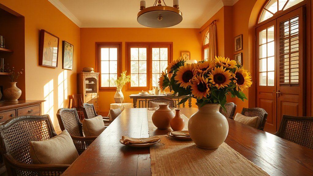
Warm colour pairings feel inviting because you trust familiar contrasts—reds with creams, oranges with taupes, yellows with soft browns. Start with soft neutrals as a warm foundation, then layer earthy tones for depth, and add cozy accents to keep it approachable. Think texture and light to boost warmth, not overwhelm. As you map rooms and test palettes, the signals stay clear: safety, openness, sociability. Keep refining, and you’ll uncover the subtle shifts that invite people in.
Key Takeaways
- Pair warm neutrals (beige, ivory, greige) with soft earthy accents (terracotta, olive) to create a cozy, inviting baseline.
- Use warm contrast combinations (reds with creams, yellows with soft browns) to foster sociability and momentum.
- Layer textures (plush fabrics, natural fibers) and warm finishes (matte/satin) to amplify tactile warmth.
- Balance bold hues with lighter secondary tones and strategic lighting for legibility and flow.
- Apply color changes gradually across zones, ensuring cohesive harmony and adaptable, welcoming ambiance.
Why Warm Colour Pairings Feel Inviting
Warm color pairings feel inviting because they evoke immediate, familiar associations—think sunlit rooms, cozy evenings, and friendly conversations.
You’ll notice how warm contrasts—reds with creams, oranges with taupes, yellows joined by soft browns—create a sense of comfort and momentum, guiding human attention without shouting.
In colour psychology terms, warmth signals safety, openness, and sociability, nudging people to linger and engage.
You’ll also rely on cultural influences to tailor pairings: some cultures associate certain hues with celebration, prosperity, or hospitality, while others prioritize subtlety and restraint.
Practical application matters: test combinations under varied lighting, monitor perceived temperature, and adjust saturation to preserve legibility and texture.
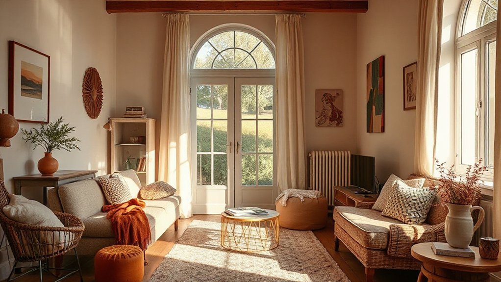
Soft Neutrals as a Warm Foundation
Soft neutrals form a warm foundation by mellowing bold accents and creating steady, breathable backdrops. In practice, you’ll layer these tones across walls, furniture, and textiles to establish a coherent field.
Choose airy neutrals like warm beiges, greiges, and ivory whites as the base, then introduce subtle contrast through texture rather than loud color pops. Soft neutrals dampen harsh light and reduce visual fatigue, letting accent pieces shine without clashing.
Build versatile palettes by pairing the base with a restrained secondary hue—soft greens, gentle blues, or taupe—kept consistent through fabrics and finishes. This approach yields versatile palettes that adapt to seasons and lighting shifts while preserving a calm, inviting atmosphere.
Keep finishes matte or satin to preserve softness and cohesion.
Earthy Tones for Depth and Coziness
Earthy tones deepen a space with natural warmth, grounding lighter hues and adding tactile richness through wood, stone, and textiles. You’ll notice how terracotta, chestnut, and olive create depth without overwhelming brightness, making corners feel intimate. Use them strategically: a leather sofa in cognac, a walnut coffee table, or clay-planter accents signal naturality while maintaining contrast for clarity.
Seasonal colour shifts matter; you’ll see subtle changes in tone as seasons turn, influencing mood and perceived temperature. Balance is key: pair darks with lighter backgrounds to preserve airiness. Consider cultural colour symbolism when selecting accents for rooms with meaning—warm browns can imply stability, while muted greens evoke renewal.
Practically, test swatches at different times of day and adjust lighting to preserve depth without dulling vibrancy.
Pairing Warm Primaries With Cozy Accents
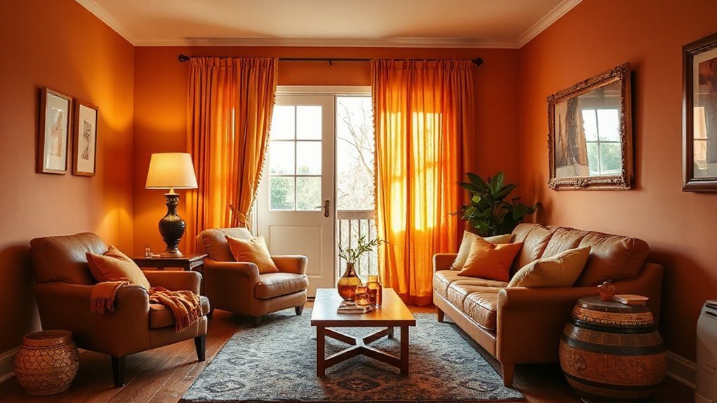
If you’re pairing warm primaries with cozy accents, start by anchoring a dominant hue—like terracotta, amber, or warm coral—with texture-rich fabrics and tactile surfaces that soften the intensity. You’ll blend color psychology insights with practical decor choices, ensuring the space feels inviting without shouting.
Use cozy accents such as knitted throws, suede cushions, and woven rugs to diffuse the bold primary and invite lingering. Consider cultural influences in patterning and craft to honor heritage while staying cohesive.
Balance is key: a lighter secondary hue helps readability and flow, while metallics add subtle glow.
- Textured fabrics that absorb light and add warmth
- Knit or boucle cushions for tactile richness
- Woven rugs to ground the palette
- Subtle metallic accents for gentle glow
Texture and Lighting to Boost Warmth
Texture adds warmth as you layer tactile surfaces—think plush textiles, soft weaves, and natural fibers that invite lingering.
Lighting creates ambiance by highlighting texture and casting cozy glows, so you can emphasize comfort without glare.
Your material choices should reflect and amplify that sense of ease, turning surfaces into subtle cues of welcome.
Texture Adds Warmth
- Embrace vintage textiles as upholstery or throws to introduce patina and depth.
- Pair tactile wall finishes with soft, matte fabrics to reduce glare and add intimacy.
- Layer rugs with varying pile heights to create steady, walkable warmth.
- Use natural fibers and breathable weave patterns to keep space feeling alive.
This approach yields a tactile harmony you can feel, guiding attention through warmth without shouting it.
Lighting Creates Ambiance
Ambient lighting shapes warmth as much as texture does, so choose fixtures that pair soft, amber tones with varied finishes to sculpt depth. You’ll leverage color psychology by selecting bulbs that warm the scene without washing out skin tones, aiming for a welcoming glow.
Layer light with ambient, task, and accent sources to control intensity and mood swings. Dimmers matter: lower levels feel intimate, higher levels sharpen details for safer daily use.
Use warm whites in living spaces and cooler tints for focused tasks, balancing function and coziness. Consider cultural associations when placing lamps—torchiere shapes evoke tradition, while minimalist sconces read contemporary comfort.
Test lighting at different times of day and adjust accordingly, ensuring consistent warmth that invites lingering conversations.
Material Reflects Comfort
When you pair tactile materials with thoughtful lighting, warmth isn’t just seen—it’s felt. Texture and light work together to cue comfort, guiding you toward cozy moments without shouting.
Choose fabrics with natural fibers to soften corners and absorb glare; pair with warm, dimmable LEDs to enhance color psychology and mood.
Subtle sheen on wood or stone reflects just enough glow to avoid cold reflections, boosting emotional impact.
Layered textures create depth, inviting lingering conversations and tactile exploration.
- Opt for wool throws, cork flooring, and linen curtains for varied warmth and texture
- Use warm white lighting to soften shadows and enrich surface tones
- Combine matte and slight gloss to balance tactile cues and light reflection
- Align color palette with intended emotional impact for cohesive ambiance
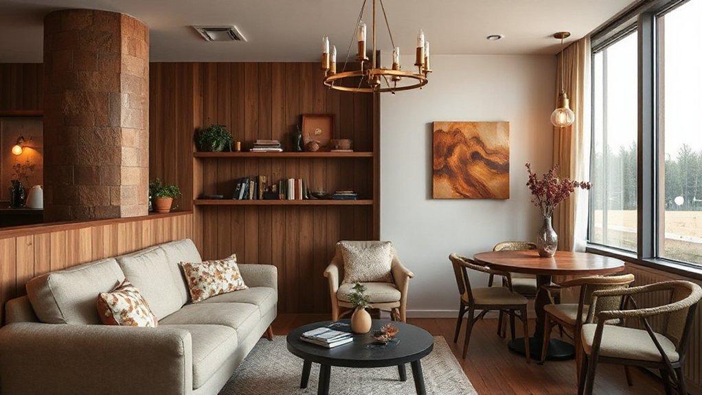
Room-by-Room Warm Palette Pairings
Are you wondering how to tailor a warm palette room by room for maximum coziness? Start with living spaces that earn their glow from layered neutrals and soft textures. Use bold accent colors strategically: a sofa throw, a vignette of pillows, a single statement chair.
In the dining area, lean into contrasting color schemes—warm wood tones paired with a deep, saturated wall or tabletop highlight—to anchor conversations.
In kitchens, keep cabinetry light, but introduce warmth with copper or brass hardware and a terracotta tile or backsplash.
Bedrooms benefit from low-contrast schemes and rich textiles; think graphite gray with cream, or taupe with blush.
Bath spaces gain warmth via warm whites and stone tones, plus a towel palette that repeats across accessories.
Test, Refine, and Implement Your Palette
Testing, refining, and implementing your palette is a hands-on process that turns ideas into lived spaces. You’ll evaluate how the hues behave in different lighting, note which tones feel welcoming, and adjust saturation or contrast accordingly.
Test in real rooms, not just swatches, to see colour psychology at work—how warm neutrals support social areas and how accent colors energize or calm. Consider cultural associations too; a shade with strong local meaning can enhance comfort or require restraint.
Document findings, then refine with small swaps to avoid command-and-control shifts. When ready, implement consistently across surfaces and furnishings to maintain cohesion and mood.
- Schedule daytime and evening tests to capture lighting shifts
- Track reactions from multiple household members
- Create a living palette with planned, limited tweaks
- Apply changes methodically across zones for balance
Frequently Asked Questions
How Can Lighting Influence Color Warmth Without Changing Paint?
Lighting can influence color warmth without repainting, through temperature and intensity. You’ll notice natural sunlight brings true warmth during daytime, while artificial lighting can skew tones toward warm or cool.
Use warm LED or incandescent equivalents to enhance yellows and ambers, and avoid harsh, cool bulbs that flatten hues. Dim to compress shadows and cozy the space, or boost brightness to reveal subtle undertones.
Adjust color rendering index (CRI) to high for faithful warmth under Natural sunlight and Artificial lighting.
Which Color Pairings Work Best in Small Spaces?
To make a small space feel bigger, pair light neutrals with a bold accent color to create strong color contrast. Use the neutral as the base walls and larger furniture.
Then introduce accent accessories in a saturated hue for pops without clutter. Add mirrors and glass surfaces to reflect light.
Keep patterns minimal, swap in transparent or airy fabrics, and guarantee the accent color appears in at least two places for cohesion.
Do Warm Palettes Affect Perceived Room Temperature?
Yes, warm palettes can make a space feel warmer, but not physically; they trigger color psychology cues that influence perceived temperature. You’ll notice softer reds, yellows, and earthy tones feel cozier, while bright accents lift mood.
Cultural associations shape reactions—cinnamon feels inviting in some cultures, while others favor teal for hospitality. Use balanced contrasts to avoid overstimulation, and remember: lighting interacts with hues, so test samples.
Can Warm Colors Impact Mood and Productivity Together?
Warm colors can impact mood and productivity together. You’ll feel more energized and focused as color psychology links warm hues to alertness.
Balanced tones reduce fatigue. Use warm accents to boost motivation, but mix with cooler neutrals to prevent overstimulation.
Consider lighting and contrast to modulate emotional impact. You’ll optimize workflow by aligning mood with task demands, monitoring responses, and adjusting palette accordingly.
What Budget-Friendly Swaps Maximize Warmth?
You can maximize warmth on a budget by choosing color psychology-guided swaps and clever accents. Start with affordable paint for a cozy base. Then add an accent wall ideas approach—one wall in a rich, budget-friendly hue to anchor the room.
Swap in warm textiles, lamps, and art to amplify mood. Use complementary neutrals to keep balance. You’ll feel more inviting, productive, and focused as you apply these practical, detail-driven choices.
Conclusion
Imagine walking into a room where every shade hums with welcome: cream-soft neutrals cradle bold reds, oranges glow against taupe, yellows kiss warm browns. You feel the room settle around you, textures whispering comfort, light dancing to reveal depth. With a tested palette, you’ll hear the feast of possibilities—cozy corners, lively gatherings, safe, open spaces. Refine your tones, balance the saturations, and let the warmth invite everyone to linger, smile, and belong.