Does a single, steady vibe truly knit a home together, or is it an illusion created by smart choices? You’ll want to start by pinning a core mood, then extend a calm color base and consistent textures across rooms. Keep scale balanced, layer patterns with restraint, and anchor bold statements with quieter furnishings. Lighting and finishes should echo one another to avoid dissonance. Ready to map your textures, tones, and shapes into a seamless flow? Let’s begin.
Key Takeaways
- Define a core vibe (calm, energetic, cozy, or sophisticated) and anchor decisions with textures, lighting, and finishes.
- Establish a consistent core palette of neutrals plus one or two accent hues across walls, furniture, and textiles.
- Reuse a limited set of core finishes and textures with deliberate tone and sheen variations for cohesion.
- Plan scale and proportions to create rhythm, repeating shapes and silhouettes at varied heights.
- Layer patterns thoughtfully by color, limiting to three or fewer patterns per zone and using negative space.
Define Your Core Vibe to Shape Your Space
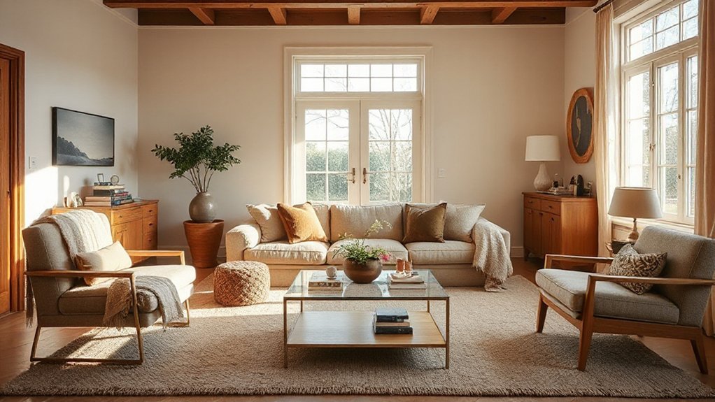
To shape a cohesive space, start by defining your core vibe: the feeling you want your home to communicate. You’ll anchor every choice to this vibe, so keep it focused and actionable. Assess your personal style and pick a mood you want to cultivate—calm, energetic, sophisticated, cozy.
Translate that into tangible cues: textures, materials, and lighting that reinforce the vibe without overwhelming the room. Prioritize a small set of elements you love, and let them lead the rest of the decisions. Use mood setting as your north star when selecting furniture, textiles, and finishes.
This clarity saves time and reduces second-guessing, ensuring each piece supports the look. Stay precise, practical, and consistent to build a genuinely cohesive home.
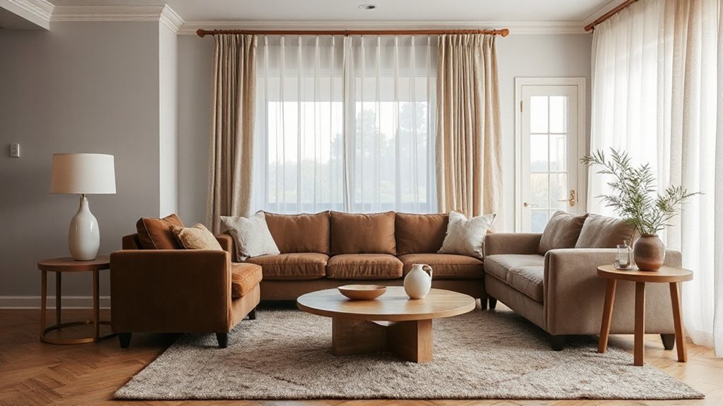
Build a Unifying Color Palette Across Rooms
Start with consistent color foundations—choose a balanced mix of neutrals and one or two accent hues you’ll repeat across rooms.
Use a core palette for walls and larger pieces, then bring in shared accents like textiles and art to tie spaces together.
Keep progressions smooth by repeating the same colors in varying textures and scales so each room feels connected yet distinct.
Consistent Color Foundations
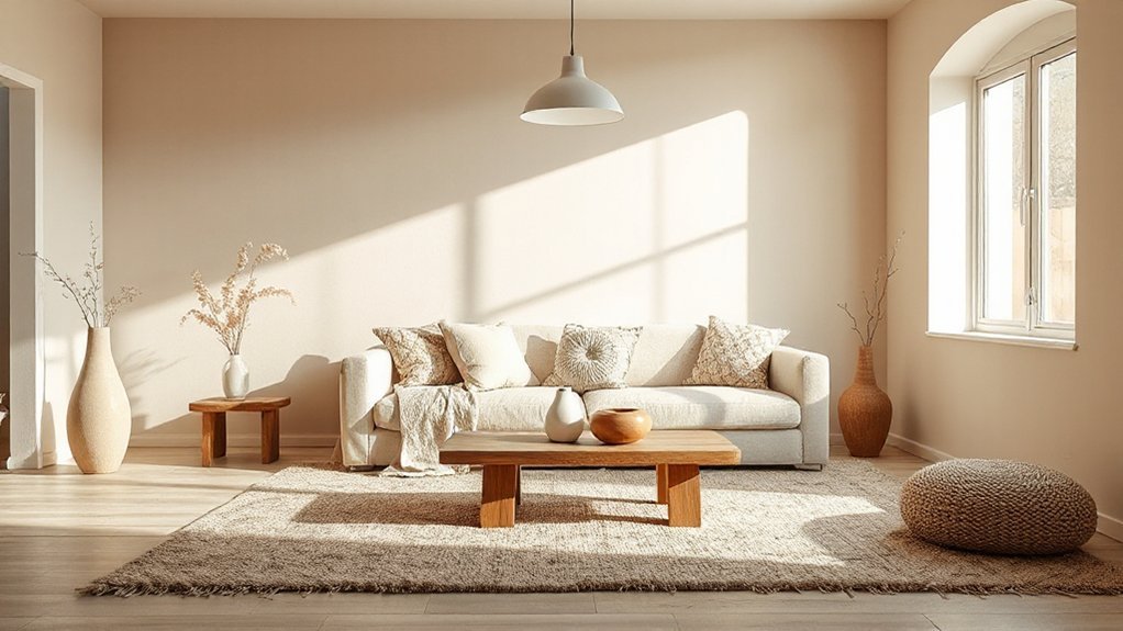
A unifying color palette ties rooms together by grounding each space in shared neutrals and complementary accents. Start by choosing one dominant neutral, then repeat it across walls, flooring, and major furnishings to create a cohesive backdrop.
You’ll layer depth with a restrained secondary tone used sparingly on textiles, cabinetry, or trim. Keep contrast intentional: aim for subtle shifts rather than loud changes.
Introduce an Accent wall in a muted version of your secondary color to anchor a room without overwhelming it. Use color blocking to delineate zones—painted panels, shelving backs, or chair rail breaks—while preserving a continuous flow.
Test swaps with swatches in natural light, then finalize with durable finishes to maintain consistency over time.
Balance Across Rooms
Once you’ve established a cohesive palette in individual rooms, extend it by repeating your dominant neutral and key accent choices across hallways, open-plan sightlines, and shared spaces, so the flow feels seamless from room to room.
Balance across rooms means anchoring every area to the same neutral backbone while allowing subtle variations in tone, texture, and lighting. Use repeatable accents—doors, rugs, art frames—in consistent hues to unite spaces without stifling individuality.
Introduce personalized accessories that reflect function and taste, ensuring they echo the palette. Thematic decor should reinforce the story you’re telling, not overpower it; choose pieces that align with the core neutrals and selective accents.
Finally, test sightlines from several angles, adjusting color intensity to maintain coherence and calm throughout the home.
Establish a Cohesive Material and Texture Grammar
To establish a cohesive material and texture grammar, identify a core set of finishes that recur throughout the home and pair them thoughtfully. You should choose materials that share undertones—warm woods with warm metals, cool stones with matte finishes—so contrasts feel intentional, not random.
Prioritize material harmony by limiting the palette to three to five core textures, then apply them consistently across rooms and surfaces. Balance texture by mixing sheen levels, grain directions, and tactile qualities in a deliberate sequence.
Use repeatable anchors like countertops, cabinetry, upholstery, and hardware to anchor the look, and introduce subtle variations through grain, patina, and surface texture. Document the assignments so every space reads as one cohesive, considered whole rather than a collection of disjointed elements.
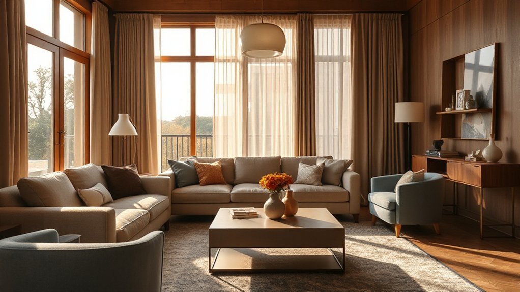
Create Flow With Scale, Proportion, and Rhythm
Seamless flow starts with thoughtful sizing and placement: scale should relate to both the room and its furnishings, guiding how you move through the space. You balance larger pieces with smaller ones so each zone reads as intentional, not crowded.
Proportion means every element feels related in weight and footprint, so aisles stay comfortable and sightlines stay clear.
Rhythm emerges as you repeat shapes, finishes, and silhouettes at varied heights, creating a steady cadence that guides you from room to room.
Include artistic accents that echo the room’s character, then let furniture flow align with the path you want to emphasize.
Prioritize a cohesive baseline—sofa, chairs, and tables—while carefully placing supporting pieces to maintain balance without visual clutter.
Layer Patterns Without Visual Noise
Layering patterns adds depth without clutter by balancing scale, contrast, and repetition. You combine patterns with intention, not impulse, ensuring each element serves a purpose.
Start with a dominant motif and introduce secondary designs in restrained sizes and colors. Keep a consistent color palette to support visual harmony, then vary textures to create tactile interest without overwhelming the eye.
Pattern mixing works best when you repeat a unifying thread—like a shared hue or geometric shape—across spaces, fabrics, and accessories. Limit the number of distinct patterns in a single zone to three or fewer, and allow negative space to breathe.
Anchor Bold Statements With Calm Furnishings
Bold statements in a room deserve grounding, so balance them with calm furnishings that let their impact shine. You anchor bold statements by pairing them with understated shapes, neutral surfaces, and measured scale.
Choose calm foundations—sofas, chairs, and cabinets with clean lines—that don’t compete with the focal piece. Then introduce decorative accessories sparingly to frame the artwork without crowding it.
Place statement artwork where it can breathe, at eye level and with ample surrounding negative space. Let colors echo other elements in the room to unify the palette, but avoid overstating any one hue.
Subtle textures—linen, wool, or brushed metals—add tactility without dominating. This approach keeps the focus on the bold piece while maintaining a cohesive, inviting atmosphere.
Lighting, Finishes, and Cohesive Atmosphere
Lighting sets the tone and finishes the look, so you want a cohesive plan that blends function with mood. You’ll pair lighting layers—ambient, task, and accent—to avoid pockets of contrast. Aim for a consistent color temperature across fixtures, then add ambient accents that echo your palette without shouting.
Use decorative highlights on architectural features, artwork, and textures to create depth and cohesion. Finishes should repeat subtly: matte metals with warm wood, or satin surfaces that reflect similar undertones. Dimmer controls give you flexibility, letting you shift from bright clarity to intimate warmth as rooms shift.
Keep cords hidden and fixtures scoped to each space’s character, ensuring a unified feel. The result is a balanced atmosphere where lighting, finishes, and decor reinforce one compelling look.
Frequently Asked Questions
How Do I Start Defining My Core Vibe Quickly?
You can start defining your core vibe quickly by pinning down your personal style. Ask yourself: what colors, textures, and moods energize me?
Collect 3–5 pieces that feel “me” and use them as anchors.
Then translate your design inspiration into a simple rule: limit palettes to two main colors and one accent.
Trust your gut, iterate fast, and adjust as you go.
You’ll apply this consistently across rooms for a cohesive look.
What’s the Best Way to Test Color Palettes Together?
A quick test: imagine a living room where you notice color harmony as the couch, rug, and art pulse in sync. Then adjust with a lighter throw to balance.
The best way to test color palettes together is to lay out swatches in real light, observe at multiple times, and try a simple palette coordination trick: pick one dominant, one secondary, and a neutral.
This keeps your palette cohesive and practical.
How Many Textures Are Too Many in One Room?
You should keep it to three to four textures in one room. Too many textures can feel busy and disrupt flow.
Stick with a unifying material or finish, then introduce contrast through texture and tone.
Use Material mixing sparingly, and rely on Pattern layering to add depth without clutter. If you mix five or more, you’ll overwhelm the eye.
Aim for balance, cohesion, and a calm, intentional feel throughout the space.
How Can I Unify Furniture Across Different Spaces?
Okay, you can unify furniture across different spaces by repeating key traits: match wood tones, maintain consistent scale, and mirror silhouettes. Use cohesive furniture styles as a thread, then anchor rooms with decorative accents that echo the same color family.
Choose a unifying material or finish, and balance focal points so each space reads as part of the whole. Start with a central piece, then replicate its vibe in other areas for a steady, intentional flow.
What Budget-Friendly Tweaks Create Cohesive Lighting Moments?
Start with affordable, unified lighting fixtures across rooms to create a cohesive mood. You can layer light by combining ceiling, table, and floor options, keeping finishes consistent.
Use dimmers to control mood lighting and switch bulbs to warm tones for a welcoming glow.
Add a few budget accents like plug-in sconces or string lights for soft mood lighting at key moments.
Aim for scale that complements each space, not dominates it.
Conclusion
You’ll love how simple it is to fail at chaos by pretending you didn’t plan anything. Define your vibe, pick a neutral backbone, sprinkle repeats of texture, and mind the rhythm—no, really. Your rooms will whisper “we match” as you resist spectacle and embrace calm anchors. If a bold chair sneaks in, balance it with quiet lighting and consistent finishes. Voilà: a cohesive home that somehow feels inevitable, not orchestrated—ironically, because you planned so little.