You might think color choices don’t matter much, but the right exterior hues and finishes can transform curb appeal and value. Start by aiming for durable, weather-friendly neutrals that pair well with brick or roof tones, then add texture with timber, render, or stone accents. Keep bold colors restrained for doors or fixtures, and test under varying light to avoid surprises. Curious how to apply these principles to your home’s style? Let’s map it out.
Key Takeaways
- Choose weather-resistant neutrals (warm beiges, cool greys, taupes) in textured finishes for durable UK curb appeal.
- Harmonise roof, brick, and trim tones within 10–20% warmth; pair cool bricks with charcoal/slate roofs and warm bricks with terracotta.
- Use a cohesive accent color sparingly for doors or railings, ensuring good contrast with light trims and testing in natural light.
- Prefer breathable, textured timber or textured cladding with smooth render for durability and moisture management.
- Align landscaping and hardscapes with the palette; highlight features with garden lighting and choose low-maintenance, slip-resistant surfaces.
Define Kerb Appeal Goals for UK Homes
A clear kerb appeal goal guides every exterior choice, so start by naming what you want to achieve—whether it’s attracting buyers, enhancing local character, or boosting curb presence on a budget.
You’ll define success with specific, measurable aims: desired first impression, seasonal brightness, and maintenance expectations.
Consider how garden lighting can extend evening curb appeal without overpowering architecture, and how driveway materials influence perceived value and durability.
Translate goals into practical actions: select a cohesive palette aligned with the area, plan focal points like entry gates, and outline timing for tweaks or updates.
Prioritize weather resilience, ease of cleaning, and resale relevance.
With clear targets, decisions become faster, more consistent, and easier to justify to anyone evaluating the exterior.
Neutrals That Boost Kerb Appeal in Britain’s Weather
A gentle neutral palette keeps exteriors calm and adaptable to Britain’s variable weather, so you don’t have to chase trends.
Choose weather-resilient tones that resist fading and staining, ensuring your home still reads polished year after year.
Timeless stone finishes add texture and durability, boosting kerb appeal without demanding frequent repainting.
Gentle Neutral Palette
Gentle neutrals offer the most reliable kerb appeal in Britain’s weather, because they stay timeless while resisting fading and staining from rain, sun, and haze. You’ll find these hues calm but expressive, creating cohesion with varied materials and accents. Use color psychology to choose undertones that align with your home’s character and surrounding greenery, enhancing perceived warmth or formality without shouting.
For application, start with a high-quality primer to seal porosity, then apply two coats of a breathable exterior paint. Use a 10–12 cm brush for edges and a roller for flat surfaces. Observe consistent color flow by maintaining a wet edge and avoiding heavy loads.
Plan your palette in swatches, testing in shade and sun to confirm true tone before final coating.
Weather-Resilient Tones
Weather-resilient neutrals stay true in Britain’s fickle climate, resisting sun fade, rain staining, and hazy glare while preserving curb appeal. You’ll choose tones that endure seasonal shifts without late-life chalking or color drift, saving maintenance time and costs.
Practical palettes lean on restrained hues—warm beiges, cool greys, and gentle taupes—that harmonize with brick, timber, and greenery. Color psychology informs choices: softer neutrals feel inviting, while deeper undertones convey solidity and curb presence.
Consider historical influences, such as traditional clay brick or chalky render, to guide saturation levels that still read modern from the street. Test samples at different times of day, then commit to a finish with UV resistance and a low-porosity coating.
With resilient tones, your home communicates calm, longevity, and understated charm.
Timeless Stone Finishes
Neutral stone finishes stay true under Britain’s variable skies, boosting kerb appeal without shouting. You’ll appreciate stone textures that read as natural, not manufactured, and that soften sharp edges without dulling presence. Timeless finishes endure while weathering patterns add character, so you don’t have to chase trends.
Choose neutral bases—sand, stone, taupe—in matte or low-sheen for universal compatibility with brick, timber, and metalwork. Apply slightly warmer undertones to counter gray skies or cooler hues to enhance contrast on sunny days.
Use consistent grout lines and minimal mortar variation to preserve a clean, cohesive look. Pair with robust, UV-resistant topcoats to maintain hue stability.
Practical maintenance matters: plan for periodic cleaning, re-sealing, and soft washes to retain timeless finishes.
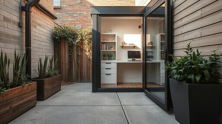
Durable Finishes: Timber, Render, and Cladding Textures
Durable finishes shape curb appeal as much as color, so you should weigh timber, render, and cladding textures by how they age, weather, and maintainability.
When you choose textured timber, you gain character but expect more ongoing upkeep in damp, shady UK spots; regular sealing or staining slows weathering and preserves grain.
Smooth render finishes offer a clean, low-maintenance alternative, yet joints and cracks reveal movement, so you’ll need routine inspection and small repairs to prevent moisture ingress.
Cladding textures bring dimensional depth, but installation quality and vented systems matter to avoid trapped moisture.
Prioritize breathable, insect-resistant options where possible, and align finish lifespan with your maintenance plan.
In practice, assess exposure, cleaning needs, and scheduled refresh cycles to sustain kerb appeal.
Exterior Colour Palettes by UK Architectural Style
You’ll start to see how Coastal-inspired palettes, Modern minimalist finishes, and Traditional brick accents shape curb appeal across UK styles. Each approach guides color choices that respect context while offering distinct personality and durability.
We’ll explore how to balance seaside warmth, clean lines, and brick heritage for cohesive exteriors.
Coastal-Inspired Palettes
Aim for seaside colour schemes that reflect the tide: gentle blues, seafoam greens, and warm pebble beiges. Keep contrast purposeful: a crisp white-trimmed facade with darker doors or shutters enhances definition without shouting.
For architectural details, introduce nautical exterior accents like rope-textured textures, navy railings, or weathered timber for Mediterranean-like warmth. Materials should read authentic rather than glossy, so opt for matte paints and fade-resistant finishes.
Test swatches in multiple lights and choose a palette that remains harmonious as the day shifts.
Modern Minimalist Finishes
Start with neutral bases—charcoal, cream, or stone—paired with few accent tones to retain visual calm. Consider the impact of color psychology: cool neutrals project steadiness, while warmer neutrals invite subtle warmth without shouting.
Materials matter as much as hue; raked plaster, timber battens, and smooth fibre cement boards read as modern and low maintenance, offering longevity and minimal upkeep.
Aim for architectural symmetry where possible, balancing massing with window placement and material changes to create a cohesive façade.
Keep detailing restrained, allowing negative space to reinforce a refined, timeless curb appeal.
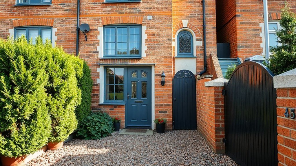
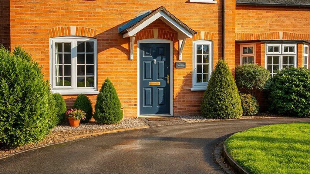
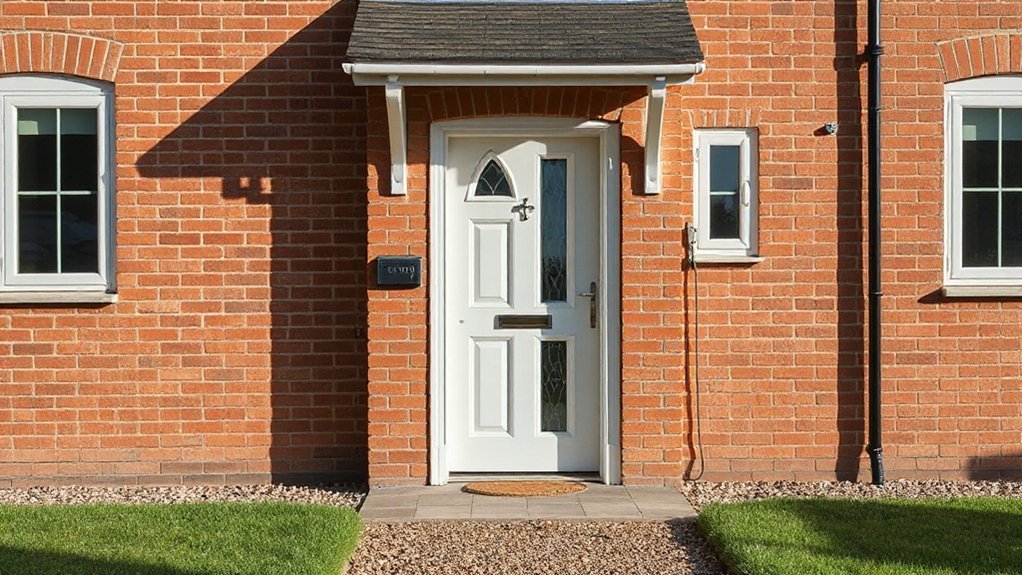
Traditional Brick Accents
Brick accents anchor period charm while keeping modern palettes grounded. Traditional brick accents offer warmth, texture, and longevity, pairing well with UK skies and garden lighting.
You’ll balance brick with tighter palettes to avoid heaviness, and you’ll consider mortar color to soften progressions with modern features like sleek exterior signage.
- Use muted brick tones with charcoal or olive accents to maintain readability from the street.
- Introduce contrasting trim or lintels to highlight brick patterns without overwhelming the facade.
- Integrate garden lighting to sculpt brick texture after dark and guide approach paths.
- Choose signage finishes that harmonize with brick ink and mortar for a cohesive curb presence.
Harmonising Roof and Brick Colors for Kerb Appeal
To create curb appeal, harmonise your roof and brick colors so they read as a single, deliberate palette rather than conflicting tones. Start with a baseline: pick a dominant brick color and choose a roof shade within 10–20% of its warmth.
Cool bricks pair best with charcoal or slate roofs; warm bricks glow with terracotta or brown roofs. Test contrast carefully at dusk, when garden lighting reveals true hues. Avoid busy patterns; unity comes from analogous tones and a shared undertone.
Keep non-essential elements calm to reinforce the harmony. For entry cohesion, align front door designs with the roof’s undertone—deep greens, navy, or charcoal work well. Subtle variation across masonry and trim prevents flatness while preserving a refined, cohesive curb appeal.
Bold Accent Colors That Enhance, Not Shout
Bold accent colors can lift a home’s kerb appeal without shouting for attention. When you choose bold accents, you direct the eye with purpose, not volume, by pairing them with neutral surroundings and restrained textures. Use these guidelines to keep it tasteful and lasting:
1) Select a single bold hue for a key feature (door frame, porch railing) and repeat it in small, intentional touches.
2) Balance contrast with lighter trims to preserve legibility and avoid visual clutter.
3) Test color in natural light corners before committing; small swatches mislead under artificial light.
4) Consider creative exterior accents like metal finishes or matte black fixtures to elevate character without overwhelming it.
Bold accent colors, used sparingly, create memorable, refined curb appeal.
Maintenance for Long-Lasting Curb Appeal and Washability
Regular maintenance keeps textures looking fresh and colours true, so establish a simple schedule from the start. You’ll extend curb appeal by washing seasonal dirt, inspecting for wear, and sealing high-traffic surfaces when needed.
Prioritise consistent cleaning with the right product for each material, and avoid harsh scrubbers that scar finishes.
For garden lighting, clean fixtures and replace bulbs before failures threaten ambiance.
Check seals around doors and windows to prevent moisture ingress, and reapply protective coatings on exposed timber or metal to slow weathering.
When choosing driveway materials, reseal or recoat every few years to preserve colour and texture.
Document tasks and intervals, then adapt routines to weather patterns; consistency beats sporadic, reactive care for lasting appeal.
Landscaping and Hardscapes to Support Your Palette
A cohesive palette isn’t just about paint; it’s shaped by how your landscape and hardscape elements frame and reinforce it. You’ll align plant selections, textures, and materials to echo your colour story while creating cohesive progressions between zones.
Practical landscaping focuses on scale, rhythm, and maintenance, so pick simple forms that complement your exterior finish without competing for attention. Consider lighting, pathways, and seating angles that extend your palette into evening hours.
- Use garden lighting to highlight focal plants and architectural features, guiding the eye toward your chosen tones.
- Choose driveway materials that harmonise with wall and path colours to avoid jarring contrasts.
- Select low-maintenance greenery with seasonal interest that mirrors your palette’s mood.
- Implement durable, slip-resistant surfaces that respect UK weather and curb-appeal goals.
Test, Implement, and Verify Your Kerb-Appeal Palette
Test your kerb-appeal palette by implementing it in small, controlled steps and validating results as you go. Start with a single exterior feature, like a door surround or one wall, then expand.
Measure impact using daylight observations, shade changes, and any reflected colour shifts at different times. Document your findings so you can repeat successes and avoid missteps.
Implement samples on low-traffic areas first to prevent costly mistakes, and adjust undertones if metal or brick hues clash.
When you’re ready to scale, verify consistency across materials, textures, and finishes under typical UK lighting.
Consider garden lighting to highlight focal colours at night and ensure security features remain visible and effective.
Finally, compile a concise rating system to guide future refinements.
Frequently Asked Questions
How Often Should Exterior Colour Schemes Be Refreshed?
You should refresh every 5–7 years to keep curb appeal sharp and avoid dated looks. In practical terms, assess wear, fading, and color psychology impacts on how visitors feel about your home.
Historical trends matter, but you’ll gain more by aligning updates with renovations or seasonal light changes. Keep schemes cohesive but allow micro-adjustments every few years to refresh accents.
Regular maintenance beats heavy overhauls, preserving value and ensuring your exterior stays inviting.
Which Finishes Resist UK Weather Best Year-Round?
Weatherproof finishes that resist UK year-round are masonry paints, silicone-based renders, and vinyl or aluminum cladding. They handle rain, wind, and temperature swings while staying durable.
You’ll want breathable options for walls and moisture barriers over roof materials to prevent leaks.
For garden landscaping and roof materials, pick coatings with UV, mould, and algae resistance. This keeps colour stable, maintenance low, and values steady, so you’re not chasing fixes all year long.
Do Timber or Render Require More Maintenance?
Timber generally requires more maintenance than render, especially over time. You’ll deal with timber weathering, including fading and potential rot, seals, and repainting every few years.
Render needs inspection for cracking and occasional re-patching, but it’s usually less labor-intensive than timber upkeep.
With timber, you’ll need regular cleaning, stain or paint, and treatment to protect against moisture.
Render can be easier in the long run if you choose durable finishes and monitor for render cracking.
How to Test Curb-Appeal Colour Choices Quickly?
To test curb-appeal color choices quickly, use color testing and paint samples on small, low-visibility areas first, then observe at different times of day.
Keep a simple note on how it looks with adjacent foliage and masonry. Compare two or three hues, and snap photos under natural light.
Move to larger swatches on a panel, and evaluate after a week. This practical approach helps you decide faster before committing.
What Are Cost-Effective Durable Accents for Sidelights and Doors?
Yes—opt for affordable, durable accents like PVC or aluminum window trims in a fade-resistant finish. Plus, choose stainless steel or powder-coated door hardware for longevity.
You’ll keep costs down by choosing standard sizes and pre-finished components, then install with proper sealant to prevent moisture.
You get low maintenance, consistent looks, and better curb appeal.
Prioritize matte or semi-gloss coatings, and test hardware finishes against your door color to avoid clashes.
Conclusion
You’ll lock in lasting curb appeal by choosing cohesive colors and textures, keeping it simple, and testing under varied light. Pair warm neutrals with durable finishes, and harmonize roof and brick for harmony. Introduce subtle, sparing accents, and maintain materials for longevity. Manage moisture, washability, and weathering with wise, warranted choices. Layer landscapes to lift the palette, and verify visuals before you commit. Practical, precise planning preserves polished, perennial curb appeal.