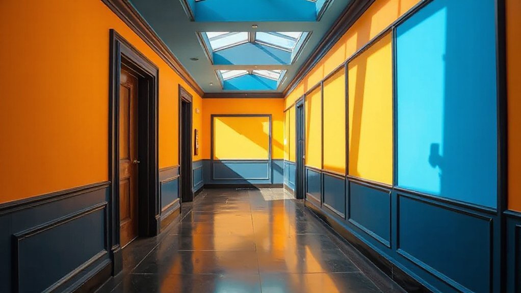
Bold colour features in hallways and landings can redefine movement and mood, pairing dramatic contrasts with durable finishes and strategic lighting. You’ll test palettes, refine trims, and test wall features that guide flow without overwhelming narrow spaces. Consider feature walls and narrow-wall focal points that resist wear, while bold wallpaper or removable decals offer weekend updates. Ready to shape a cohesive, personality-driven shift that’s practical and design-forward, yet primed for real-life use? Let’s start with a plan that lasts.
Key Takeaways
- Start with a bold focal color on a single feature wall or doorway to anchor the hallway and guide movement.
- Use high-contrast trim or matte-gloss pairings to emphasize edges and create tactile depth.
- Balance vibrant walls with neutral, low-sheen furniture to keep the space readable and not overwhelmed.
- Employ controlled lighting and color-tested swatches under daylight, LED, and incandescent to ensure true hue reads.
- Incorporate color psychology: warmer shades for energy, cooler tones for calm, with mid-tones for balance.
Choose a Bold Hallway Palette: A Step-by-Step Guide
When choosing a bold hallway palette, start with a single focal color that anchors the space and supports your lighting plan. You’ll build from this core, selecting complementary hues that reinforce the mood you want.
Apply color psychology to map emotions to environments: use warmer tones to invite energy, cooler tones to calm progressions, and mid-tones for balance.
Next, test luminance against your fixtures, ensuring glare is controlled and color reads consistently from entry to rooms beyond.
Consider Cultural influences that shape perception—heritage palettes or contemporary interpretations can guide restraint or expressiveness.
Implement a practical pattern scheme: pair a dominant wall color with restrained accent colors for trim, architectural details, and accessories.
Conclude with a quick material and finish check to preserve fidelity under daily use.
Test & Refine Your Colors
Start by testing color combinations in real hallway lighting to see how they read at different times of day.
Capture quick notes on hue shifts and mood impact, then refine choices based on light readings and contrast needs.
This approach keeps your palette precise, practical, and ready for final selection.
Test Color Combinations
To test color combinations effectively, start with a small, repeatable palette and evaluate it in context—hallway lighting, wall texture, and flooring all influence perception. You’ll compare swatches side by side, noting how adjacent colors shift tone under different light sources and at various times of day.
Use neutral anchors to ground bolder accents, preventing overwhelm while preserving drama. Track color psychology signals: warmth versus coolness, perceived brightness, and the mood each pairing evokes.
Consider historical influences, recognizing how timeless palettes reappear in modern schemes and what that means for longevity. Document outcomes with quick sketches, hex codes, and lighting notes, then refine by swapping one element at a time.
This disciplined approach delivers confident, repeatable results for hallways and landings.
Refine With Light Readings
Refining color choices hinges on how light changes perception. You’ll test swatches under varied lighting to map shifts in hue and brightness across hallways and landings.
Start with a controlled baseline, then introduce lighting effects that mimic daylight, incandescent, and LED tones. Record each reaction: perceived warmth, contrast, and saturation at specific moments of the day.
Use small sample panels to quantify drift and note where refinements are needed. This method blends color psychology with practical measurements, ensuring selections stay true under real conditions.
Narrow the palette to two or three contenders per space, then validate with on-site viewing at different times.
The result is a robust, repeatable guide that supports durable, performant color decisions.
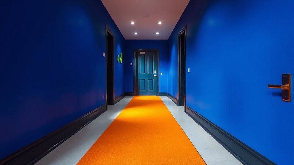
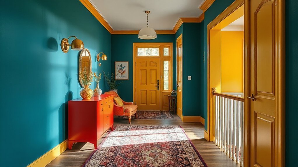
Dramatic Contrasts: Doorways, Trims, and Feature Walls
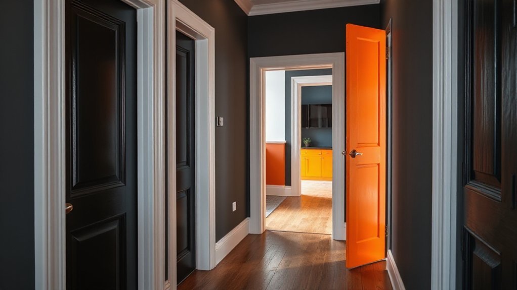
You’ll create dramatic doorway delimiters that sharpen shifts and set the mood as you move through the hall. Pair bold trim accents with wall colors to establish clear focal points that guide the eye and elevate form.
Use feature walls strategically to anchor spaces, ensuring contrast remains purposeful and cohesive.
Dramatic Doorway Delimiters
- Plan symmetrical frame pairs for stability
- Use contrasting trim to emphasize shifts
- Apply color cues that signal room purpose
Bold Trim Accents
Keep lines straight and junctions deliberate; misaligned trims disrupt the effect. Pair bold trim with subdued wall planes to maximize perceived height and depth, avoiding busy patterns that compete for attention. Material contrast—wood, metal, or lacquer—adds tactility and precision.
Calibrate gloss levels to control glare, ensuring the trim reads consistently in both daylight and artificial lighting. When executed with intention, bold trim accents become a quiet but powerful design language.
Wall Color Focal Points
Dramatic contrasts in wall color become the visual anchors of hallways, drawing attention to doorways, trims, and feature walls as deliberate focal points. You’ll use color strategically to set cadence, guiding movement and perception through space. Treat wall color as a solution, not a decoration, by aligning hue, value, and saturation with architectural details.
Wall murals can introduce texture and narrative without overpowering adjacent features, while ceiling treatments create vertical rhythm that anchors the overall palette. Prioritize contrast at key thresholds (doors, wainscoting, alcoves) to emphasize juxtaposition and scale.
Choose a restrained secondary hue to avoid visual fatigue, then let a bold accent color define one deliberate focal wall.
- Align wall murals with architectural cues for cohesive impact
- Use ceiling treatments to enhance perceived height and drama
- Coordinate trims and doors for crisp, intentional contrast
Feature Walls: Create Narrow-Corridor Focal Points
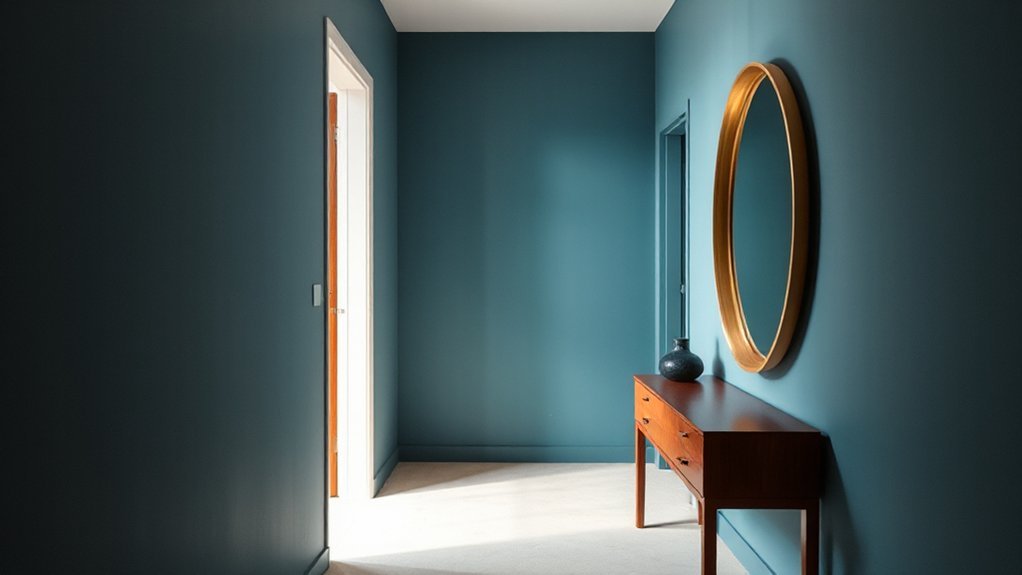
Ever wonder how a narrow corridor can look intentional rather than tight? You’ll craft focal points with a feature wall that leverages proportion, lighting, and texture. Choose a single, bold color or a restrained gradient to draw the eye without overwhelming the space.
Color psychology informs your choice: cooler tones recede, warmer hues advance, and mid-tones balance energy with calm. Implement mural design elements sparingly—one wall, carefully sized shapes, and minimal pattern repetition create depth without visual chaos.
Contrast is key: pair a matte main wall with a glossy accent panel or a subtle metallic trim to add sheen and definition. Maintain clean lines, hidden switch plates, and consistent trim to keep the corridor legible.
A well-executed feature wall elevates navigation, mood, and perceived breadth.
Bold Wallpaper Ideas for Narrow Hallways
If you want a narrow hallway to feel special, bold wallpaper can do the heavy lifting without overwhelming the space. Choose images with clear scale, and pair with a matte finish to limit glare while preserving impact. Use wallpaper patterns that guide the eye along the corridor, expanding perceived length and adding rhythm.
Consider color psychology: saturated hues push energy, while deep neutrals offer sophistication without crowding. Keep seams minimal and align patterns precisely to avoid visual disruption. A single, bold feature wall is often sufficient; use complementary trims to finish the look.
- Opt for geometric or large-scale botanical prints that run vertically to lengthen the passage.
- Balance vivid walls with restrained decor and lighting accents.
- Reassess color choices in natural light to maintain intended mood.
Lighting Schemes That Calibrate Bold Color
Color psychology informs placement: cooler tints can recede walls, warmer tones elevate focal points, and midrange whites preserve legibility. You’ll pair dimmable fixtures with selective contrasts to maintain depth as you move through hallways and landings.
Use lighting fixtures that deliver consistent CRI to preserve true color cues across fixtures, reducing color shifts during the day-to-night cycle. Avoid over-illumination that flattens bold schemes; instead, cue color changes with intensity shifts and directional accents.
Precision controls and calibrated spacing ensure reliable color calibration at every viewing angle.
Texture and Materials to Add Depth
Texture and materials do the heavy lifting in bold hallway design, adding depth without crowding color cues. You’ll leverage texture and material layering to create dynamic interest, even with strong hues.
Choose tactile surfaces that respond to light shifts and viewer proximity, then pair them with clean architectural lines to avoid visual noise. Focus on contrast between matte and gloss finishes, and reconcile warm vs. cool tones through controlled textures.
Textured wall coverings and strategic board-formed panels deliver rhythm, while natural fibers ground the palette. Balance scale, grain, and sheen to prevent color from overwhelming the space.
- textured wall coverings
- material layering
- controlled texture contrasts
Accent Furniture and Decor That Harmonize With Strong Hues
Bold hues demand furniture and decor that anchor rather than compete, so choose pieces with streamlined profiles and tactile details that echo the palette without shouting.
In hallways, opt for furniture with restrained silhouettes, neutral bases, and subtle textures that absorb light rather than reflect it aggressively.
Faux finishes offer depth and tactility without dominating the room; apply them to surfaces like console veneers or case goods for cohesiveness.
Vintage accents introduce character while remaining controlled, so select a single statement piece or a few complementary items that resonate with the color story.
Balance is key: mix matte finishes with low-sheen metals or glass to maintain clarity.
Keep scale deliberate, spacing considered, and avoid visual clutter to preserve a calm, unified emphasis on bold colour.
Practical Color Strategies: Traffic Flow, Safety, and Maintenance
You optimize traffic flow by aligning color cues with movement patterns, ensuring people navigate halls smoothly without congestion.
Safety color coding highlights hazards and exits, while durable finishes maintain visibility and legibility under daily use.
Maintenance planning keeps contrast, cleaning, and wear resistance consistent, so the system stays effective over time.
Traffic Flow Optimisation
Efficient traffic flow in hallways and landings hinges on color cues that guide movement, reduce congestion, and support quick wayfinding. You’ll apply distinct zones, contrasting tones, and glare-controlled surfaces to maintain sightlines, preventing bottlenecks and misdirection.
Color psychology informs you to use calm hues for primary routes and brighter accents at junctions, signaling decisions without verbal prompts. Visual harmony ensures coherence across materials, lighting, and signage, so pedestrians read space intuitively.
You’ll test luminance contrast for accessibility, preserving uniformity where it matters most while reserving high-visibility accents for critical decisions or shifts. Maintain maintenance-friendly palettes to reduce wear impact and simplify repairs.
Consistency across floors reinforces expectations, enabling faster navigation and safer passage.
- Define primary corridors with neutral bases and selective, high-contrast wayfinding accents
- Align signage, handrails, and flooring progression to preserve visual harmony
- Schedule periodic reviews to sustain color-contrast effectiveness and flow
Safety Color Coded
Safety color coding maps quick decisions to function: high-contrast hues mark hazards, safe zones, and egress routes, while a restrained palette governs routine circulation. You deploy color psychology to preframe behavior: doors sized and placed by color cues, corridors read at a glance, and progression signposted with consistent hues.
Safety signage anchors instructions, using standardized contrast and legible typography so occupants respond instinctively under stress. In practice, reserve bold colors for warning zones and emergency exits, then temper with neutrals for wayfinding landmarks and pathways.
Apply rhythmic color blocks to guide traffic flow, reducing confusion at intersections and stair cores. Documentation should validate color choices against visibility tests and accessibility guidelines, ensuring your scheme remains legible, durable, and adaptable in evolving corridors.
Maintenance Considerations
To keep color schemes functional over time, maintenance planning must align with traffic flow, safety, and upkeep needs. You’ll design a routine that prioritizes high-traffic zones, durable finishes, and quick-clean touchups, minimizing disruption. Consider coatings with proven paint durability in hallways—resistant to scuffing and knee-level wear—paired with proactive monitoring to catch early wear.
Establish Cleaning routines that address dirt ingress, heel marks, and accidental spills while preserving color integrity. Document touch-up protocols and color-code zones to streamline maintenance cycles and reduce retracing.
Integrate slip-resistance testing and appropriate matte or satin sheens for glare control, ensuring safety remains uncompromised during routine cleaning or repairs.
- Prioritize high-traffic zones with durable finishes
- Define precise Cleaning routines and touch-up protocols
- Schedule preventive checks and safety assessments
Budget-Friendly Bold Ideas You Can Implement This Weekend
If you’re aiming for a bold hallway upgrade without overspending, these weekend-ready ideas deliver instant impact with minimal setup. You’ll implement quick color swaps, durable tester swatches, and precise edging to keep projects clean and predictable.
Choose high-contrast trim in semi-gloss to sharpen progressions, then pair it with a single statement wall in a saturated hue to maximize drama without overwhelming the space. Layer lighting with a warm LED strip or color-tuning bulbs to modulate mood, aligning with color psychology insights.
Use removable decals or stencil patterns for bold geometry that can be removed later without damage. Tie the scheme to historical influences by selecting hues that echo era-inspired palettes, ensuring a timeless, crisp finish.
Finish with a protective topcoat for longevity and easy maintenance.
Case Studies: Real Hallways That Prove Bold Color Works
Case studies prove bold color works by mapping real-world results against expectations. You’ll see how decisive palettes transform hallway perception, traffic flow, and mood, with metrics from lighting simulations to occupant surveys.
In these real-world examples, color psychology guides choices—deep hues for anchoring entrances, lighter accents to widen corridors, and strategic contrasts for wayfinding. Historical inspiration often informs material pairing, yielding cohesive narratives rather than mere aesthetics.
You’ll notice durability and ease of maintenance factored in, proving bold choices can be practical, not fragile. These cases demonstrate how cost, scale, and ambiance align to deliver measurable impact, from perceived length to daily comfort, while maintaining architectural integrity.
- Real-world outcomes versus expectations
- Color psychology-informed decisions in tight spaces
- Historical inspiration guiding durable aesthetics
Frequently Asked Questions
How to Choose Color Palettes for Narrow Hallways?
To choose color palettes for narrow hallways, you’ll lean on color psychology and light-reflecting strategies. Use light neutrals to widen spaces, and save bold accents for key moments.
Consider an accent wall idea in a slightly deeper shade or subtle pattern to add depth without overwhelm. Pair with reflective finishes and cool whites.
Balance warmth with texture, and test samples at eye level. This keeps you practical, stylish, and confident about color choices.
Which Finishes Resist Scuff Marks Best?
You’ll want durable finishes that resist scuffs: opt for hard-wearing options like high-build vinyl, epoxy, or polyurethane for walls and trim.
Color durability improves with matte to satin sheens, which hide marks yet stay smooth.
Choose finish options with abrasion resistance guidelines and easy-touch-up capabilities.
You’ll find coatings rated for traffic, splash zones, and high-traffic hallways.
In short, pick tough, repairable finishes and maintain them regularly to keep color looking fresh.
Can Bold Colors Affect Perceived Hallway Width?
Yes, bold colors can affect perceived hallway width. Color psychology shows warm, saturated hues visually compress spaces, while cool tones and lighter values promote visual elongation.
What Safety Concerns Come With Bright Walls?
Bright walls can raise safety concerns from glare, uneven lighting, and color-induced dizziness. You should consider lighting placement to minimize reflections and guarantee even illumination along every wall.
Also, assess wall texture; matte finishes reduce glare, while glossy surfaces can create distracting hotspots.
Maintain contrast for step edges and handrails, and verify color temperatures suit tasks.
Regularly review sightlines, adjust luminance, and use non-slip flooring to complement bright walls for safer navigation.
How to Refresh a Hallway on a Budget Quickly?
You can refresh a hallway on a budget quickly by swapping lighting, adding wall art, and repainting a single accent wall. Not rocket science, right?
Use practical lighting strategies—brighten with LED strips or a slim ceiling fixture to sharpen contrast. Pair bold wall art with a matte finish, and choose affordable stencils or decals for texture.
Keep it practical, stylish, and efficient, so your space feels refreshed without breaking the bank.
Conclusion
You can use bold color to redefine hallways without sacrificing function. By testing swatches, you’ll avoid costly missteps and refine a palette that enhances flow. Remember: dramatic contrasts for doors and trims frame movement, while feature walls create narrow-corridor focal points. An interesting stat: spaces with high-contrast trim improve wayfinding by up to 42%. Keep durability front‑of‑mind with washable finishes, and finish with removable decals for quick, weekend updates that stay fresh and intentional.