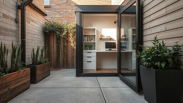
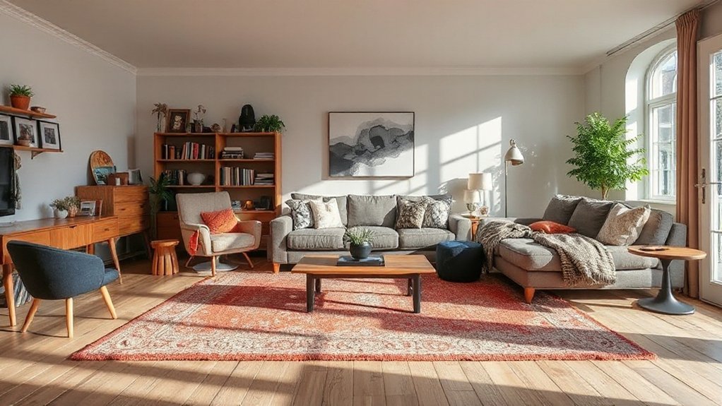
Homeowners often stumble over space planning, furniture scale, and cohesive color when designing a room. You’ll miss flow if you skip measurements, pick oversized pieces, or mismatch textures. Inconsistent lighting and clutter undermine mood and function, and window treatments that don’t fit can ruin ambiance. Get ahead by focusing on layout, scale, color, lighting, and organization—then you’ll see where these mistakes begin and what to fix before choosing pieces. There’s more to take into account as you plan your space.
Key Takeaways
- Start with careful space planning to map layouts, doorways, electrical outlets, and clear 32-36 inch pathways before purchasing furniture.
- Size and placement matter: avoid oversized or undersized furniture, ensure good sightlines, and account for delivery clearance and traffic flow.
- Create cohesive color, material, and texture schemes with a neutral foundation, balanced accents, and intentional texture mixing.
- Use layered lighting (ambient, task, accent) and plan treatments that suit room scale, light control, and natural daylight.
- Limit clutter on surfaces, group decor by color/material, and establish a dominant texture to preserve visual harmony.
How to Start: Define Your Space Before Choosing Furniture
Before you buy furniture, map out your space. Define each zone and note doorways, windows, and electrical outlets. Measure walls, ceilings, and any architectural quirks, then sketch a simple floor plan. Prioritize clearance for pathways and scales that fit real-life use.
Decide your main function for each area: lounging, dining, work, or entertaining, and align furniture size accordingly. Consider lighting needs first so decorative accents and furniture don’t crowd a focal point.
Choose a neutral base for larger items, then layer with decorative accents to introduce color and texture. Plan lighting fixtures to serve distinct tasks—ambient, task, and accent lighting—without creating glare.
Keep traffic clear, sightlines open, and storage accessible, so you can rearrange confidently as your needs evolve.
How to Plan a Layout That Maximizes Comfort and Flow
Start by mapping how you move through your space, prioritizing clear pathways that support daily tasks.
Use the layout flow principles to place key zones—seating, work, and dining—where they’re most convenient, with sightlines and passages that feel natural.
Keep comfort at the center by testing spacing and furniture scale, ensuring enough room to relax and reconfigure as needed.
Layout Flow Principles
Good layout flow starts with a clear purpose for each space and a logical path through the room. You design around function first, then scale furniture to fit without crowding walkways. Prioritize sightlines, avoid clutter traps, and place high-traffic zones where doors and openings won’t collide.
Use a grid or alignment cues to keep edges honest and rooms visually connected. Consider traffic patterns: entry, seating, work, and circulation should unfold naturally, not abruptly.
Integrate Feng Shui concepts subtly by aligning spaces for ease of movement and calm focal points, rather than forcing symmetry. In practice, map a simple progression diagram, test with mock placements, and refine until transitions feel effortless.
This mindful sequencing supports comfort, efficiency, and a cohesive Interior Fengshui rhythm.
Comfort-Centric Spacing
Use rug boundaries to anchor zones, then place accent seating to support flow without clutter. Opt for scalable layouts that adapt to gatherings, pets, and daily routines. Integrate storage solutions that hide clutter yet stay accessible, preserving calm.
Choose personalized decor that echoes purpose—textiles, art, and plants—to reinforce zones without visual noise. Maintain clear paths around furniture and entryways, avoiding abrupt shifts. This practical approach yields comfort, usability, and a cohesive, breathable environment.
How to Size the Sofa for Your Room and Seating Needs
To size a sofa correctly, start by measuring the room and noting where you’ll place it, doorways, and any obstacles like a coffee table or vents. You’ll also map clear paths for traffic and seating access.
Pick a scale that suits the space: measure wall length and consider how many people you want to sit regularly.
Choose sofa height to match sightlines and nearby furniture, ensuring cushions don’t overwhelm air paths.
Consider the seating depth and arm style for comfort and movement.
Plan for flexibility with modular pieces if you host varied layouts.
Material durability matters for high-traffic rooms, so select fabrics and leathers that endure daily use.
Finally, confirm delivery clearance and placement to avoid rearranging walls or rugs later.
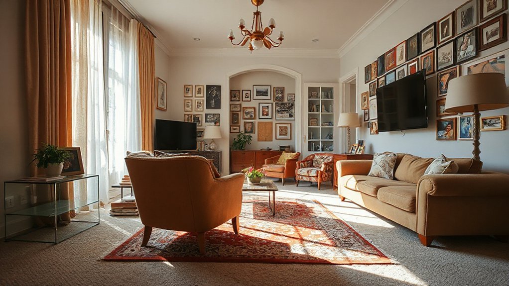
How to Build a Cohesive Color Story That Feels Put-Together
Start with a Neutral Foundation to ground your palette, then add Color Harmony Basics to guide how shades relate.
Use Neutral Foundations First so you can layer accents without overwhelming the room.
Finish with Accents That Unite to guarantee your colors feel cohesive and intentional.
Color Harmony Basics
Color harmony starts with a clear plan: map out a dominant color, two supporting shades, and an accent that pops without clashing. You’ll keep the palette tight to avoid unnecessary complexity.
Begin with a dominant hue that governs most surfaces, then select two complementary supports to add depth without competing for attention. The accent should energize the room, used sparingly on accessories or a single focal piece.
Consider color contrast to guide placement—light walls with darker furnishings, or a bold accent against neutral fields—to create visual depth without strain.
Hue psychology matters: choose calm tones for relaxation zones and uplifting saturations for social areas.
Test combinations under natural light, then adjust if contrasts overwhelm or fade. Finish by applying consistent saturation levels across fabrics, art, and trim.
Neutral Foundations First
Neutral foundations set the stage for a cohesive color story, giving you a calm canvas before you layer in personality. You pick a neutral base and let it anchor your space, then layer with intention to keep everything readable and balanced.
- Imagine walls in a soft taupe that travels well with furniture textures.
- Picture hardwood floors or sustainable materials that ground the room.
- Visualize a light, breathable ceiling height that enhances color perception.
- Think of durable textiles in restrained hues that support color psychology without shouting.
Accents That Unite
Accents are the glue that ties a space together, so choose pieces that echo your neutral foundation while adding character. To build a cohesive color story, aim for consistent undertones across decorative accents, like cushions, vases, and throws.
Practice deliberate Accent coordination by repeating a signature hue in varied textures and scales, not identical items. Limit your palette to two or three core tones plus one accent color for focused contrast.
Pair metallics and natural materials to create depth without clutter. Use lighting to highlight key accents, ensuring shadows don’t mute color intent.
Group smaller decorative accents in odd-numbered clusters for visual rhythm, and avoid mixing wildly disparate styles. With intention, your accents unite spaces, feel deliberate, and reinforce your overall design narrative.
How to Layer Lighting for Mood and Function
To layer lighting effectively, start with a clear plan: identify the tasks each space needs and the mood you want to set, then choose fixture types that serve both purposes. You’ll balance ambient, task, and accent lighting to create depth, clarity, and atmosphere.
Layered lighting lets you switch between modes without overhauling the room, boosting Mood enhancement while maintaining practicality.
- A ceiling wash for general glow that doesn’t overpower artwork or furniture
- Adjustable task lights at desks, vanities, and counters for focused work
- Dimmed sconces beside seating to soften corners and invite conversation
- Highlighting with a narrow beam to draw attention to features without glare
How to Mix Textures and Materials Without Clashing
Texturing your space without clashes starts with a clear plan: you’ll mix patterns, finishes, and materials in a way that supports the room’s function and vibe.
Begin by establishing a dominant texture and a supporting one, then add a subtle accent. Prioritize material pairing that echoes the room’s purpose: soft fabrics for comfort, hard surfaces for durability, and a natural element for balance.
Maintain a cohesive color base to unify varied textures. Introduce contrast through scale rather than color; pair large, smooth surfaces with smaller, tactile textures to create depth.
Limit the number of textures to four to prevent clutter. Use finishes with compatible sheens to avoid visual noise.
Observe how light interacts, adjusting placement to emphasize textural contrast without overwhelming the space.
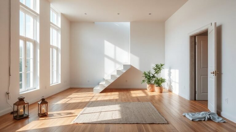
How to Create Clear Pathways Across Rooms
You’ll map clear pathways by prioritizing main circulation routes and keeping furniture away from doorways.
Aim for intuitive flow that guides movement from room to room without obstacles, using visible sightlines and intentional rug placements.
Start with a simple layout: define primary paths, test for pinch points, and adjust layout to maintain smooth, unobstructed travel.
Clear Pathways Across Rooms
Ever wonder how to move through a space without tripping or bumping into furniture? You create clear pathways by prioritizing flow over clutter and aligning furniture with foot traffic. Focus on sightlines, keep doors open, and designate main routes so guests don’t detour.
Consider furniture placement that supports traffic management, not obstacle courses, and allow at least 32 inches of clearance around seating. Use low-profile pieces near hallways to maintain openness, and group seating to direct movement naturally.
Elevate visibility with lighting along paths and avoid oversized rugs that snag feet.
- Visualize routes from every doorway before placing pieces
- Position sofas and coffee tables to keep main corridors clear
- Use lighting to guide the way without glare
- Place accent furniture as accents, not barriers
Flow-Enhancing Spatial Plan
A clear pathways plan starts with visualizing every doorway and main entry in the space, then arranging furniture to prioritize flow. You create a natural circulation loop by placing sofas and chairs to form defined zones without blocking aisles.
Keep traffic lines clear: avoid placing low pieces in doorways, and maintain at least 36 inches of clearance around coffee tables. Choose focal furniture angles that guide movement from room to room, not against it.
Use decorative accents to punctuate routes without clutter, and align them with the color coordination of each area to reinforce continuity. Test your layout by walking through with a light tray or your usual daily items to confirm unobstructed paths.
Reassess periodically as you add decor or scale changes occur.
How to Avoid Surface Clutter While Keeping Character
To avoid surface clutter without sacrificing your home’s character, establish a simple rule: only keep items out that tell your story or serve a daily purpose.
- Choose a single display shelf for personal mementos, rotating pieces seasonally.
- Use closed storage for radios, remotes, and chargers to preserve clean lines.
- Group decor by color and material to imply intent, not random placement.
- Prioritize function: every object should either be used weekly or clearly reinforce your style.
Clutter control hinges on discipline and routine—reset weekly, not yearly. Maintain surface organization by designating a daily reset zone near entryways and in the living room.
Replace excess items with thoughtful, compact alternatives to preserve character without overwhelming space.
How to Choose Window and Ceiling Treatments That Fit
Window and ceiling treatments should be chosen to support the room’s scale, light, and style already established by your clutter-balance strategy. You’ll select window treatments that control glare without shrinking space, favoring clean lines, proportional rod positions, and neutral or coordinated fabrics. Measure precisely, confirm hardware depth, and test light diffusion before mounting.
For ceiling designs, consider how height, texture, and color interact with your furniture layout; choose finishes that complement walls and flooring rather than compete. Keep patterns restrained to avoid visual clutter, and guarantee motorized options are reliable if you value ease.
Prioritize balance over novelty: the goal is cohesion, not showmanship. Finally, align both treatments with existing architectural details so the room reads as intentional and calm.
How to Foster Conversation: Arrangements That Invite Interaction
Creating conversation-ready seating means arranging people and sightlines for easy eye contact and natural flow. You’ll group seating to foster interaction, not isolation, by facing each other and avoiding barriers. Keep aisles open and traffic predictable so conversations don’t break.
- Conversation starters sit within easy reach of guests, at eye level and portable surfaces.
- Social zones defined by rug edges and lighting that invite lingering.
- Low-profile furniture that doesn’t block sightlines or cast awkward shadows.
- Flexible layouts that shift for small gatherings or bigger groups.
This approach emphasizes practical, intentional placement over style alone, using seating as a tool to invite dialogue. You’ll create spaces where guests feel included, and conversations feel effortless.
How to Balance Accessories and Artwork With Scale
Balancing accessories and artwork with scale starts with measuring how pieces relate to the room and each other. You’ll determine a visual footprint, then adjust until two rules hold: artwork scaling aligns with wall space, and accessory placement respects furniture dimensions.
Place a dominant art piece at eye level, roughly 57 to 63 inches from floor, and group smaller works in a unified grid or salon-style cluster to maintain harmony. Consider weight, color, and texture so the gallery feels cohesive, not crowded.
Proportion dictates shelf and mantle items, with no more than three focal accessories in a single zone. Use negative space to prevent clutter and keep routes clear. Revisit distances between objects to preserve balance as you add or remove pieces.
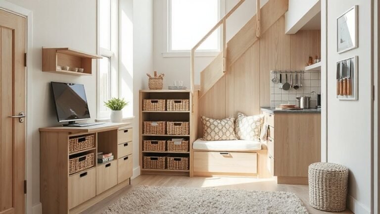
How to Plan for Storage and Budget: Common Costs You’ll Encounter
Planning for storage and budgeting starts with a clear picture of what you need and what it costs, so you don’t overbuy or overspend. You’ll map each room’s essentials, estimate deliveries, and account for installation time. Expect to encounter cabinet costs, closet upgrades, and specialty organizers.
Use Storage solutions to guide choices, prioritizing quality over impulse buys. Budget planning hinges on separating must-haves from nice-to-haves and leaving a 10–15% contingency for surprises. Track prices, compare installers, and time sales to maximize value.
Think long-term: durable materials reduce frequent replacements and clutter. Stay disciplined, adjust as you go, and avoid duplicating functions.
- Clear, functional closets with adjustable shelves
- Hidden storage integrated into seating or furniture
- Durable materials that withstand daily use
- Timely installations that minimize disruption
Frequently Asked Questions
How Do I Start When I Have No Design Background?
You start by trusting your instincts and learning the basics quickly. Consider color psychology to pick mood-friendly hues and use simple, balanced furniture placement.
Begin with a single room, measure space, and sketch layouts before buying.
Gather versatile pieces, test paint samples on a wall, and keep notes.
Ask for feedback, adjust lighting, and document what works.
Stay practical: prioritize comfort, flow, and cohesion, so each choice supports your overall look and feel.
What Mistakes Ruin a Cohesive Color Story Quickly?
Color coordination can go wrong fast if you chase trends instead of harmony, honestly. Palette mismatches derail a room the moment you add a random accent.
You’ll ruin a cohesive color story by choosing hues that fight each other, or by piling too many contrasting tones.
Stick to one base, one or two supporting colors, and repeat them.
You’ll avoid chaos, create balance, and keep the space feeling intentional, not chaotic.
How Can I Test Lighting Effects Before Buying Fixtures?
To test lighting effects before buying, you can simulate scenes using dimmers, lamps, or apps that model color temperature and brightness.
Start with lighting placement sketches, then place temporary lamps in those spots to compare shadows and mood.
Check fixture compatibility by confirming bulbs, wattage, and size fit your ceiling, wall, or cabinet spaces.
Use a white surface to gauge color accuracy, and adjust until you’re satisfied with the overall balance and functional brightness.
When Should I Refresh Rather Than Replace Furniture?
You should refresh furniture when it no longer supports your daily habits or both fits and feels out of date, like a tired suit that doesn’t suit you anymore.
Consider furniture longevity, and opt for updates, not constant replacement, when frames or fabrics show wear rather than structural failure. You’ll save money with targeted updates, and achieve style updates by swapping accents, reupholstering, or refinishing rather than a full substitution.
What Budget Mistakes Drain Costs Unexpectedly?
Budget planning stops cost overruns by forecasting every expense, including delivery fees and taxes. You’ll avoid surprises if you itemize essentials, decide on priorities, and set a contingency of 10–15%.
Track every purchase, compare quotes, and resist upgrades mid-project. Don’t overlook disposal, installation, and warranty costs.
Conclusion
You’ve got the tools to transform a space into a calm, usable home. Picture each room as a well-tuned instrument: measurements aligned, furniture scaled for comfort, a cohesive color story echoing softly, and lights layering like a warm sunrise. Hide clutter behind thoughtful storage, let windows frame views, and furniture arrangements invite conversation. When you balance access, texture, and budget, your space becomes inviting, functional, and unmistakably yours. Now, start with a plan and make it real.