Clear pathways, airy walls, and furniture that breathes will instantly make your space feel larger. Start by defining zones, keep only essential pieces, and choose low-profile, flexible items that reconfigure with ease. Maximize natural light with smart window treatments and mirrors, and use negative space to balance busy zones. Layer rugs carefully and align colors for cohesion. Ready to apply these ideas without clutter? The results will reveal themselves as you test each change.
Key Takeaways
- Define clear zones with boundaries, sightlines, and dedicated storage to create a sense of order and space.
- Use low-profile, modular furniture along main traffic routes to maintain open aisles and flexible layouts.
- Maximize light and reflection with natural light, mirrors, and light surfaces to enhance brightness.
- Employ a cohesive color, material, and pattern strategy to unify spaces and reduce visual clutter.
- Test layouts by walking routes, minimize clutter, and leverage negative space to improve movement and perception.
Make Space Feel Bigger: Core Principles Revealed
Lighten the feel of any room by clearly reading its boundaries: define where walls, windows, and furniture end so your eye can travel unobstructed. You’ll tune space perception by prioritizing clean sightlines and proportional gaps, letting scale register naturally.
Emphasize contrast and rhythm rather than clutter, because perceptual illusions rely on how you frame a scene. Use vertical elements to draw the eye upward, widening the sense of height without adding bulk.
Mirror placement can double a view, but avoid reflections that trap corners. Favor light, neutral tones with matte finishes to reduce glare, then insert a bold accent sparingly to anchor the eye.
Keep traffic clear; movement feeds perception, not chaos. With intention, you convert limited square footage into perceived expanses. Space perception sharpens, perceptual illusions become allies.
Define Zones First: Create Clear Functions Without Clutter
Start by outlining purpose-built zones before adding furniture, so each area serves a concrete function.
Keep the plan lean: avoid clutter by distinguishing zones with subtle cues like placement, lighting, and materials.
When functions are clear, flow becomes intuitive and spaces feel larger.
Define Clear Zones
- Assign a primary function to each space and honor it with intentional furniture.
- Let sightlines guide separation, not partitions or clutter.
- Use color, texture, and scale to reinforce zones without crowding.
- Maintain a consistent minimalist vocabulary to sustain perceived space.
This approach preserves openness while signaling distinct uses, maximizing perceived roominess and calm.
Function Over Clutter
Defining clear functions first keeps clutter at bay and makes every inch count. You’ll set zones that serve a purpose, not a mood board, so traffic flows smoothly and you use space efficiently.
Begin by mapping each area’s job: cooking, work, lounging, laundry, storage. Then assign dedicated storage solutions so belongings land in their homes, not on surfaces.
Keep decorative accents minimal and purposeful, reinforcing function without stealing space. Choose multiuse furniture that hides clutter and creates surfaces only where necessary.
Avoid overlapping tasks in one zone; use visual cues like rugs, lighting, or color to signal boundaries.
Regularly reassess layouts as needs change, trimming excess so rooms feel calm, cohesive, and visually larger.
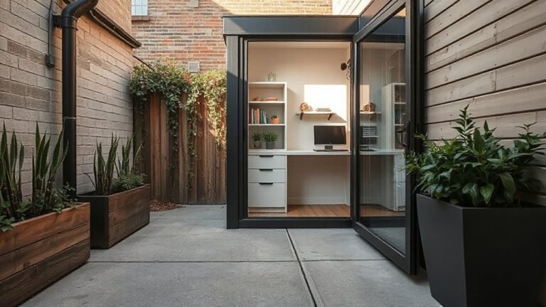
Choose Low-Profile Furniture for Better Airflow
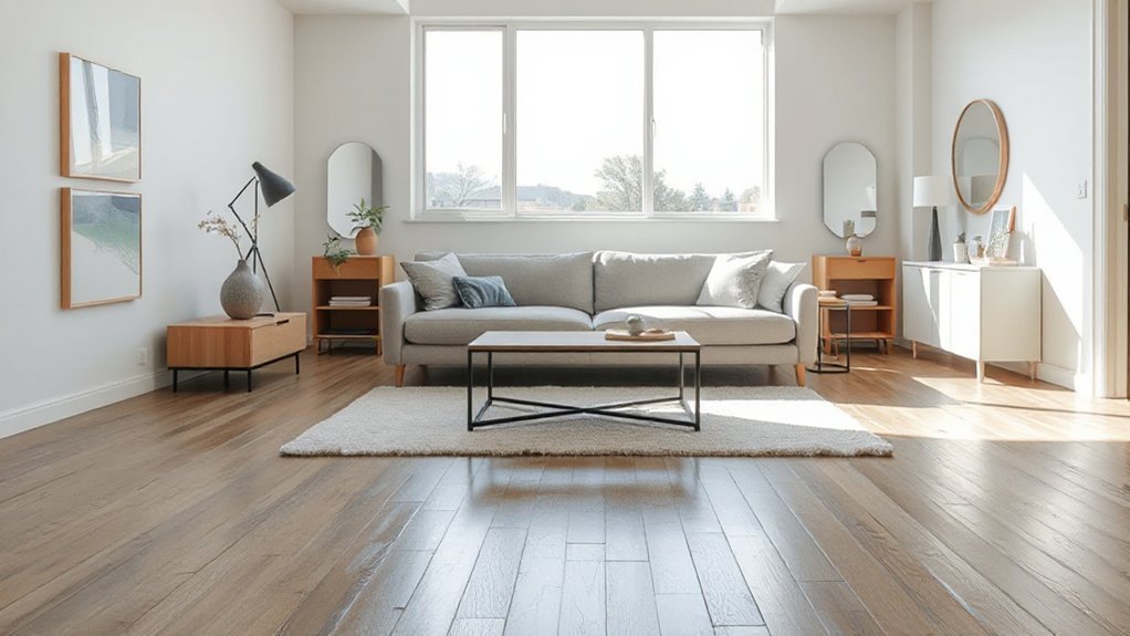
Opt for low-profile furniture to keep sightlines open and air moving freely through rooms.
By staying close to the floor, you reduce visual clutter while improving airflow and perceived space.
This approach pairs practicality with a clean, aesthetic vibe that supports a larger-feeling footprint.
Low-Profile Furniture Benefits
Low-profile furniture clears floor space and preserves sightlines, making rooms feel more open. You’ll notice the difference in movement, light, and perceived depth as clutter recedes. The approach supports space saving solutions and ergonomic design, letting you use every square inch without visual heaviness.
1) Maximized floor clearance keeps traffic flows smooth and rooms breathable.
2) Lower silhouettes reveal architecture and lighting, enhancing perceived size.
3) Slim profiles minimize shadowed corners, reducing visual clutter.
4) Modular options let you tailor layouts without overwhelming the space.
Choose pieces with smooth edges, sturdy bases, and neutral finishes to elongate lines. Prioritize multifunctional items that double as storage or seating. Opt for lighter woods or fabrics that reflect daylight, preserving harmony between function and aesthetics.
Enhance Airflow With Furniture
Choosing low-profile furniture isn’t just about looks; it directly improves airflow by keeping sightlines clear and air moving beneath pieces. When you select slim profiles, you create physical space for circulation, reducing visual clutter and enhancing ventilation.
Position pieces to support a natural flow, aligning seating with doorways and vents to promote consistent movement of air—this is airflow optimization in practice. Avoid oversized blocks that disrupt paths; instead, choose compact sofas, chairs, and media consoles that breathe.
In your furniture arrangement, leave generous gaps for air to travel around furniture legs and under raised platforms. Pair this approach with lighter fabrics and reflective finishes to minimize heat buildup.
The result is a calmer, cooler room with enhanced perceived spaciousness and better air distribution.
Create Easier Traffic Flow With Clean Aisles
Clear pathways are essential for a room to feel airy. You’ll improve flow by prioritizing movement and minimizing obstacles, directly supporting traffic optimization. With deliberate choices, you create space that invites use without feeling crowded, all while preserving aesthetics.
- Arrange furniture to align main traffic routes, keeping aisles clear and sightlines open.
- Group related pieces, preserving single-file paths and reducing side-chession clutter.
- Elevate underused zones with wall niches or slim consoles to free floor space.
- Test your layout by walking the intended routes, adjusting for bottlenecks and easy turning.
Key tactics: furniture arrangement guides how you move; traffic optimization minimizes friction. Keep scales balanced, avoid oversized pieces in narrow halls, and maintain consistent gaps for seamless navigation.
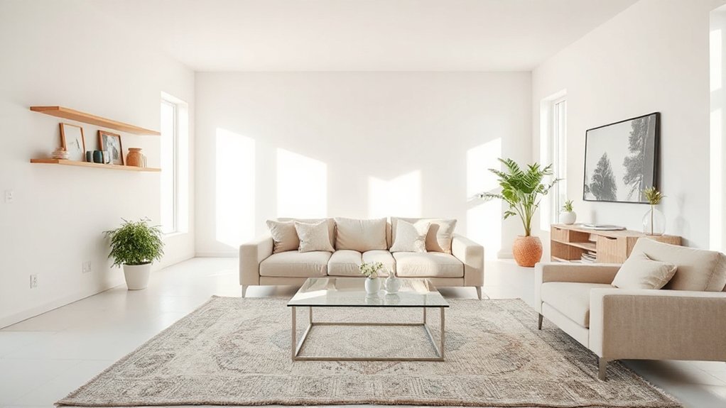
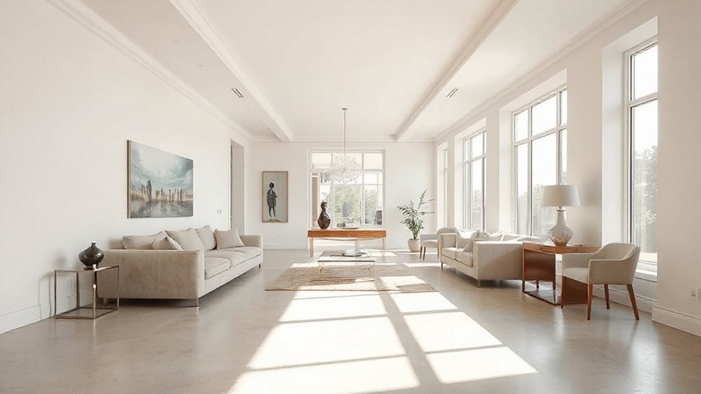
Let in Light: Maximize Natural Light and Reflective Surfaces
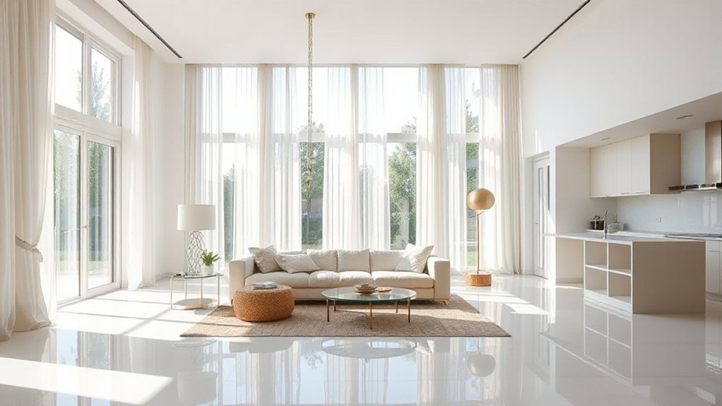
Let the outdoors brighten your rooms by inviting in natural light and reverberating it with reflective surfaces. You optimize daylight by choosing window treatments that shade without blocking: slim blinds, airy curtains, or translucent shades.
Position mirrors and metallic accents to bounce light deeper, especially in darker corners. Clear glass surfaces, like coffee tables, keep lines open and resist visual clutter.
Keep a low-contrast palette to amplify luminance, letting natural brightness become the dominant element. Avoid heavy draperies that trap dimness; instead, layer where needed for glare control.
Reflective surfaces—polished stone, glass, or lacquered finishes—multiply radiance without adding bulk. In every choice, prioritize simplicity, function, and a seamless flow of daylight through connected spaces.
Window treatments and reflective surfaces maintain a brighter, more expansive ambience.
Create Visual Unity With Color and Material Coherence
Color and material coherence ties spaces together by repeating tonalities and textures across rooms, creating a calm, uninterrupted flow. You’ll achieve this by applying deliberate color harmony and material consistency, so progression feels seamless rather than jolting.
- Select a restrained palette and carry it across furniture, textiles, and finishes.
- Match wood, metal, or stone finishes to reinforce unity without monotony.
- Use consistent light exposure and reflectivity to maintain rhythm.
- Favor cohesive textures—matte surfaces with subtle sheen prevent visual fatigue.
This approach keeps the eye moving smoothly, reducing perceptual breaks. You gain a quiet sophistication, where form follows function. Color harmony guides focal points, while material consistency anchors the room’s identity.
The result: an expansive feel achieved with purposeful, minimal variation.
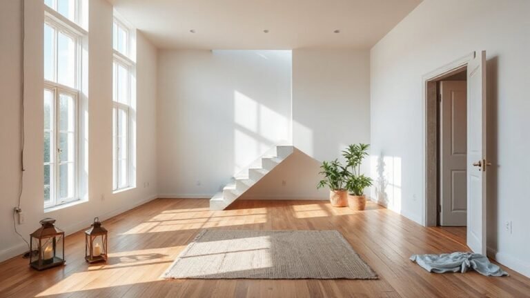
Use Walls and Ceilings to Expand Perception
You can use wall illusion tactics and ceiling height tricks to make spaces feel instantly larger. Think about light walls, subtle vertical patterns, and keeping ceilings visually uninterrupted to extend sightlines.
Small changes here set up the conversation for how walls and ceilings alter perception throughout the room.
Wall Illusion Tactics
Walls and ceilings can be used to trick the eye into making a room feel more expansive. You’ll deploy precise contrasts and proportional tricks that sharpen perception without clutter. Use these wall illusion tactics to subtly widen a space and guide attention.
- Choose color psychology tweaks with cool tones on walls and lighter tones on adjacent surfaces to extend depth.
- Align wall art arrangements in a linear rhythm, spacing pieces evenly to create a continuous focal plane.
- Apply vertical or diagonal patterns to push ceilings higher, avoiding heavy frames that crowd sightlines.
- Embrace negative space around furniture; let shelves, mirrors, and art breathe for a cleaner horizon.
These moves prioritize clarity, balance, and restrained elegance over busy decoration.
Ceiling Height Tricks
Start by painting ceilings a shade brighter than adjacent walls to bounce light upward, creating apparent height. Narrow, recessed lighting or uplights draw the eye upward without cluttering surfaces.
Consider continuous crown molding or a slim, uninterrupted trim to guide gaze along the room’s length, enhancing perceived height. Soften upper edges with sheer window treatments that skim the ceiling instead of stacking heavy drapes.
Choose furniture with a low profile and wall-mounted storage to keep floor space clear, expanding vertical perception. Finally, align art and shelves higher than typical eye level to reinforce the sense of vertical space.
Ceiling height, vertical space.
Let Negative Space Breath: Balance Fill and Silence
Negative space isn’t empty air; it’s intentional silence that lets your rooms read clearly. You’ll feel the impact when you pace your composition, not pile it on. Negative space, visual breathing, becomes a design tool you control with margins, gaps, and height.
- Prioritize clear sightlines and generous whitespace around key pieces.
- Balance bulk with empty zones to prevent clutter and fatigue.
- Let shadows and subtle textures define edges, not lines.
- Review every surface, removing nonessential accents for quiet coherence.
This approach is pragmatic: you calibrate restraint as a feature, not a limitation. By honoring negative space, you create room for movement, light, and function. Your eyes travel, not grind. The room reads calmer, more intentional, and distinctly yours.
Rug Layering Without Overwhelm: Size, Texture, and Placement
Rug layering can amplify space without crowding it, if you size, texture, and place with restraint. You’ll layer textiles by choosing one dominant rug and a secondary, smaller piece that nudges edges without sharps or clutter.
Keep the largest rug aligned with furniture lines, not walls, to preserve sightlines. Texture contrasts matter: a flat-welt sisal under a plush velour creates depth without visual bulk. Use low-pile next to high-pile to avoid catching feet or tripping focus.
Aim for borders that reveal floor between layers; avoid overlapping edges that create a single, heavy field. Specify scales that echo room proportions—large rooms tolerate bigger repeats, compact spaces benefit from tighter patterns.
This approach balances tactility with restraint, yielding a cohesive, open feel.
Flexible, Multi-Use Pieces for Dynamic Rooms
Flexible, multi-use pieces are the simplest way to adapt a room on the fly: a modular sofa, an extendable coffee table, and storage ottomans that double as seating keep traffic clear while expanding function.
- Choose modular furniture that reconfigures for gatherings or daily use.
- Pair adaptable layouts with smart storage to reduce clutter.
- Prioritize pieces that serve dual purposes without sacrificing comfort.
- Favor clean lines and hidden casters for effortless reconfiguration.
With the right selections, you create flexibility without visual chaos. You’ll notice how adaptable layouts encourage circulation and permit quick shifts between zones.
This approach reinforces a calm, cohesive aesthetic while maximizing square footage. Modular furniture remains your most practical solution for dynamic spaces.
Frequently Asked Questions
How Can I Measure Space Before Reconfiguring Furniture?
Take precise measurements first. You measure space by marking furniture dimensions and noting doorways, windows, and obstacles.
Use measurement tools like a tape measure, laser measure, and a notepad for notes.
Start with the footprint of each piece, then add clearance around stairs and paths.
Measure ceiling height and column placements if relevant.
Draft a simple plan, compare it to your space, and adjust furniture dimensions to fit without crowding.
Consider flexible layouts before committing.
Which Rooms Benefit Most From Open-Plan Adjustments?
Open-plan adjustments benefit living rooms and dining areas the most, because their flow and sightlines gain impact with fewer barriers. Start strong: studies show homes feel up to 20% larger when sightlines are uninterrupted.
You’ll want cohesive color schemes and compatible furniture styles to maintain rhythm. Use light, neutral tones with accent colors to define zones.
Prioritize flexible furniture and thoughtful circulation, so you preserve function while maximizing space in these rooms.
Can Mirrors Truly Enhance Perceived Room Size?
Yes, mirrors can truly enhance perceived room size. You’ll notice brighter, deeper spaces when you use decorative reflections strategically.
Start with mirror placement opposite a window or across from a light source to double light and visually expand walls. Choose frames that suit your style for cohesion.
Keep reflections clean and uncluttered, avoid doubling objects, and balance pairs or layouts to avoid busy focal points.
What Light Sources Create the Illusion of Height?
Ceiling lighting and natural skylights create the illusion of height. You’ll notice brighter ceilings pull your gaze upward, while skylights bathe rooms in vertical daylight, reducing heaviness.
You should layer light: indirect ceiling fixtures, recessed kits, and task lamps near walls to prevent glare. When you use ceiling lighting deliberately, you feel taller spaces without structural changes.
Embrace skylights for honest daylight; you’ll sense airiness without sacrificing coziness.
How Do I Avoid Overcrowding After Adding Multi-Use Pieces?
To avoid overcrowding after adding multi-use pieces, you prune clutter and plan furniture arrangement carefully. Start by prioritizing clear pathways and defining zones.
Use color schemes that unify spaces, keeping walls light and cohesive. Choose slim profiles, double-duty pieces, and scalable storage.
Rotate or desk-stow items weekly to maintain openness. Visualize sightlines, place sofas against walls, and anchor with a single focal point.
Balance proportions, so your furniture arrangement feels intentional, not crowded.
Conclusion
In a room you can feel the air tighten or loosen with a single choice. Picture clear aisles, walls hosting softly-misted light, and furniture that slides into space rather than crowding it. You’ll sense how negative space breathes, how mirrors catch a glow, how low profiles skim the ceiling line. The next move isn’t clutter but strategy: define zones, layer textures, and perch versatile pieces where you’d least expect. Watch the space reveal itself—quiet, expansive, inevitable.