Color is your compass, guiding every room into a single, steady story. You’ll start with a calm base, add repeating accent tones, and tune saturation for each space based on light. Keep textures and patterns intentional to avoid clutter, then test swatches in different conditions and document what works. If you map the palette to lighting and layout first, you’ll see where small tweaks matter most—and you’ll want to push further before you commit. The key reveal awaits in how you apply it room by room.
Key Takeaways
- Start with a dominant base neutrally toned palette and build repeating accent colors for cohesion across rooms.
- Balance neutrals with pops of color and varied textures to add personality without visual chaos.
- Map colors to lighting and space, adjusting saturation for natural and artificial light conditions.
- Tailor palettes room-by-room by function, using calm neutrals in living areas and durable, brighter accents in kitchens/baths.
- Test swatches in real lighting, track tweaks, and allow time for rooms to breathe before finalizing.
Identify Your Core Palette and The Mood It Creates
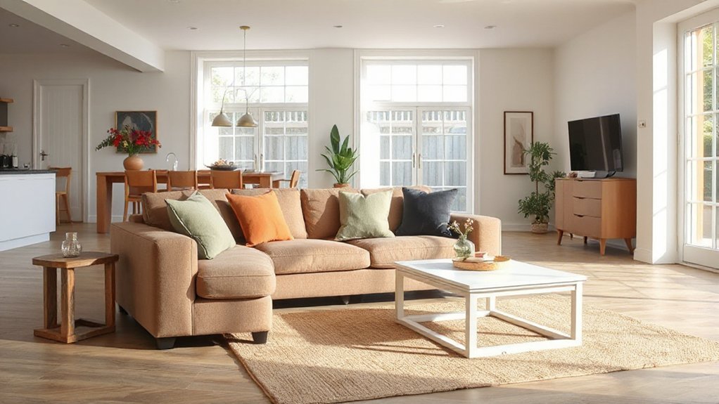
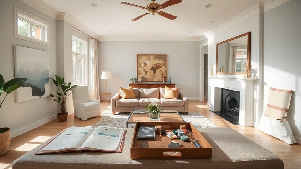
Choosing a cohesive colour scheme starts with your core palette. You identify the hues that define your spaces, then map how they interact. Start with a dominant base—neutral or muted—so your rooms feel grounded.
Add a few accent tones that repeat across areas to create visual threads. Your core palette should reflect function and light: cool tones in high-traffic spaces for freshness, warmer shades where you want cosiness.
Consider contrast levels, avoiding jarring jumps; you want smooth progressions rather than abrupt shifts. Define how each color supports mood creation: serene, energised, or focused.
Test swatches under natural and artificial light, noting how textures modify perception. Document your decisions so future renovations stay faithful to the original mood you intended.
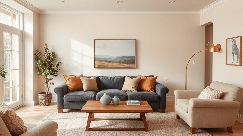
Balance Neutrals With Color Pops and Texture
Neutral bases ground the scheme, while color pops and texture deliver personality and tactility. You balance neutrals with deliberate contrast, letting accents breathe without overwhelming the room. Choose one or two accent walls to anchor focal points, using a bolder hue or subtle depth variation—then repeat the color story in décor to reinforce cohesion.
Layer texture through fabrics, rugs, and natural materials to add depth without clutter. Limit pattern mixing to two complementary scales: a large, restrained motif on a throw or pillow, and a smaller, geometric or organic print elsewhere. This keeps the eye moving without chaos.
Maintain proportion: neutrals dominate, color pops highlight, texture grounds. Done correctly, the space feels curated, purposeful, and visually dynamic.
Map the Palette to Lighting and Space-Filling Details
To map your palette to lighting and space-filling details, start by matching each color’s function to the room’s light and scale. You’ll translate brightness, warmth, and contrast into purposeful choices, ensuring hues support form, texture, and architectural features.
Consider how natural and artificial light shift tones throughout the day, and adjust saturation for visibility and mood. Pair light-reflective surfaces with deeper accents to prevent flatness, and use space-filling details to reinforce hierarchy without overcrowding.
This approach elevates cohesion, stability, and flow across rooms.
- Lighting considerations shape tone, depth, and perceived size
- Reflectivity and temperature affect color accuracy
- Scale aligns with furniture and architectural elements
- Contrast guides focal points without harsh separations
- Spatial rhythm ties rooms into a single narrative
Apply the Palette Room by Room for Function
Begin by assigning each room a primary function and then tailor the palette to support that purpose. You’ll align color psychology with activity—calm neutrals in living areas, brighter accents for focus zones, and muted tones in circulation spaces.
Apply the palette room by room, prioritizing coherence while honoring function. In kitchens and baths, use durable finishes and high-visibility color for quick recognition. In bedrooms, favor soothing hues that promote rest. In workspaces, introduce subtle contrast to sharpen focus without strain.
Decorative accents should echo the core palette to reinforce unity. Balance warmth and coolness across zones to avoid jarring progressions. Maintain logical flow from room to room, ensuring lighting, texture, and material choices support each function while preserving overall harmony.
Test, Tweak, and Avoid Common Mistakes
Before finalizing your palette, test it in real life and be prepared to iterate; small shifts can prevent big mismatches later. You’ll learn what actually works, not just what looks good on swatches. Use lighting, room size, and traffic to judge color feel, not just hue. Consider color psychology in each space to guide energy and mood, and be mindful of Cultural influences that alter perception. Keep notes of what you adjust and why, so you avoid repeating mistakes.
Aim for harmony across rooms, then fine‑tune contrasts for depth. Be deliberate with finishes and samples, and give rooms time to breathe before final decisions.
- Test under different lighting
- Compare real-life swatches at scale
- Track psychological intent per room
- Respect cultural cues and sensitivities
- Document tweaks for consistency
Frequently Asked Questions
How Do I Choose Colors for a Rental Space I Don’T Own?
Yes, you can choose colors for a rental space by focusing on temporary decor and rental-friendly palettes. Start with a neutral base you’ll keep, and add accent pieces you can remove easily.
Opt for washable, low-commitment finishes and removable wallpapers or decals. Use color strategically in textiles and accessories, not walls.
Consider temperature groups (warm vs cool) for cohesion. Prioritize lighting, then test swatches, and document everything for the next renter.
Can I Use Bold Colors Without Overwhelming Small Rooms?
Yes, you can use bold accents without overwhelming small rooms. Think of bold color as a punctuation mark: you place it sparingly for impact, not for coverage.
Start with a neutral canvas, then introduce bold accents on a single feature wall, textiles, or accessories. Maintain color balance by repeating one bold hue in small doses across the space.
Trust contrast and scale, and you’ll create clarity, depth, and a dynamic, lived-in flow.
Should I Prioritize Color Flow Over Distinct Room Themes?
Yes, you should prioritize color flow over distinct room themes. You’ll achieve Color harmony by linking neutrals and accents across spaces, so progressions feel seamless.
Maintain Theme consistency by repeating core hues in furniture, fabrics, and finishes, then vary saturation for interest. Use a cohesive palette, not identical palettes, to guide decisions.
Keep contrasts deliberate, textures subtle, and lighting aligned, so shifts feel intentional rather than jarring. This approach keeps your home unified and practical.
How Many Shades Are Too Many in a Cohesive Scheme?
Answer: Three to five shades total keeps cohesion without confusion.
Color psychology guides you to use one dominant color, a couple of supporting tones, and an accent wall for emphasis. You’ll stay consistent by applying the same hues across rooms, with variations in value and saturation.
Don’t overdo it—an accent wall spotlights depth and interest. Use 1–2 neutrals, 1 primary color, 1 secondary, and 1 accent to keep balance and clarity throughout the home.
What Are Budget-Friendly Ways to Refresh a Palette?
Yes—budget-friendly ways to refresh a palette include leaning on your color wheel to spot complementary colors you already own. Swap small accents first: pillows, throws, frames, and textiles in contrasting hues.
Paint a single feature wall or door to anchor the scheme without a full redo. Use affordable swaps like washable wallpapers or decals for texture.
Prioritize harmony: balance bold complementary colors with neutrals, and test palettes in your lighting before committing.
Conclusion
To finish strong, commit to a single core palette and repeat its accents across spaces for flow. Prioritize neutral bases and carefully controlled pops to keep rooms cohesive, while textures add depth without clutter. Map lighting to your hues and test swatches in multiple conditions to avoid surprises. As a quick stat: homes with a chosen, repeatable palette report 40% faster decision-making during decorating. Tweak boldly, document changes, and trust the system you built.