Texture is the quiet argument you make about a room—soft wool, nubby linen, and sun-warmed wood all speaking in tactile whispers. You’ll notice how layered cushions, tactile wall coverings, and natural materials transform a neutral palette into a responsive space, one that invites you to touch and linger. With thoughtful lighting and purposeful accents, you’ll see a balance emerge—enough contrast to keep things lively, yet calm enough to feel cohesive. The next step reveals how you can shape that balance.
Key Takeaways
- Layer textures through textiles, rugs, and upholstery to add tactile depth without overwhelming a neutral palette.
- Use varied lighting (ambient, task, accent) to create warmth and highlight textured features.
- Introduce subtle color and natural materials (wood, stone, linen) to soften neutrals and add organic contrast.
- Add visual interest with textured edges, layered throws, and statement yet restrained accessories.
- Create defined zones with textured rugs and cushions to enhance depth while maintaining a calm, cohesive space.
How to Add Texture With Tactile Materials
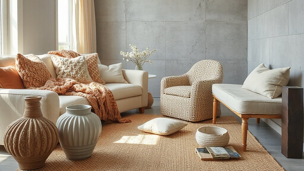
Texture begins with tactile materials you can feel in every corner—think cozy boucles, nubby bouclé, brushed velvet, and natural fiber weaves. You select tactile wall coverings and textured upholstery to establish immediate depth.
In practice, place a dense, woven panel at eye level to anchor the room’s rhythm, then add a padded, textured sofa or chair to echo the wall’s character. Look for fibers with interesting hand, like loops, nap, or a slight sheen, and note how light interacts across surfaces.
Pair matte textures with a subtle sheen to avoid visual competition. Keep scale deliberate: large panels and oversized cushions balance small, intricate weaves.
Finish with minimal metal or wood accents to let texture remain the focal point without competing.
Layer Warmth With Lighting: a Practical Plan
You’ll map warmth across your space by layering lighting sources—ceiling, lamps, and accent fixtures—so every zone feels inviting.
A practical plan focuses on color temperature, brightness levels, and placement to highlight textures and furniture silhouettes without glare.
Start with a cohesive scheme that blends function and mood, then adjust through small, intentional tweaks.
Layer Warmth With Lighting
Wondering how lighting can layer warmth into a room? You’ll approach this with intention, not glare. Start with ambient glow to fill shadows softly, using fixtures that hug the ceiling or walls so light feels embedded, not overpowering.
Then introduce task lighting for function without breaking the mood, choosing bulbs with a warmer color temperature to twin your neutrals rather than clash with them. Opt for dimmers, so you can sculpt intensity as the day shifts.
Build contrast by balancing warm-toned rays against cool accents, letting wood grains and textiles drink in the glow. Avoid harsh, direct beams; curate a layered palette where every source contributes depth.
The result: a cohesive, inviting atmosphere where warmth feels engineered, not accidental.
Practical Plan For Lighting
To layer warmth with lighting in a practical plan, start with a clear layout that maps zones for ambient, task, and accent illumination. You’ll prioritize lighting fixtures that complement furniture silhouettes and architectural details, avoiding glare and harsh contrast.
For ambient glow, place ceiling fixtures or wall sconces to wash walls evenly, then add dimmers to modulate mood.
In task areas, select brighter, color-balanced lamps that reduce eye strain during reading or crafting.
Accent lighting should highlight textures, art, and architectural features without overpowering the room.
Lamp placement matters: distribute sources to eliminate shadows and create depth, aiming for layering from multiple angles.
Coordinate finishes and bulb temperatures to preserve the neutral palette while enhancing warmth and visual interest.
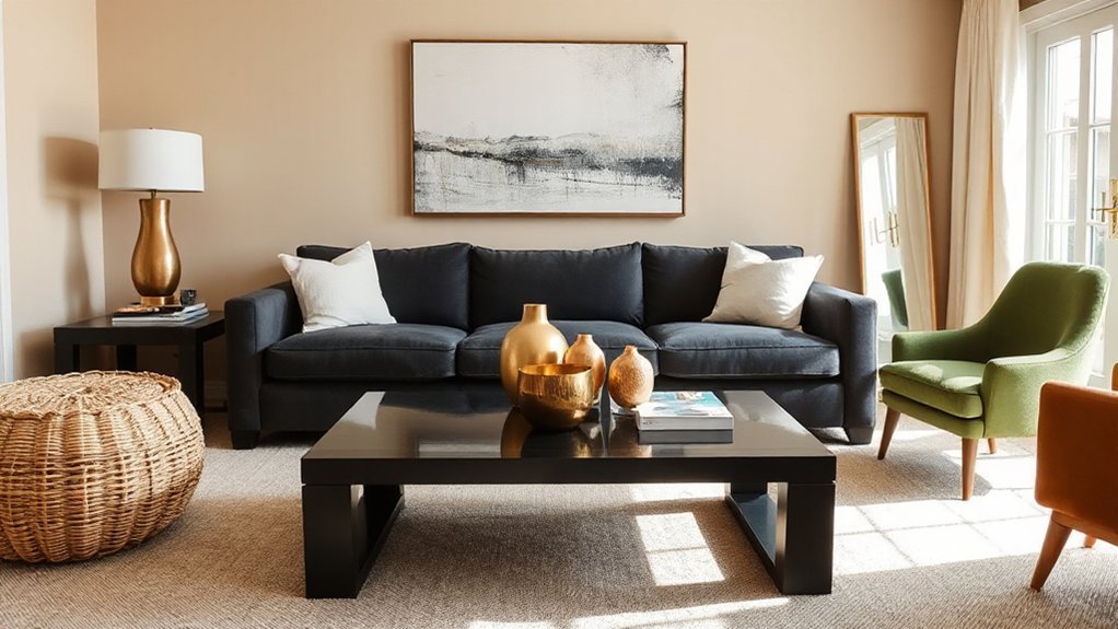
Introduce Subtle Color Pops With Art
Art that whispers with color can pull a room together without overwhelming it. You’ll introduce subtle pops by selecting one statement piece and supporting it with restrained accessories.
Choose vibrant wall art that echoes your neutral base—think botanical prints or abstract shapes in a small to medium scale. Balance withheld color with negative space so the image remains the focal point, not a distraction.
Pair the piece with colorful throw pillows in a single contrasting hue or a coordinated trio, keeping patterns simple and repeating the color from the artwork. Integrate texture through a woven frame, matte finish, or a subtle glaze to deepen the tonal punch without shouting.
Maintain a calm rhythm by repeating the hue across textiles, ceramics, and accent throws.
Blend Metals With Natural Elements
You’re balancing mixed-metal accents with raw natural elements, letting copper or brass catch the light against wood, stone, or linen.
Pair rough textures with sleek metal to emphasize texture-rich details, from hammered surfaces to matte finishes. This approach creates a cohesive room where metallic reflections point to nature’s warmth and tactile depth.
Mixed-Metals Accents
Integrate vintage finishes on hardware or frames to amplify the aged patina, then balance with clean lines to keep the space modern. Geometric patterns—triangles, hexagons, or stepped rectangles—beneath plates, rugs, or tile reinforce structure amid the mix.
Keep scale deliberate: small accents multiply impact; large pieces unify the composition, ensuring the mix feels intentional, not chaotic.
Natural Element Pairing
Natural elements soften gleaming metals by pairing warm or cool finishes with wood, stone, or ceramic textures. You’ll balance brass with a raw oak surface, or satin nickel against slate, letting contrast guide the eye.
Choose botanical accents—feathery ferns, sculpted eucalyptus—that echo metal’s reflectivity without competing with it.
Integrate organic shapes: rounded pendants, pebble-like hardware, curved furniture silhouettes that mirror a natural flow.
Keep scale precise: a slim metal frame around a stone tabletop creates a defined edge, while a wider wooden base softens the gleam.
Introduce texture through matte coatings on metal or a subtle grain in wood, ensuring the finish doesn’t overpower the palette.
The result remains clean, cohesive, and visually engaging, with metallic gleam anchored by nature-inspired form.
Texture-Rich Details
Textured interplay elevates metal and natural elements by inviting tactile contrast. You blend brushed brass with weathered wood, pairing gleam with grain to form a tactile narrative across surfaces.
Focus on pattern contrast: repeat subtle metallic flecks against matte stone, then echo that rhythm in textiles for cohesion. You’ll notice how color harmony anchors the contrast, choosing a restrained palette—stone, taupe, and gilded accents—that lets texture do the talking.
When you introduce woven rattan cushions beside a steel coffee table, the visual weight shifts without clutter. Maintain clean lines and purposeful gaps to prevent overstatement.
Let natural imperfections—the grain, knots, and patina—become focal points. In short, texture guides depth, while metals and nature stay intentionally coordinated.
Ground the Room With Textured Textiles and Rugs
Texture and depth begin at the floor: layer warm, tactile textiles and rugs that invite touch and anchor the space. You choose materials with evident texture—ribbed weaves, boucle, jute, and dense pile—so light, color, and form read as a single, grounded surface.
Place a large, neutral rug under seating to define zones, then add smaller layered runners or cushions to echo color. Consider a bold pattern as a focal cue: a carefully scaled rug or a throw with a graphic motif can energize the room without shouting.
Pair textiles with a clean, unobtrusive palette to preserve calm. If you want a visual punch, a statement wall should coordinate, not compete, with the rug’s texture and color.
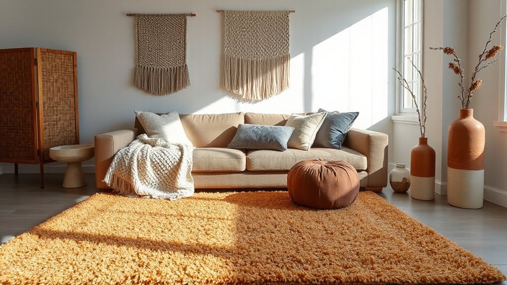
Create Cozy Corners With Functional Accents
Settle into intimate pockets by pairing comfort with function: a compact chair or floor-seat, a small side table, and a warm, tactile throw. You curate a corner that reads calm yet intentional, every element speaking with purpose.
Choose decorative storage that hides clutter while showcasing texture—woven baskets, slim wall shelves, and a lidded box in a contrasting finish. A compact sofa or wedge chair, if space allows, becomes statement furniture that anchors the scene without overpowering it.
Layer quiet lighting—a narrow floor lamp, a puckered lampshade, and a dimmable glow—to sculpt cozy shadows. Ground the setup with a textured rug edge peeking beneath, and knit a few tactile cushions for depth.
Minimalism remains, but the corner feels alive and usable.
Frequently Asked Questions
How Do I Choose the Right Neutral Base for Accents?
To pick the right neutral base for accents, you choose a shade that supports color psychology goals and the room’s lighting.
If you want calm, go warm whites or greige; for crisp contrast, cool taupe or stone.
Test swatches on multiple walls, observe at different times, and pick one that won’t clash with your accent wall.
Consider undertones, depth, and how the base mirrors natural light to keep your accent walls striking.
Which Materials Feel Most Durable in High-Traffic Areas?
They’re the materials that survive the buzz of daily life: durable textures you can feel underfoot and in your grip. You’ll favor high-traffic survivors like luxe, tightly woven fabrics, and sturdy leathers, plus hard-wearing surfaces.
Luxury textiles stay plush with proper care, while metal finishes resist wear when you wipe, not scrub. You’ll notice the sheen age gracefully as you walk by, textures staying crisp, edges sharp, colors staying true in your high-traffic space.
Can Small Changes Truly Alter a Room’s Mood?
Yes, small changes can alter a room’s mood. You’ll feel it when color psychology guides your choices and lighting techniques sculpt the space.
You’ll pick warmer tones to cozy the atmosphere or cooler hues to sharpen focus, then layer light—ambient, task, and accent—for depth.
You’ll notice texture, scale, and contrast sharpen perception, making everything feel deliberate.
You’ll trust subtle shifts to drive mood, not overhaul.
Where Should I Place Accent Pieces for Balance?
Place your accent pieces to create a clear focal point while maintaining symmetry in decor. Start with a strong focal point—like a sofa console or fireplace—and balance it with matching lamps, art, or tables on both sides.
Use vertical height at eye level and mirror shapes for harmony. Distribute texture evenly, vary scale, and keep color ties consistent.
This deliberate focal point placement plus symmetry keeps the room visually balanced and inviting.
Do Budget-Friendly Options Work With Refined Interiors?
Budget-friendly options do work with refined interiors, yes—but you’ll need restraint. Start with color contrast to anchor a space without shouting.
Then add texture layering to convey depth, not clutter. You’ll pull this off by choosing one statement piece and building around it with complementary neutrals.
You get refined impact without excess, and your eye travels naturally. Practical, stylish, and surprisingly cohesive when you stay targeted, detail-driven, and deliberate about every accent you choose.
Conclusion
You’ve got the toolkit to transform neutral spaces into tactile, inviting scenes. Lean into varied textures, layer lighting, and sprinkle subtle color through art and accessories. Let natural materials—wood, stone, metals—ground the look, while textured textiles and rugs carve cozy zones. Use functional accents to invite lingering, not clutter. Think of your room as a woven tapestry—each element a thread that, when connected, reveals a richer, warmer picture. Enjoy the texture-rich journey.