Chances are you underestimate how much a single, cohesive color palette can quiet a room before you even notice it. You’ll start spotting soft neutrals, subtle textures, and matte finishes aligning like a chorus, then wonder how much calmer your space could feel with one deliberate swap. If you want a practical path—layered fabrics, gentle lighting, and tidy surfaces—you’ll find the next steps quietly compelling, shaping a space that breathes easier without shouting for attention.
Key Takeaways
- Use a calming color palette with analogous schemes and restrained pops; test in natural light and apply consistently on large surfaces first.
- Layer quiet textures (bouclé, velvet, linen) with low-contrast patterns to add depth without visual noise.
- Create ambient glow with dimmable warm LEDs and indirect lighting; layer multiple low-intensity sources for depth.
- Prioritize clear sightlines and open pathways; arrange seating to face focal points while maintaining generous margins.
- declutter surfaces, use practical storage, and include subtle greenery to reduce stress and enhance calmness.
How Calm Feels in a Room: Visual Cues That Speak Quiet
Calm in a room isn’t an accident; it’s the result of deliberate choices that shape perception. You create serenity by anchoring visuals to restrained contrast, balanced textures, and purposeful spacing.
Start with soundproofing techniques that reduce cluttered noise, letting hues and forms read clearly. Choose muted tones with subtle depth, avoiding jarring color shifts as you move through the space.
Let natural light guide your palette, pairing matte surfaces with gentle reflections to prevent visual fatigue. Introduce scent mood pairing to reinforce stillness without overpowering.
A calm room invites deliberate haptic details: a smooth surface, a soft weave, a deliberate absence of busy patterns. Maintain order through consistent scale and repetition, so every element reinforces quiet focus rather than distraction.
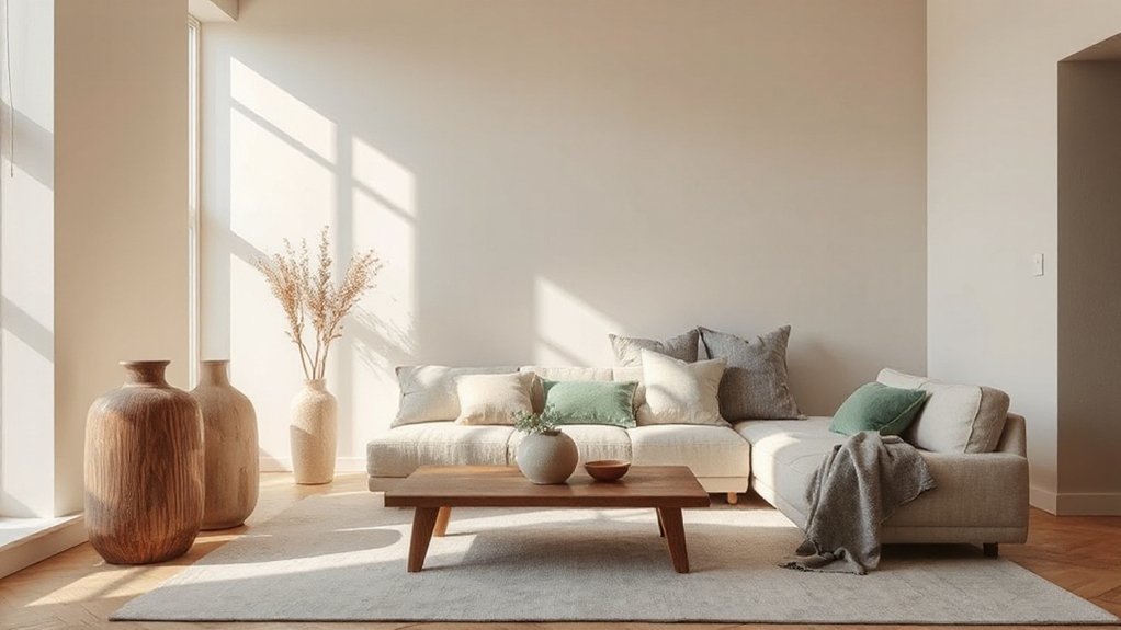
Start With a Soft, Cohesive Color Palette
Use color harmony principles: analogous schemes feel harmonious, while slight complements add depth without disruption. Test palettes in natural light at different times of day to confirm mood everywhere.
Limit saturated accents to sparing—choose one or two restrained pops that draw the eye rather than shout. Documentful color swatches, and apply them consistently on large surfaces first, then mirror with accessories.
Mood enhancement relies on deliberate repetition, predictable rhythms, and a quiet, intentional palette.
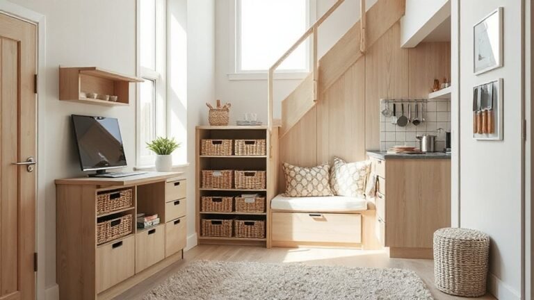
Layer Textures for Quiet Comfort
Layer textures anchor quiet comfort by pairing tactile materials like boucle, chenille, and felt with smoother finishes. You’ll balance layered textures—soft, fuzzy, and matte—to create depth without visual noise.
Start by selecting complementary pairs that feel cohesive under the same lighting and scale.
Layered Material Textures
- Pair velvet cushions with a linen sofa for subtle depth
- Layer a wool throw over a smooth cotton blanket
- Introduce a ribbed rug beneath a sleek leather chair
- Combine matte wood with glass for restrained shine
- Dial in metal accents with fabric-covered lampshades
Quiet-Comfort Textural Pairings
Quiet-comfort textures hinge on thoughtful pairings that soften edges without dulling definition. You’ll balance tactile variety to create calm without clutter, mixing matte weaves with subtle sheen and natural fibers with low-contrast patterns.
Pair a plush upholstery with a crisp linen throw to keep rooms grounded, then layer in a coarser wool rug to anchor sound in high-traffic zones. Keep color restraint: monochrome or near-neutral palettes preserve serenity while texture does the talking.
Incorporate practical tech-conscious details through soundproofing techniques, ensuring materials meet comfort without sacrificing airflow. Consider acoustic panel ideas that blend with décor—gridded wood frames, fabric-wrapped panels, or recessed inserts—so function feels intentional, not clinical.
Finalize with minimal accessories, allowing textures to guide the room’s quiet, confident mood.
Lighting That Breathes: Gentle, Ambient Glow
You’ll start with a soft glow that feels effortless yet intentional, using gentle layers to avoid harsh hotspots. Consider Soft Glow Techniques to cast even warmth.
Layered Light Balance to prevent flatness, and Warm Dimmer Cues to cue atmosphere without brightness spikes. Keep your setup precise and adaptable, so the room breathes with ambient harmony rather than glare.
Soft Glow Techniques
- Use dimmable warm LEDs and place them behind furniture edges for soft walls.
- Favor indirect lighting like coves, shelves, and top-down lamps.
- Layer multiple low-intensity sources to weave depth.
- Choose matte shades and lampshades that diffuse rather than transmit harsh beams.
- Align brightness with task needs, not fashion, to sustain calm.
This approach keeps spaces intimate and legible, enabling you to read, relax, or converse without distraction.
Fine-tune based on room size, color, and texture, and you’ll achieve a consistently serene glow.
Layered Light Balance
Place a soft ceiling glow or diffused pendants to establish natural diffusion, avoiding glare that hunts corners. Add warm task lamps near work zones, dimmable to suit mood without abrupt shifts.
Use ambient shadows to sculpt depth, letting furniture edges soften rather than sever light from form. Coordinate color temperatures within a narrow range to keep harmony, not contrast.
Test at eye level, not ceiling height, and adjust angles so reflections stay controlled. The result: breathable brightness, practical clarity, and a calm, deliberate atmosphere.
Warm Dimmer Cues
- Define intent before you adjust
- Use dimmers for all primary zones
- Match bulbs to decor tones
- Sync lighting with scents
- Observe and iterate refinements
Declutter Your Surfaces, Clear Your Mind
Decluttering your surfaces isn’t about chasing perfection; it’s about reclaiming focus. When you clear flat expanses, you reduce visual noise and give your brain room to decide what matters.
Start with a single surface—mail, keys, gadgets, and a decorative item you truly love. Remove everything else, wipe the area, and place only essentials in reach.
Establish a daily habit: five-minute surface checks before bed or after work, returning items to their homes.
Use practical storage: trays, labeled boxes, and vertical organizers that keep counters clean without feeling sterile.
Integrate Mindfulness meditation into the ritual by pausing to notice how calm the space feels.
Consider Aromatherapy practices with a subtle diffuser scent to reinforce the sense of order and intention.
Maintain momentum with consistent, purposeful touches.
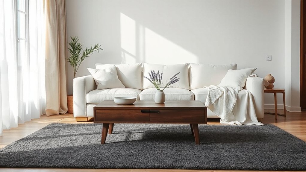
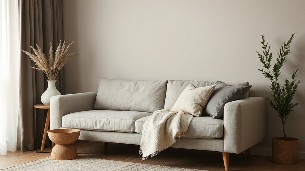
Calming Fabrics: Upholstery and Throws to Pick
When you choose calming fabrics, prioritize soft texture across upholstery and throws to create immediate comfort.
Pair neutral color palettes with durable mood materials to maintain a serene, lasting look.
This approach keeps your space cohesive, practical, and ready for everyday life.
Soft Texture Choices
Ever wondered which fabrics truly calm a room? You’ll pick soft textures that feel deliberate, not decorative. Choose upholstery and throws with density and restraint, prioritizing tactile quality over flash.
Opt for fabrics that drape smoothly, resist pilling, and invite touch without shouting color. You’ll notice how textured walls and plush rugs ground the space while soft textiles absorb echoes and elevate comfort.
Stick to a narrow palette to keep calm, and rotate surfaces seasonally to preserve interest without clutter.
- Dense cotton bouclé upholstery for warmth
- Velvet accents in muted tones for subtle shine
- Woven wool throws with tight weaves for structure
- Linen blends with low sheen for breathing room
- Fleece-lined throws for cozy, approachable softness
Neutral Color Palettes
Aim for consistency: limit furniture upholstery to two to three neutrals, then introduce contrast with cushions, throws, and rugs.
Prioritize fabrics with depth, like cotton blends, linen, or wool, that drape well and wear gracefully.
Your goal is subtle serenity, not monochrome sameness; vary tones within the neutral spectrum to avoid flatness.
Use lighting and accessories to reveal the palette’s warmth.
When you want a pivot, add Vibrant accents sparingly and balance them with bold patterns in small doses—think a single statement pillow or a patterned throw—so the room reads calm, polished, and intentional.
Durable Mood Materials
- Textural contrast
- Material durability
- Tight weaves
- Stain resistance
- Colorfast dyes
Subtle Patterns That Compliment, Not Compete
Subtle patterns can elevate a room without stealing the spotlight; when used strategically, they provide texture and depth that support rather than compete with larger elements. You’ll want patterns that soften hard surfaces while preserving quiet drama.
Choose textiles and surfaces with low contrast and measured scale, so the room reads cohesive rather than busy. Use subtle motifs—microstriping, faint geometrics, or botanical textures—on cushions, rugs, or curtains to add dimension without shouting.
Balance is essential: pair patterned pieces with solid foundations and keep the palette restrained. Bold contrasts can sneak in via a single accent, but don’t overdo it.
Pattern mixing should feel intentional, not accidental; let the motifs repeat across materials to thread continuity. Mastery lies in restraint, precision, and thoughtful placement.
Thoughtful Accessory Rules: Minimal, Purposeful Touches
In every room, select only the items that earn their place—each accessory should serve a clear function, add a point of calm, or tell a subtle story. You keep the look calm by embracing artful arrangement and intentional placement, avoiding clutter.
Choose pieces with purpose, display them thoughtfully, and resist duplicating signals. Maintain negative space to let each item breathe, and prefer quality over quantity. Use restrained color accents that echo the room’s palette.
The goal is coherence, not decoration for decoration’s sake.
- A single sculptural object on a console
- One framed memory that resonates
- A small tray for keys and coins
- One vase with a quiet bloom or branch
- A curated collection that feels intentional rather than decorative
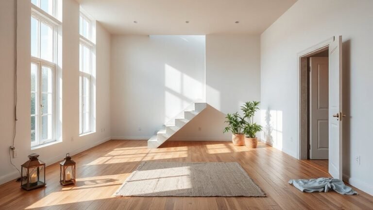
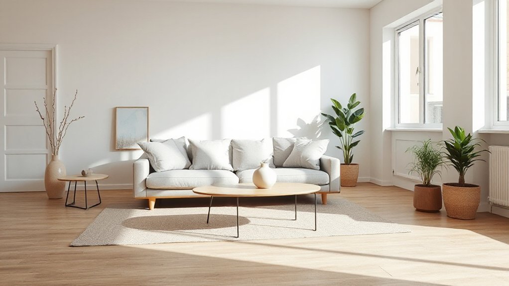
Furniture Layouts That Promote Easy Flow
Good flow depends on clear sightlines and purposeful spacing. You’ll map furniture around pathways, not around objects, so traffic remains effortless.
Place seating to face focal points without blocking doors or vents, and keep at least two distinct zones readable from the main entrance.
Prioritize low, solid profiles to preserve openness, and use height variation to define areas without visual clutter.
Decorative accents should reinforce balance, not crowd space; choose a few well-timed pieces that echo the room’s color and texture.
Consider spatial proportions: scale sofas and tables to the room’s dimensions, and leave generous margins beside every piece.
Align edges, avoid perpendicular clutter, and allow natural light to travel.
With disciplined placement, rooms feel calm, cohesive, and instantly easy to navigate.
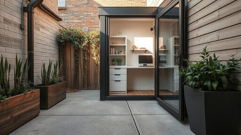
Greenery and Natural Elements for Serene Energy
Ever notice how a few well-placed plants can shift a space from flat to calm? You’ll harness greenery and natural elements to cultivate serene energy without clutter. Think practical balances, not showy excess, and let nature do the rest.
- Urban gardens as compact anchors that visually soften hard lines
- Indoor water features for subtle motion and cooling sound
- Textured greenery: ferns, moss, and trailing vines to add depth
- Natural materials: wood, stone, and terracotta to ground the palette
- Strategic lighting to highlight plant textures and create atmosphere
Keep maintenance minimal: rotate plants seasonally, wipe leaves, and ensure drainage. Pair greenery with clean lines and airy spacing to preserve calm, focused energy throughout the room.
Urban gardens and Indoor water features become quiet accelerants of serenity.
Refine Details: Hardware and Finishes That Quiet the Space
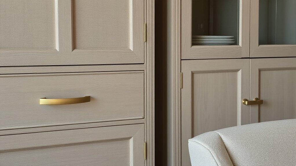
Silence the visual noise with carefully chosen hardware and finishes that subtly shape the room’s mood. You’ll spot how hardware finishes influence perceived calm: brushed metals soften edges, matte tones reduce glare, and warm patinas invite softness.
Prioritize cohesive, quiet hardware across doors, drawers, and fixtures to avoid jarring contrasts. Select decorative accents that echo the room’s palette instead of shouting the moment you enter.
Opt for minimal ornamentation, avoiding overly shiny surfaces that reflect light and create visual clutter. Consistency matters: align pulls, knobs, and hinges with the same finish family for a unified, restrained look.
Consider proportion and scale—small rooms benefit from smaller hardware that stays unobtrusive. When in doubt, test in natural light to confirm the space remains serene.
Quick, Budget-Smart Weekend Refreshes You Can Do Now
Even on a tight schedule, you can deliver a noticeable upgrade with a few targeted, budget-minded steps this weekend. You’ll focus on practical, high-impact changes that calm the room without breaking the bank.
Prioritize color psychology by selecting a cohesive, soothing palette and applying it to one focal wall or accessories to reduce visual clutter.
Next, add acoustic treatment in key spots—soft textiles, a rug, and door or window seals help absorb sound and lower echo.
Reconsider lighting angles to emphasize calm, using dimmers or warm bulbs.
Finally, declutter deliberate zones, and swap mismatched hardware for uniform finishes to unify the space.
- Paint with a calm color family
- Introduce soft textiles for warmth
- Add a budget rug for texture and sound
- Install door/window seals for quiet
- Harmonize hardware and finishes
Frequently Asked Questions
How Can I Quiet Noisy Rooms Without Major Changes?
You can quiet noisy rooms without major changes by applying practical soundproofing techniques and choosing suitable Acoustic panel options. Start with door sweeps and weatherstripping to reduce gaps.
Then add heavy curtains or rugs to absorb mid and high frequencies. Consider soundproofing techniques like mass-loaded vinyl behind furniture or under rugs.
For wall ears, mount decorative Acoustic panel options or fabric-wrapped panels in key spots. Pair with plants and soft furnishings to dampen echoes without a remodel.
Which Colors Promote Instant Calm in Small Spaces?
Blue, soft neutrals, and pale greens promote instant calm in small spaces. Color psychology shows these hues reduce visual noise and breathe space, while you feel grounded.
Opt for soothing palettes with muted saturation and warm undertones to avoid clinical vibes. Use one accent color sparingly for depth, and keep ceilings light to push the room higher.
You’ll notice calmer energy, better focus, and a sense of airiness as you navigate the space.
What Lighting Levels Feel Both Soft and Functional?
Soft, functional lighting sits around 300–400 lux overall, with brighter task spots at 500–700 lux for focused work.
You’ll want natural illumination whenever possible, and layer in layered lighting—ambient, task, and accent—to blend glow levels without glare.
Keep dimmers on main and desk lamps, so you can adjust as needed.
This approach gives you gentle, usable light that maintains depth and avoids flatness while supporting precise tasks and relaxed moods.
How Do Textures Influence Perceived Calmness Quickly?
Textures influence perceived calmness quickly by blending tactile softness with deliberate texture contrast. When you pair plush fabrics with matte surfaces, you create depth that soothes rather than shocks. You feel calmer as your brain reads familiar, low-contrast cues.
Texture contrast invites you to explore without strain, while tactile softness cushions sharp edges. You’ll notice reduced visual noise, making space feel steadier and more intentional.
In practice, choose restrained contrasts and generous, soft textures.
Which Plants Best Calm a Busy Room?
You should choose plants with proven calming effects, like broad, fleshy leaves and slower growth, such as snake plant, pothos, and ZZ.
For busy rooms, prioritize structure over perfume.
Indoor greenery like Peace Lily, areca palm, and ferns filter noise visually and create balance.
Opt for low-maintenance, drought-tolerant varieties to avoid clutter.
Calming foliage thrives in indirect light, regular but moderate watering, and strategic placement away from drafts.
Conclusion
Inhale the room and feel the quiet center it reveals. Your palette is the breath you share with walls; textures, the fabric of calm; lighting, the gentle hand on your shoulder. When surfaces clear, thoughts settle like settled dust—visible, manageable. Layout becomes a compass, guiding you toward ease. Greenery is the quiet heartbeat, hardware the soft punctuation. A weekend refresh becomes a ritual, not a feat—a deliberate key turning toward serenity, opening a door you can live in.