You’ll transform any UK room this year by layering warm neutrals with bold accents, then grounding spaces in earth tones like deep greens and terracotta. Expect creamy ivories and airy blues for calm, light-filled walls, plus textured finishes and natural materials for depth. Layered lighting and cohesive repeats across textiles, furniture, and surfaces keep things harmonious. Watch for regional twists—from coastal pale aquas to urban terracotta accents. Ready to apply practical tips that keep every space warm and cohesive as you explore more.
The 2024 UK Colour Story Explained
The 2024 UK Colour Story blends warm neutrals with bold accents to create rooms that feel both calming and energizing. You’ll notice how vintage patterns recur as tasteful nods to the past, giving texture without overwhelming the space.
Colour psychology guides every choice, so you pick hues that soothe during winding evenings and sharpen focus when you’re tackling tasks. Think creamy ivories, taupes, and soft browns paired with saturated blues, charcoal, or moss greens to calibrate mood.
The approach remains practical: you test swatches, light adjust, and layer neutrals with accent accents to preserve flow. Cohesion comes from consistent finishes and alternated scales, ensuring a lived-in vibe that stays fresh.
This framework supports adaptable palettes, from kitchens to living rooms, without locking you in.
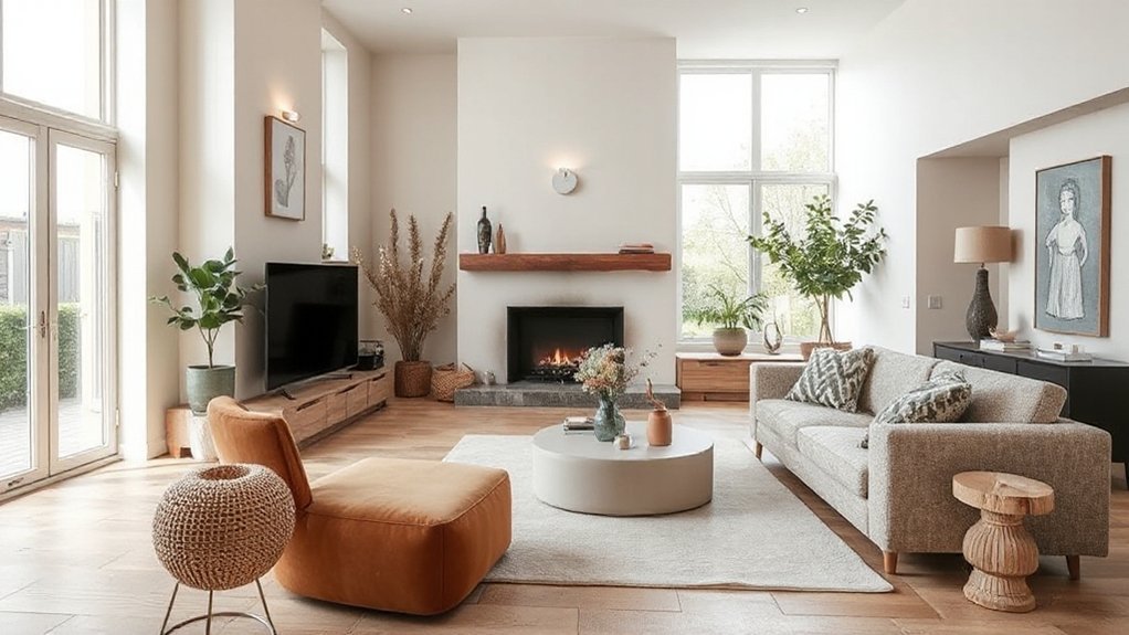
Embrace Earth-Tone Palettes: Deep Greens and Terracotta
You’ll see deep green accents grounding spaces, with terracotta textures adding warmth without overpowering light.
Pair these earth tones with simple, functional furniture and natural materials to keep rooms cohesive and livable.
This trend balances bold color with tactile details, guiding you to mix patterns and textures through a practical Earth-Tone Pairings approach.
Deep Green Accents
Ever wondered how to anchor a room with a nature-inspired mood without tipping into forest-hugging overload? Deep green accents act as a quiet backbone, pairing well with warm terracotta to create depth without heaviness. Use mossy velvet cushions, emerald throws, or a forest-toned feature wall to draw the eye inward, then balance with light, neutral surfaces.
This approach supports sustainable choices by letting you reuse existing furniture and layer textures rather than overhauling your space. Green psychology suggests these tones can calm chatter and invite focus, while keeping energy bills in check if you favor natural daylight and breathable fabrics.
Consider matte finishes for walls and soft, tactile fabrics for softness. Sustainability impact comes from durable, versatile pieces anchored in timeless hues rather than fast-trend buys.
Terracotta Textures Trends
Terracotta textures bring warmth and grounded charm to earth-tone palettes, pairing neatly with deep greens to create rooms that feel both organic and polished. You’ll notice the tactile depth in terracotta textures elevating spaces without shouting.
Use earthy ceramics to anchor shelves and tabletops, letting natural glaze variations speak for the design. Embrace a restrained palette: clay, olive, and charcoal weave a cohesive backdrop for living areas and kitchens alike.
- Integrate terracotta textures in statement ceramics and bowls
- Layer warm wall tones with deep green upholstery for balance
- Choose matte finishes to keep the look contemporary
- Add textural contrast via woven rugs and raw wood
This approach stays practical, trend-aware, and cohesive while delivering refined warmth.
Earth-Tone Pairings Guide
Earth-tones thrive when you pair deep greens with terracotta, creating a grounded palette that feels both modern and timeless. You’ll anchor rooms with a deep emerald or sage on walls, balancing it with terracotta furniture or accents for warmth.
Choose muted wood grains and matte finishes to keep the look cohesive and tactile. Introduce vintage patterns in textiles—think kilim cushions or botanical prints—that echo history without overpowering the space.
For visual interest, layer soft textures: wool throws, cork rugs, and linen curtains. Industrial accents—black metal hardware, exposed beams, or a thin steel lighting frame—ground the palette while keeping it current.
Use lighting to elevate tone shifts from day to night, and maintain balance with greenery for a fresh, lasting vibe.
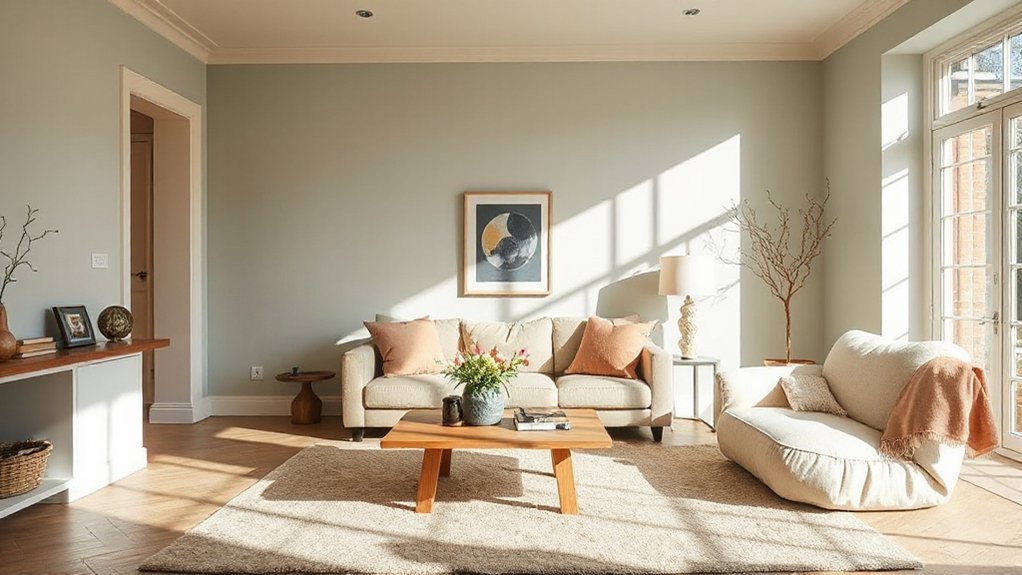
Create Calm With Creamy Off-Whites and Airy Blues
Creamy off-white walls create a calm, versatile backdrop you can build from with simple, airy blues. Use the lightening of the room atmosphere to open spaces and keep features crisp and clean.
Pair soft whites with gentle blue accents to maintain a cohesive, trend-aware feel throughout your home.
Creamy Off-White Calm
If you want a calm, modern backdrop, creamy off-whites paired with airy blues create a serene foundation that instantly softens a room. You’ll notice a sense of nature-inspired calm and minimalist elegance, guiding furniture choices and textures.
- Pair chalky off-whites with pale blue accents to sustain a breathable, airy feel.
- Embrace matte finishes and natural textures for tactile warmth.
- Keep architectural lines clean to enhance minimalist elegance.
- Layer subtle contrasts—warm woods against cool whites—to add depth without clutter.
This approach stays practical and trend-aware, helping you achieve cohesion across spaces. Use creamy tones as a versatile base, then introduce restrained color pops through textiles and art to maintain serenity while reflecting contemporary UK homes.
Airy Blue Accents
Use muted pastels in textiles and accessories to soften gradual changes between hues, keeping the palette cohesive rather than busy. Introduce airy blues through wall art, cushions, and small furniture pieces, then ground the look with creamy whites on walls and larger surfaces.
Consider bold contrasts sparingly—think a navy chair or a charcoal frame against light walls—to add depth without overpowering serenity. This approach supports versatile, day-to-night living, where light-filled rooms stay inviting while staying easy to refresh with seasonal accents.
Lightening Room Atmosphere
Want to make a room feel brighter and calmer? Lightening the atmosphere relies on creamy off-whites and airy blues to reflect natural light and support Colour psychology. You’ll notice spaces feel bigger, softer, and more inviting when you pair warm neutrals with cool, breathable blues.
- Use high, clean whites only as highlights, not walls.
- Choose matte finishes to diffuse glare from windows.
- Layer textures: linen, cotton, and wood for warmth.
- Break color with subtle accents that echo the light.
Practical setup tips keep the look cohesive: keep a consistent brightness level, test paint in daylight, and coordinate textiles with wall tones. Natural light drives mood; your calm palette mirrors it, guiding the whole room’s energy.
Porcelain Neutrals Meet Soft Pastels in Kitchens
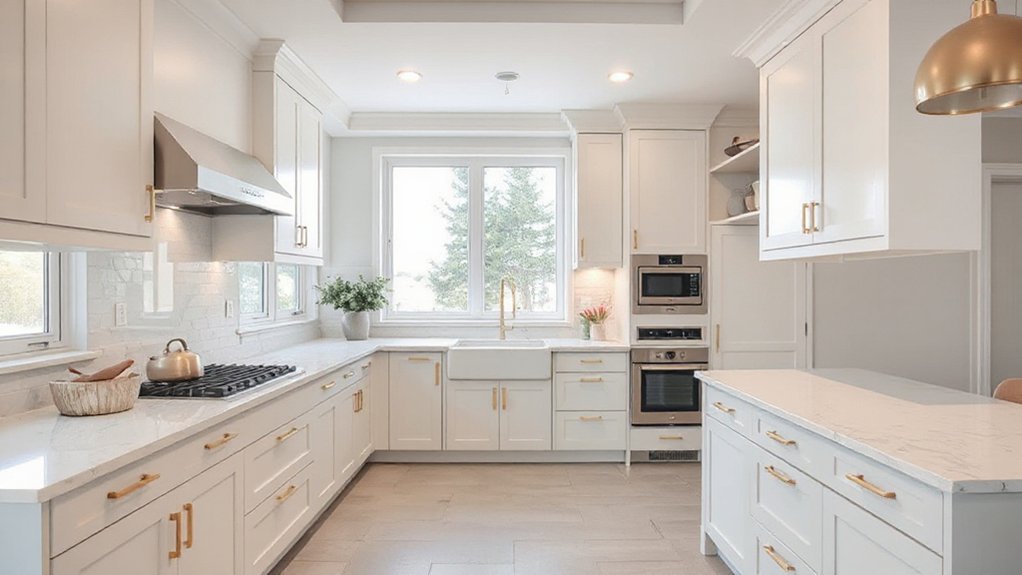
Porcelain neutrals form a calm, versatile base, while soft pastels inject gentle color that keeps kitchens feeling fresh and welcoming. In this pairing, you’ll find clean cabinetry, pale gray or ivory grounds, and pastel accents that don’t overwhelm.
You should surface choices with Porcelain neutrals as the anchor, then layer in Soft pastels through accessories, tile, and small appliances to avoid over-saturation.
Consistency matters: repeat a single pastel rhythm across hardware, textiles, and lighting to maintain cohesion.
This trend favors light-reflective surfaces and matte textures that amplify natural daylight, making kitchens read as airy and approachable.
Practical upgrades include drawer organizing, easy-care finishes, and budget-friendly pastel updates.
Embrace this balanced palette for timeless, versatile kitchen warmth.
Layer Textures to Make Colour Feel Lived-In
Layer textures pull color into life by pairing tactile details with your palette, turning flat walls into a warm, inviting backdrop. Think chunky knits, linen throws, and woven baskets that add depth without overpowering the scheme.
This approach amplifies warmth through detailing, making each room feel thoughtfully lived-in.
Layered Textures Effect
Layered textures bring colour to life by pairing finishes, fabrics, and surfaces in a single coordinated look. You’ll create depth with tactile contrast, so walls, textiles, and furniture read as a cohesive whole rather than separate pieces.
Keep the palette restrained to let texture do the talking, then punctuate with a few porous or matte surfaces for warmth.
- Combine a soft wool throw with a linen drape and a velvet cushion for subtle shifts in feel.
- Mix matte wall paint with a satin wood tone to heighten tactile variation.
- Introduce natural fibres (rattan, jute, wool) to anchor the room.
- Layer rugs of different textures to anchor zones without visual clutter.
Warmth Through Detailing
Texture is how you make color feel warm and lived-in, so focus on small, tactile details that invite touch. You layer materials—undoes of linen, brushed brass, and oiled timber—to build a quiet warmth that lasts beyond trends.
Thoughtful textures add depth to palettes, letting colour breathe without shouting. Use cultural symbolism in patterns or finishes to anchor rooms with meaning, whether a woven motif nodding to heritage or terracotta tones recalling craft traditions.
Seasonal variations guide your textural swaps: switch lightweight throws for heavier knits in cooler months, swap cottons for velvets as days shorten, and introduce tactile rugs to soften high-contrast schemes.
Keep transitions cohesive by repeating a core material across spaces, letting texture release warmth while keeping colour confident and versatile.
How Lighting Transforms Colour in UK Homes
Lighting isn’t just about brightness—it actively shapes how colour reads in your rooms. You’ll notice how bulbs, temperature, and placement tilt colour perception toward warmer or cooler moods, influencing mood as you move through the day. Here’s how to use light strategically:
1) Choose layered lighting—ambient, task, and accent—for balanced colour reading.
2) Opt for adjustable colour temperature to adapt to spaces and times.
3) Use dimming controls to modulate intensity, shifting perception without changing paint.
4) Highlight materials with directional light to reveal depth and nuance.
Lighting effects determine finish richness, while practical placement prevents unwanted shadows. By testing with samples under real lamps, you’ll see how subtle tweaks alter tone, helping you match schemes consistently across rooms.
How Sustainable Materials Deepen Colour
Sustainable materials do more than reduce impact—they subtly deepen colour by introducing natural variation, texture, and patina that reflect light in unique ways. You’ll notice this in fabrics and surfaces that age gracefully, not just survive.
Recycled textiles bring subtle flecks and depth, because post-consumer threads carry histories and tones that ordinary fibers can’t reproduce. Natural dyes amplify that richness with imperfect, nuanced shifts as they respond to humidity and temperature, creating colours that feel alive and dimensional.
When you pair these materials with simple palettes, you gain versatility: muted greens deepen with time, charcoals glow with warmth, and earthy browns gain complexity.
Embrace sustainable options as purposeful accents that evolve, rather than static finishes anchored to trend.
Living Rooms: Room-By-Room Colour Guide
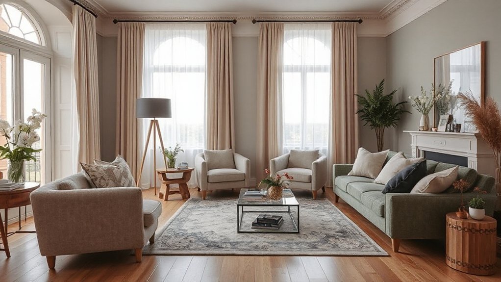
If you want living rooms that feel cohesive and current, start with a clear color plan that respects each zone’s rhythm and function. In practice, use color psychology to cue mood: calming neutrals for hubs, bolder accents for focal walls, and lighter tones to expand space.
Consider historical influences—palette notes from mid-century, Art Deco, and traditional schemes—to create depth without distraction. Now, apply these ideas room by room:
- Entry: a welcoming, warm neutral base with a subtle accent.
- Seating: soft, versatile hues that complement upholstery and textures.
- Media wall: a deeper shade to anchor the focal point.
- Gallery/nook: brighter, coordinating accents for contrast.
Keep *progressions* gentle, and test swatches under varied daylight to *verify* timeless coherence.
Kitchens and Dining Areas: Practical Colour Guide
You’ll start with practical kitchen palettes that stay fresh year after year, balancing warm neutrals with bold accents to suit your space.
In the dining area, tune colors to temperate temperatures that feel inviting and easy to live with, no matter the lighting.
Finally, choose durable finishes that wear well, so your look stays cohesive from prep to dining without extra fuss.
Practical Kitchen Palettes
- Use durable neutrals on cabinetry to hide smudges and prolong polish.
- Introduce warmth with wood-tone accents for cutting boards and stools.
- Pair matte finishes with selective gloss for depth and easy wipe-downs.
- Zone color by task: cooler tones near prep, warmer tones around dining.
These choices support practicality in action: Kitchen appliances stay visually unified, and cooking techniques remain intuitive rather than fussy.
You’ll notice smarter storage, quicker tidying, and calmer spaces that invite you to cook, plate, and enjoy without distraction.
Dining Area Colour Temperatures
If your space leans modern, push toward neutral whites with subtle beige undertones to avoid sterility. For traditional setups, weave warmer timber tones and soft amber highlights to enhance intimacy.
Choose lighting fixtures that allow dimming to shift moods without shifting hues. Window treatments should filter daylight to preserve balance—sheer panels for softness, or deeper curtains to tighten the temperature narrative after sundown.
Pair textures and finishes that echo your palette, ensuring a cohesive, practical dining environment.
Durable Finishes Guide
Durable finishes matter most in kitchens and dining areas because they pair practical longevity with coherent colour storytelling. In this guide, you’ll lean on sustainable finishes and understand how colour psychology shapes daily use, from cabinetry to countertops.
Choose materials and coatings that resist heat, moisture, and wear, while still reflecting your style. Prioritise consistency across surfaces to maintain a calm, cohesive mood, then layer with accents that age gracefully.
- Select low-maintenance, durable substrates for high-traffic zones
- Match finishes across cabinetry, countertops, and hardware for unity
- Opt for sustainable finishes that reduce environmental impact
- Use colour psychology to influence mood and perceived space
Keep it practical, trend-aware, and cohesive, so your kitchen and dining area stay durable and inviting.
Bathrooms and Hallways: Practical Colour Guide
Bathrooms and hallways lean toward calm, durable palettes that keep high-traffic spaces feeling fresh: think cool neutrals, gentle greens, and restrained blues paired with warm timber or stone textures to ground the look.
You’ll create cohesive schemes by pairing moisture-resistant paints with matte finishes and simple hardware.
For bathrooms, opt for soft whites or greys as the base, then introduce a muted green or blue as an accent on cabinetry or tiling.
In hallways, lean into warm timber tones and stone-effect floors to add texture without overwhelming space.
Focus on practical contrasts that hide grime and wear.
Include deliberate touches like bathroom accessories and hallway lighting to reinforce a calm, durable vibe throughout.
Pattern and Palette: Elevate Colour With Plants
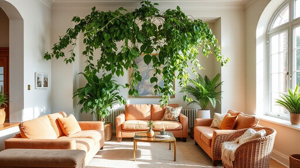
If you want to elevate colour without overhauling your scheme, use plants to pattern and palette your rooms. You’ll find that plant patterns add texture without clutter, while botanical palettes pull hues together subtly.
Choose diverse leaf shapes and greens to echo your walls, then layer with pots that repeat colour accents for cohesion.
- Highlight a dominant leaf motif and echo it in cushions or artwork.
- Mix cool and warm greens to create a balanced, dynamic look.
- Use terracotta or clay pots to introduce earthy warmth against foliage.
- Group plants in odd numbers to create visual rhythm and depth.
Coordinating Neutrals With Accent Hues: a Practical Palette
Mixing neutrals with accent hues creates a practical, cohesive palette you can apply room by room. You’ll balance warm creams and cool greys as the backbone, then layer in accents that energise without shouting.
Use complementary colour schemes to create visual coherence—choose one dominant neutral and pair it with a sharper hue on feature walls, textiles, or artwork. Keep tonal shifts subtle to maintain calm, then let a single accent pop in each space for focal points.
Colour psychology insights suggest that softer neutrals feel expansive, while saturated accents stimulate mood; apply accordingly by room function. In living areas, introduce a grounding accent; in bedrooms, a soothing touch; in kitchens, a confident highlight.
This approach sustains flow while delivering purposeful, current style.
Regional Influences Shaping Local Colour Choices
Regional influences shape the color choices you’ll most often see in UK homes, from coastline-inspired blues to earthy uplands tones. You’ll notice how local memories guide palettes, turning regional traditions into tangible spaces and letting cultural expressions shine through.
- Coastal towns favor pale aquas and chalky whites that brighten small rooms.
- Rural interiors lean into muted greens, warm ochres, and robust timber accents.
- Northern scapes invite inky blues and charcoal contrasts for depth.
- Urban hubs blend saturated terracotta, plaster pinks, and concrete grays for modern warmth.
These shifts help you read a home’s story at a glance, keeping interiors practical, trend-aware, and cohesive.
Regional traditions inform pattern choices and finish textures, while Cultural expressions steer artwork, ceramics, and textiles into everyday living.
Budget-Friendly Updates for 2024 Colour
Here are accessible, budget-friendly colour updates for 2024 that let you refresh looks without breaking the bank. You can leverage accents rather than full-room overhauls, stretching colour impact without steep costs. Try repainting a single feature wall in a muted sage or warm terracotta to shift mood instantly, then swap textiles and accessories for a refreshed feel.
Embrace Colour affordability by choosing versatile neutrals paired with statement tones in pillows, throws, and curtains. Update hardware finishes—matte black or brushed brass—to modernize spaces at low expense.
Borrow trends from palettes that mix earthy tones with soft pastels for cumulative effect, maintaining cohesion across rooms. Prioritise durable, easy-care finishes and shellac or wipeable coatings for longevity.
Budget updates are practical, design-forward, and achievable for any room.
Common Mistakes When Mixing Multi-Tone Schemes
Even with the best intentions, mixing multi-tone schemes can backfire if you don’t keep a unifying thread. You’ll feel ungrounded if colors clash or patterns fight for attention, so aim for harmony anchored by a single mood.
1) Prioritize color coordination over sheer variety, selecting a dominant base and two accent tones.
2) Watch for pattern mismatch; repeat a shared motif or scale to visually connect different rooms.
3) Test lighting before committing—what looks good in daylight may read wildly differently under lamps.
4) Create a cohesive flow by carrying one material or finish through spaces, then layer subtle differences.
Keep revisions small, observe how the eye travels, and resist adding a fourth bold tone that upends balance.
Quick-Start Checklist to Implement 2024 Colour Trends
With 2024’s color trends guiding the look, you can kick off quickly by anchoring a base palette and layering two or three on-trend accents. Start by selecting a dominant neutral that travels well in rooms with different lighting, then add two complementary colors for depth.
Next, map color psychology to mood—calm blues for bedrooms, energizing yellows for kitchens, grounding greens in living spaces. Test swatches on walls at different times of day and observe how hue shifts.
Plan with paint durability in mind: choose finishes suited to each room and purchase enough on the first pass to avoid mismatches.
Finally, build a simple, cohesive transcript—throw pillows, artwork, and textiles in coordinating tones to reinforce the trend without overpowering.
Frequently Asked Questions
How Do I Start With a Year-Long Colour Plan for My Home?
Start by mapping rooms, moods, and lighting, then choose a cohesive palette with color psychology in mind; pick durable paints for high-traffic areas. Set a yearly plan: test swatches, document changes, and rotate accents while monitoring wear and vibe.
Which Rooms Benefit Most From Bold Accent Colours?
Bold accents lift rooms most: living areas, bedrooms, and kitchens. Color psychology shows you’ll feel energized in living zones and calm in bedrooms; try Accent wall ideas like a strong focal hue. You’ll love cohesive, trend-aware results.
What Are Affordable Ways to Test New Colour Schemes?
You can test new colour schemes affordably by using paint samples and colour swatches on your walls. Rotate swatches over a week, compare lighting, and note mood shifts, then choose cohesive tones that align with current trends.
How Can Natural Light Affect Our Chosen Palette?
Natural light shifts your palette; it boosts perceived color warmth and brightness. Lighting impact varies by time, so test swatches near windows. It supports mood enhancement, guiding contemporary choices while keeping your space cohesive and trend-aware.
Which Trends Suit Rental Homes With Restrictions?
Temporary decor and removable touches are ideal for rental homes; you pick lighter, breathable palettes and switchable accents. Use paint samples on accent walls, test trims, and keep everything cohesive while you stay flexible and trend-conscious.
Conclusion
You’re stepping into a home that speaks softly but with intent. Let the 2024 palette guide your rooms: earthy greens, terracotta warmth, creamy whites, and airy blues. Layer textures, mix neutrals, and let subtle pastels whisper in kitchens. Keep it budget-smart, avoid clash, and trust regional vibes to anchor your choices. Start small, dream big, and watch color become your everyday backdrop—an evolving story you actively write, one cozy corner at a time.