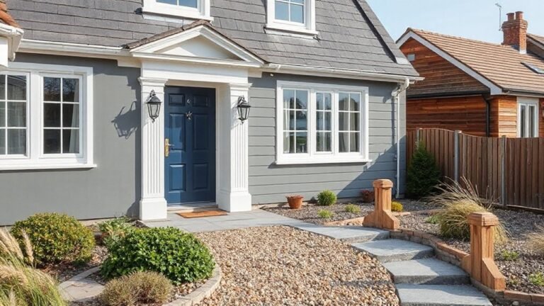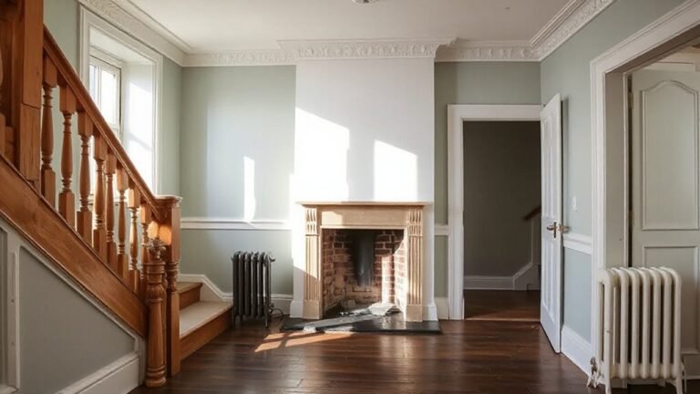
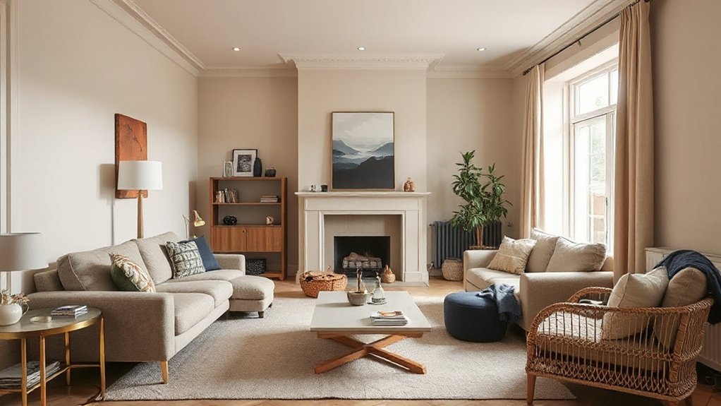
In UK homes, you’re seeing earthy neutrals with warm undertones elevated by bold botanical accents and rich textures. Pair soft neutrals with light-reflective finishes to maximize daylight, then introduce color-blocked schemes for depth—balancing two muted anchors with one bold accent for focus. Layer materials like linen, wool, and stone to add tactility, while calibrated contrasts keep edges crisp and visual weight even. If you want to explore practical applications further, you’ll uncover how these trends translate to real spaces.
Current UK Interior Color Trends You Can Use
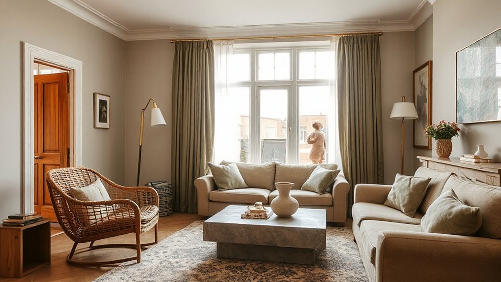
Current UK interior color trends lean toward earthy neutrals paired with bold accents, creating versatile palettes that adapt across rooms and lighting. You’ll see warm terracotta, stone, and muted olive grounding schemes, while charcoal and deep navy provide strong architectural counterpoints. This balance supports flexible furniture choices and art placement, enabling cohesive storytelling from living spaces to work zones.
Historical color influences inform current palettes, with heritage greens and ochres resurfacing alongside modern mineral tones, delivering a measured authenticity. You’ll also notice a pull toward saturations that react well to daylight shifts, preserving depth without overwhelming.
Designers factor Future color predictions into materials—lives of textiles, finishes, and paints—ensuring durability beyond trends. In practice, select scalable neutrals as anchors, then apply intentional accents to create enduring, adaptable interiors.
Soft Neutrals With Warm Undertones to Try
Warm undertone palettes create a versatile backdrop that pairs soft neutrals with gentle warmth, enhancing both architectural details and natural light. Start with light-reflective finishes to maximize brightness.
Then layer soft neutral pairings that lean warm rather than cool for cohesive mood. This approach supports precise color balance across spaces, guiding selection of tonal ranges that harmonize Warm Undertone Palettes with practical, understated elegance.
Warm Undertone Palettes
Neutral, soft neutrals with warm undertones create interiors that feel inviting yet refined. You’ll leverage Warm Undertone Palettes to establish cohesion across spaces, balancing light and depth without sacrificing clarity. Key moves center on controlled saturation and purposeful contrast.
- Select complementary accent tones to illuminate architectural features and elevate focal points.
- Integrate vintage inspired palettes for timeless appeal, guaranteeing modern utility remains intact.
- Layer texture and finish to enhance warmth without introducing harsh shadows.
- Apply strategic lighting to reveal subtle nuances in undertone shifts, maintaining consistency.
Technical application guides ensure predictable outcomes: harmonize wall, trim, and cabinetry tones, then corroborate with fixtures in slightly cooler neutrals. This approach minimizes drift, supports resale versatility, and preserves a refined ambiance. Complementary accents and vintage-inspired palettes define a confident, durable palette strategy.
Soft Neutral Pairings
Color psychology informs your selections: warm neutrals can invite comfort without overwhelming space, while subtle contrast preserves clarity for daily tasks. When pairing, prioritize undertone alignment—vanilla, apricot, or honey hues should read consistently under your interior lighting.
You’ll optimize depth by layering textures—linen, wool, and matte ceramic surfaces—to prevent monotony. Consider lighting temperature and duration, ensuring warms amplify rather than distort tonal intent.
As you test combos, document perceived warmth at multiple times of day. This disciplined approach yields timeless interiors that remain adaptable to evolving furnishings and accessories.
Light Reflective Finishes
Light reflects differently on surfaces when you pair soft neutrals with warm undertones, creating rooms that feel brighter without adding glare. Light reflective finishes boost perceived space by diffusely scattering daylight, while light enhancing paints improve contrast for architectural details.
You’ll benefit from calibrated sheens that balance glare control with depth, particularly on walls, ceilings, and cabinetry.
- Choose mid-sheen paints in ivory, latte, or greige to achieve even illumination.
- Pair with reflective finishes on trims to amplify daylight without overpowering.
- Use warm undertones to prevent clinical coolness while preserving clarity.
- Test under varied lighting to optimize saturation and consistency.
These tactics deliver a polished, technical result that enhances room brightness with controlled, nuanced depth, leveraging Reflective finishes and Light enhancing paints.
Bold Botanical Accents for Fresh Rooms
Bold botanical accents sharpen fresh room vibes by integrating plant-inspired palettes with crisp, architectural contrasts. You’ll see how bold leaf motifs and vibrant greens energize spaces while maintaining a cohesive, modern aesthetic.
This approach prioritizes clarity and precision in color pairing to sustain a polished, UK-ready interior.
Bold Botanical Accents
Are bold botanical accents the simplest way to refresh a room without a full remodel? Yes—when executed with precision, they deliver measurable impact. You’ll shape the space by layering texture, color, and form through curated elements.
- Botanical artwork anchors focal walls with high-contrast compositions.
- Indoor greenery adds vertical interest and improves perceived air freshness.
- Planter scale and placement optimize balance between architecture and décor.
- Material finishes harmonize with plant tones to sustain visual cohesion.
Key considerations include lighting, container material, and maintenance cadence. Your selections should remain cohesive with existing colour schemes while allowing botanical accents to read as deliberate design decisions.
Emphasise longevity by opting for durable planters and fade-resistant prints. This approach yields room-refresh outcomes without major disruption.
Fresh Room Vibes
Eco friendly materials underpin the framework, ensuring sustainability without compromising finish or resilience. In practice, this means selecting natural woods, recycled metals, and low-VOC paints that support longevity and indoor air quality.
Minimalist decor acts as the counterbalance, simplifying silhouettes and reducing clutter to let botanical notes breathe. You achieve focal points through restrained shelving, clean lines, and purposeful gaps that frame plant-led features.
Lighting is calibrated to enhance leaf patterns and shadow play, reinforcing a fresh, contemporary mood while preserving functional versatility across rooms. The result is a disciplined, enduring freshness.
Plant-Inspired Palettes
- Ground with a neutral base and a single bold botanical focal
- Vary greens from sage to olive to maintain depth
- Introduce textural plant elements for tactile contrast
- Circle back with zen garden-inspired minimalism
Rich Earthy Textures for Depth and Coziness
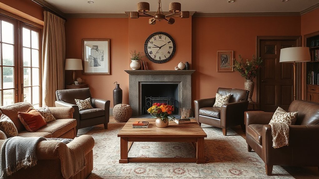
Rich earthy textures add depth and warmth to a space by combining natural materials—like leather, stone, and wood—with saturated, mineral-inspired tones. You implement this by prioritizing tactile surfaces that retain comfort without sacrificing precision.
Textured wall treatments, in particular, deliver subtle dimension, absorbing light to create a grounded atmosphere while maintaining a clean silhouette. Pair this with vintage fabric accents for a curated, timeless note that still feels contemporary.
Use carefully calibrated contrasts: matte finishes on major areas, a gloss accent in small doses, and breathable textiles to balance moisture and air quality. Durability matters; choose hides, stone, and timber with appropriate finishes to resist wear.
This approach reinforces depth, coziness, and a resilient, premium feel throughout living spaces.
Balanced Color-Block Schemes That Invite It In
Balanced color-block schemes invite a calm, organized energy into the room by pairing restrained, offbeat hues with clean, defined boundaries. You’ll apply color blocking techniques to establish contrast without chaos, ensuring each block communicates purpose.
This approach relies on balanced hue combinations that avoid overload while maintaining visual interest. Precise alignment, sharp edges, and consistent scale anchor the composition, so your eye travels smoothly from one zone to the next.
Use these steps to refine the scheme:
- Select two muted neutrals as anchors.
- Introduce one bold accent for focal emphasis.
- Maintain equal visual weight across blocks.
- Keep edges crisp with tidy progressions.
Result: a cohesive, intentional space that feels both modern and livable.
Apply Trend Colors on a Budget in Small Spaces
Adopt trend colors in small spaces by prioritizing strategic picks that maximize impact without overwhelming the area. In compact rooms, you harness color through targeted, high-contrast accents rather than full saturation.
Begin with budget friendly accent walls to anchor perception, then layer lighter tones on trim, doors, and textiles to create depth without crowding the space. Choose color decisions that align with natural light and furniture scale, ensuring readability and cohesion.
To minimize waste and commitment, employ DIY color sampling on card swatches or large taped panels before committing paint. This approach keeps risk low while validating mood and brightness.
Document outcomes and adjust finishes—matte for calm, satin for durability—so you retain control over budget, atmosphere, and long-term polish.
Frequently Asked Questions
How Can I Mix Trends With classicUK Furniture Without Clashing?
Yes—you keep classic UK furniture while mixing trends by using vintage accents and controlled pattern mixing, balancing hues, scale, and materials. Use a neutral base, repeat motifs, and let one bold vintage piece anchor the room.
Which Paint Finishes Suit High-Traffic UK Homes Best?
You should choose satin or eggshell for high-traffic UK homes, as they withstand wear and wipe clean. In practice, decorative wall techniques and paint application methods ensure durability and a polished, technical finish that lasts under heavy use.
Can Bold Colors Affect Room Acoustics or Lighting Perception?
Bold colors can influence perception: bright hues may alter lighting perception and room brightness, and certain tones can subtly affect mood. Color psychology informs choices, while acoustic effects depend on surface materials, not color alone, making light–sound interactions nuanced.
Are Sustainable Pigments More Costly Than Conventional Options?
Eco friendly pigments tend to be more expensive upfront, but the cost difference narrows with scale; a prudent cost comparison shows sustainable options often offer comparable total value when lifecycle and performance are considered.
How Do Colour Schemes Impact Resale Value in UK Markets?
Do colour schemes boost resale value in UK markets? Yes, they influence perception and market appeal through color psychology, guiding buyers’ emotions; you’ll maximize appeal by selecting palette harmonies that align with room function, ambience, and property positioning.
Conclusion
As you apply these trends, you’ll notice how soft neutrals with warm undertones dominate, while bold botanical accents refresh rooms without overwhelming them. One striking stat: homes updated with just one feature color report a 28% perceived improvement in cohesion and calm. Use rich earthy textures to add depth, and balanced color-block schemes to invite conversation. In small spaces, keep palettes restrained and budget-friendly—rotate accent pieces to maximize impact without compromising polish or technical rigor.
About the Author