A shaded home that uses creamy beige siding can feel brighter in morning sun and softer in afternoon shade. You’ll notice how warm neutrals reflect ambient light, while subtle contrasts keep architectural details from vanishing. This approach isn’t just about choosing a color; it’s about testing swatches under different light and pairing tones with materials and landscape for cohesion. If you want practical steps that actually translate to curb appeal, you’ll want to push further.
Key Takeaways
- Choose warm neutrals (creamy beiges or warm greige) and midtone bases with light accents to brighten shaded areas while preserving architectural details.
- Use one or two complementary accent hues on focal points (doors, shutters) to add depth and visual hierarchy in dimmer light.
- Apply contrasting trims darker or lighter than the body to define silhouettes without creating flatness; keep trims proportionate to house size.
- Test swatches on multiple elevations at different times of day to ensure color consistency under varied lighting.
- Balance bold accents with an overall cohesive palette, limiting to two or three bold colors for harmony and curb appeal.
Why Shade Alters Exterior Color Perception
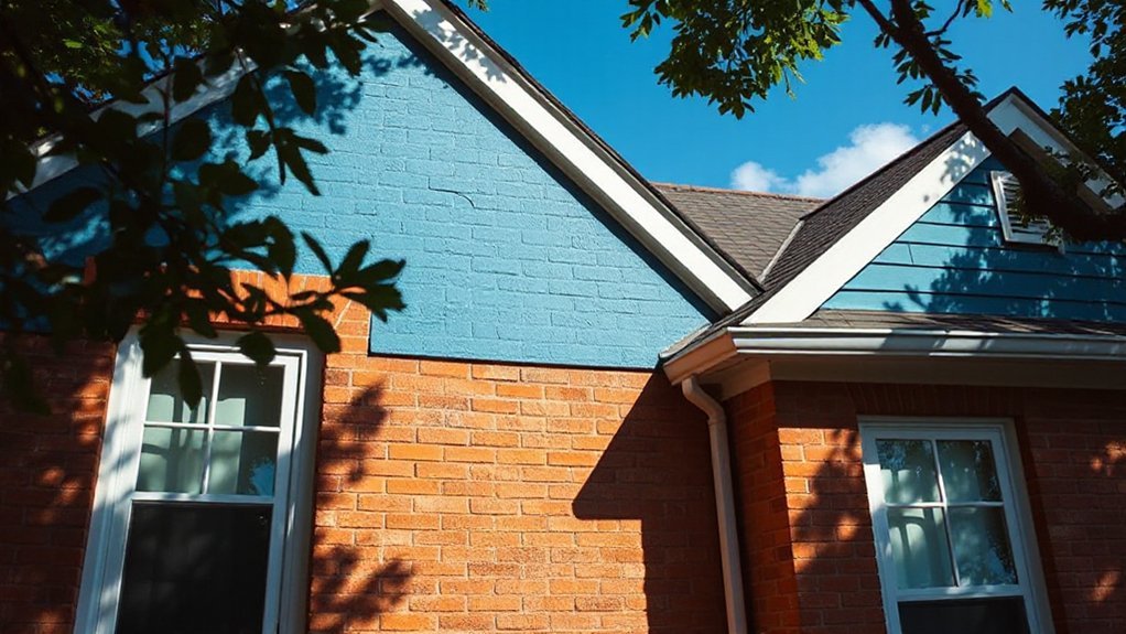
Shade appears differently on your home depending on the light and surroundings. When you place a color outdoors, shade changes its look because darker or cooler tones absorb light, while light or warm tones reflect it. This isn’t just about brightness; it alters shade effects on surfaces, making a hue seem richer, duller, or slightly tinted.
Your eye works with nearby colors, and shadows shift contrast, influencing perceived depth and temperature. Plan for common lighting: morning sun, noon glare, and evening shade. Test swatches in actual conditions, since pigments respond to ambient light.
Remember that color perception can shift with foliage, sky, and nearby materials. Choose a palette that remains legible and harmonious across varying shade effects.
Choose Warm Neutrals to Brighten Shaded Facades
Warm neutrals illuminate shaded facades by reflecting ambient light without overpowering features, so you can brighten without losing depth. You’ll choose tones like creamy beiges or warm greige to preserve natural texture while toning down harsh contrasts.
The goal is even illumination that still reveals architectural details, so start with a midtone base and use lighter accents sparingly to avoid flatness. Incorporate focal point techniques by anchoring the brightest neutral where the eye should rest, such as a welcoming entry or prominent door surround.
Pair neutrals with unobtrusive trim to maintain cohesion. Outdoor lighting should complement the hue, not compete with it; opt for fixtures with warm color temperature and soft diffusion.
This approach yields balanced brightness and nuance for shaded façades.
Add Depth With Strategic Accent Hues
To add depth, introduce strategic accent hues that anchor focal points and create visual hierarchy. You’ll use color subtly to highlight architectural details, doors, and hardscape edges, while keeping overall harmony.
Begin by selecting one or two accent tones that complement your base palette, then apply them with restraint for impact. Consider how interior paint and exterior elements interact with garden lighting to influence mood after dusk. Use contrast rather than saturation spikes to maintain depth without overpowering the facade.
- Choose an accent hue that echoes interior paint for cohesive transitions.
- Apply it to entry doors, shutters, or trim to frame focal points.
- Pair accents with warm or cool lighting to sculpt shadows.
- Test color samples under evening garden lighting before committing.
Define the Home With Contrasting Trims
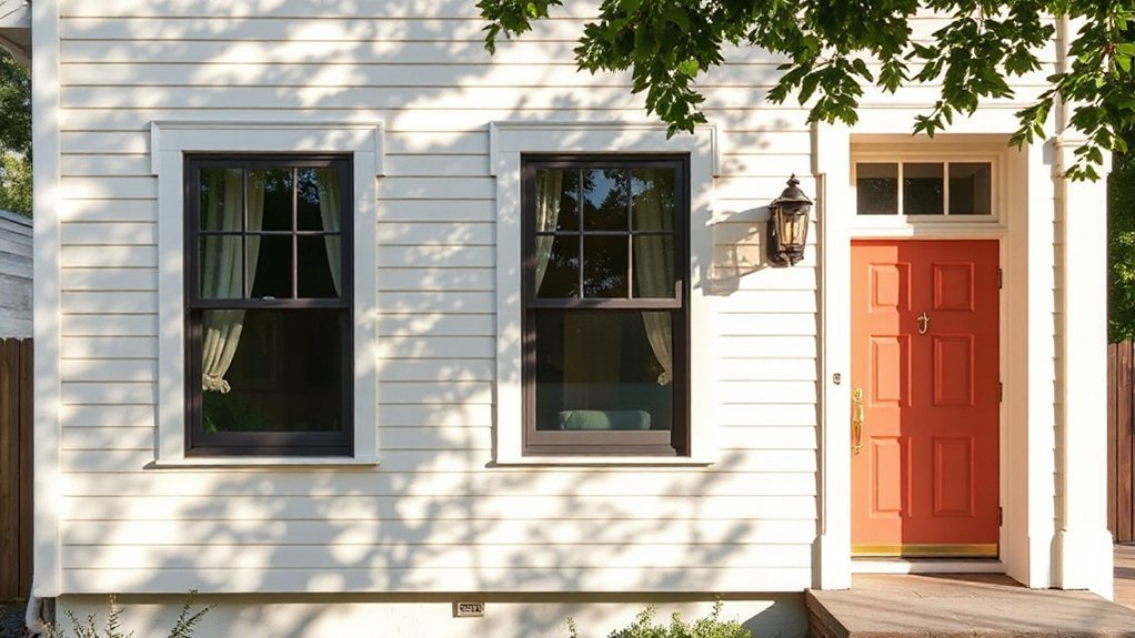
Using contrasting trims defines the home’s silhouette and guides the eye to architectural details. You select trims that frame windows, doors, and corners, creating deliberate visual pauses.
Choose a trim color darker or lighter than the body to emphasize depth without shouting. A narrow, crisp line around openings can sharpen the focal point, while a broader strip under eaves softens shadows and adds polish.
Consider architectural features you want to highlight—columns, cornices, or cantilevers—and let trims trace their forms. For privacy screening, use trims to outline fences or screens, ensuring cohesion with nearby walls without overpowering the facade.
Maintain contrast that’s proportional to the house size; subtlety often reads as sophistication, clarity, and purposeful design.
Create Cohesion: Materials, Roof Tone, and Landscaping
You’ll start by aligning materials with a cohesive color, so textures and hues reinforce each other rather than clash.
Aim for roof tones that echo the main palette, creating harmony from top to base.
Let landscaping serve as an accent starter, using plantings to echo or punctuate your color story without overpowering it.
Materials Cohesion Through Color
When aiming for materials cohesion, color acts as the unifying thread that ties siding, roofing, and landscape together. You’ll use color theory to pair tones that complement, not clash, while respecting the home’s natural context.
Consider how surface material texture affects perception: rough stucco reads differently than smooth vinyl, so adjust hue intensity accordingly. Harmony comes from deliberate, repeatable cues across elements, creating a coherent exterior without monotony.
- Choose a dominant color family and pull secondary accents from its neighboring tones.
- Match roof substrate and siding texture to keep depth consistent.
- Align landscaping foliage and rock colors with the chosen palette.
- Test daylight shifts to preserve cohesion from morning to dusk.
Roof Tone Harmony
A cohesive roof tone starts with choosing a shade that anchors the color family you’ve chosen for siding and landscape. Then, adjust its intensity to respect roof texture.
You align the roof color with the overall palette, ensuring contrast isn’t harsh but deliberate. Pick a tone that grounds rather than competes, so materials read as a single composition from curb to eave.
Consider the roof’s texture—shingle, tile, or metal—and how its sheen shifts light; adjust brightness accordingly.
Subtle shifts in hue can unify garden pathways with the home’s exterior, while still allowing individual features to stand out.
Plan porch lighting to echo the roof’s undertone, reinforcing harmony after dusk and guiding movement toward entry points.
Landscaping as Accent Starter
Landscaping should act as the accent that ties materials and roof tone into one cohesive scene. You’ll guide color flow by choosing plantings and hardscape that echo or contrast the exterior palette, creating depth without clutter.
Start with garden pathways that weave toward entry points, using materials that echo your roof and siding choices. Consider texture and form: low shrubs for backbone, taller accents to frame views, and evergreen anchors for year-round structure.
Outdoor furniture should complement the scene, not dominate it—opt for pieces with durable finishes that pick up tone variations from stone or wood. The result: a unified exterior that feels intentional and inviting, even on shaded facades.
- Use pathway materials that mirror roof tones
- Layer textures with foliage height variation
- Choose garden benches and seating that match palette
- Introduce seasonal focal points with planters
Palette Guides by Shade Level: Quick Fixes and Examples
When you choose palettes by shade level, start light with subtle hues to brighten facades without overpowering details.
Use midtone balance techniques to harmonize elements like trim and siding, keeping contrast intentional but calm.
Consider bold accent strategies to create focal points that feel deliberate rather than random.
Lighten With Lighter Hues
Lighten up a space by using lighter hues across your palette, starting with soft tints and airy neutrals that reflect more light and create the feel of extra depth. You’ll leverage color psychology to make exteriors feel welcoming, while keeping historical influences in mind to honor era-appropriate tones.
Light tones can expand shade perception without compromising curb appeal, and they pair well with contrast accents to heighten texture.
- Begin with warm off-whites and pale beiges to diffuse sun exposure.
- Introduce cool whites or greiges for modern balance and versatility.
- Test subtle tint shifts on siding and trim to gauge depth.
- Use lighter accents on doors or shutters to anchor the facade.
These steps offer practical, precise options that brighten shaded homes without sacrificing character.
Midtone Balance Techniques
Midtones strike a practical balance between warmth and contrast, giving you reliable options that read as sophisticated without overpowering architectural details. In midtone balance, you tune the complexion of exterior surfaces so the house reads as grounded rather than flat.
Use a subdued base hue paired with a slightly lighter or deeper companion to create depth without shouting. Quick fixes include testing swatches on multiple elevations at various times of day and applying a consistent finish to prevent glare.
Color psychology matters: warmer mids feel welcoming, cooler mids project discipline, while still honoring the structure’s form. Environmental influences—sun exposure, shading patterns, and neighboring landscapes—guide your pairings to maintain legibility across seasons.
Aim for harmonious contrast that preserves architectural clarity and curb appeal.
Bold Accent Strategies
Bold accents punch up visual interest without overpowering the architecture. When you choose bold accents, you guide the eye along architectural lines and create contrast that still respects the structure. Use palette guides by shade level to keep balance, then test colors in lighting at different times of day.
Consider how lighting effects reveal or mute saturation, and adjust accordingly. Color psychology helps you pick accents that feel inviting rather than aggressive, especially on shaded facades. Apply these quick fixes to avoid overkill and maintain curb appeal.
- Test a single bold hue on trim or door, paired with a supportive neutral.
- Use a high-contrast accent for focal architectural features.
- Limit color variety to two to three bold tones.
- Observe transitions under natural and artificial lighting before finalizing.
Frequently Asked Questions
How Does Light Direction Affect Color Choices at Different Times of Day?
Light direction changes how you perceive color throughout the day. Natural light shifts from cool morning tones to warmer afternoon hues, altering color perception.
East-facing walls look crisper at sunrise, while south and west exposures deepen and enrich tones as sun climbs.
Consider pigments with subtle undertones that stay true under varying light.
Test swatches at different times, observe under real daylight, and choose colors that stay balanced, ensuring your home reads consistently all day.
Can Reflective Paint Boost Brightness on Heavily Shaded Facades?
Yes, reflective coatings can boost brightness on heavily shaded facades. You’ll brighten spaces by bouncing more light onto the surface, while avoiding harsh glare.
Use durable, high-quality reflective paints to maintain color integrity, and consider a lighter base color with strong reflectivity.
Remember, reflective coatings help, but you still need proper maintenance for long-term paint durability.
It’s a practical, insightful choice that improves visibility without sacrificing durability.
Don’t overlook surface prep and coating compatibility.
Do Architectural Styles Dictate Color Brightness Differently in Shade?
Yes, architectural styles influence brightness in shade, but you still choose color with purpose. Modern lines favor higher-contrast, light-reflective palettes, while traditional styles embrace nuanced tones that feel brighter through context.
Consider color psychology to convey energy or calm, and cultural influences to respect neighborhood norms. You’ll brighten shaded facades by pairing luminance with saturation, testing in natural light.
Practical tests, then finalize with contrast ladders that align style, psychology, and local expectations.
Which Exterior Finishes Resist Fading in Shaded, Cool Climates?
In shaded, cool climates, choose finishes with excellent color durability and proven fade resistance. Opt for paints labeled for UV resistance and advanced polymer binders, or high-quality masonry sealants that resist chalking.
Material selection matters: mineral-based paints, elastomeric coatings, and coated metal or fiber cement siding hold color better than standard vinyl.
Apply proper primers and two coats.
Consider darker-but-not-black tones to reduce glare.
Maintain by washing yearly to preserve vibrancy.
Is There a Best-Practice Sequence for Repainting Shaded Homes?
Yes. There’s a best-practice sequence: prep, prime, paint, then inspect and touch up.
Start with a thorough power wash, repair damaged surfaces, and seal joints.
Apply a high-quality primer, then two coats of durable exterior paint.
Schedule a mid-cycle inspection to catch peeling early.
Consider Color psychology to choose hues that reflect light and mood, and prioritize paint durability for shaded walls that endure subtle, long-term fade.
Maintain trims and caulking after repaint.
Conclusion
Shade may dim the hue, but your home can still glow. Think of warm neutrals as morning light on brick—soft, inviting, endlessly forgiving. Add a sparing dash of accent hues to pull the eye, then frame with contrasting trims for definition. Tie everything together with materials, roof tone, and landscaping in harmony. Test swatches under different sun, then trust your eye. With these colors, shaded façades become vibrant, welcoming canvases you’ll enjoy year-round.