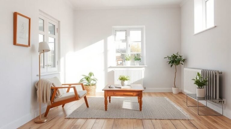
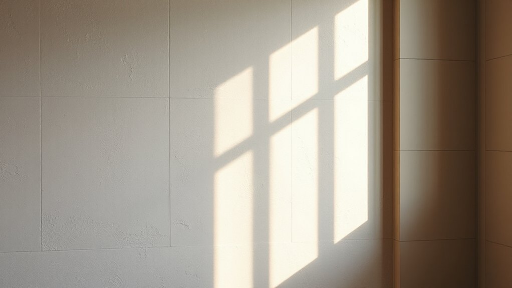
You can add depth to walls without crowding the room by using subtle textures, soft finishes, and restrained patterns. Choose matte or low-sheen surfaces that absorb light and soften edges, then layer tactile elements like plaster or textured panels with careful lighting to avoid glare. Metallic accents should besparingly placed to create dimension. Start with calm neutrals and washable patterns, and you’ll create a space that feels larger yet inviting—ready to explore how these choices work in your space.
Key Takeaways
- Use layered wall finishes with subtle tone variations and soft lighting to create depth without crowding the space.
- Combine matte or low-sheen paints with gentle textures (plaster, soft stone) to absorb light and reduce glare.
- Add strategic metallic accents and reflections in controlled zones to enhance dimension without overwhelming the room.
- Apply wallpaper with layered patterns on one focal wall and softer textures nearby to maintain calm, cohesive depth.
- Prioritize durable, washable finishes and regular maintenance to keep depth looking fresh in high-traffic areas.
How Depth in Wall Finishes Makes Small Spaces Feel Bigger
Depth in wall finishes can visually expand a small room by creating subtle shifts in light and texture. You’ll notice how reflective or matte panels guide eye movement, increasing perceived height and width without heavy alterations.
Use lighting effects to emphasize these nuances: wall controls, sconces, and adjustable LEDs cast gentle shadows that elongate walls and define zones. Pair finishes with intentional furniture placement; keep pieces proportionate and avoid crowding corners.
A taller, slim console along a recessed wall invites depth without bulk, while low-profile seating maintains openness. Choose finishes that subtly vary tone across panels to create a cohesive, layered surface.
Maintain consistent gloss levels to prevent glare, and align trims with architectural lines for a polished, disciplined look.
Texture-First Finishes: Soft Stone, Plaster, and Subtle Textures
Texture-first finishes guide you to softer walls with Soft Stone textures, a plaster depth that stays quiet, and subtle surface variations. You’ll feel how each choice changes light diffusion and tactile perception without shouting for attention.
Start by pairing one texture with a nearby neutral palette to measure the mood before layering more.
Soft Stone Textures
In practice, apply a thin, layered plaster or skim coat that creates subtle relief rather than deep relief; you want depth, not drama. The result pairs well with Rustic charm in rustic-cottage or lodge-inspired spaces, and with Modern minimalism in contemporary interiors that favor clean lines and restraint.
Maintain even lighting to reveal the subtle variance in depth. Avoid heavy coatings or glossy seals that glare. Finish with a matte or satin seal for longevity and understated sophistication.
Plaster Finish Depth
This approach suits Modern minimalism, where subtle relief foregrounds structure over ornament. Use a consistent tool for uniform, soft ridges, then seal with a matte finish to preserve the restrained look. The result reads as calm, architectural depth rather than busy ornamentation.
You can pair it with clean lines, neutral tones, and uncluttered furnishings to emphasize form over fuss. For Vintage charm, introduce imperfect edges or a slight hand-skim for character, ensuring the texture remains deliberate.
Subtle Surface Variations
Surface embossing offers a tactile cue you can feel as you move past the wall, giving subtle dimension without visual shouting. Pair it with subtle gradients to create imperceptible shifts in tone that deepen perception of flat planes.
In practice, apply a fine skim or a delicate plaster mix with a low-facing grit, then seal lightly to preserve breathability. Control glare with matte or satin sheens and avoid aggressive patterns.
The result: a refined, cohesive backdrop that supports art, furniture, and daylight.
Light and Finish: Matte, Low-Sheen, and How Sheen Changes Perception
Matte finishes read as calm, reflective surfaces that subtly shift with light, influencing how your walls feel to the eye. The level of sheen directly affects perception: higher sheen adds brightness and makes textures more pronounced.
While matte minimizes glare and softens detail. Consider how matte versus low-sheen choices can shape depth, space perception, and the overall mood you want to achieve.
Matte Finish Perception
When a room reads as calm and intimate, it’s often due to the way matte finishes absorb light rather than reflect it. You’ll notice that matte perception softens edges, reduces glare, and creates a cohesive backdrop for furniture and art. This subtle glow emphasizes texture without shouting color, letting you shift mood with lighting and accents.
Finish versatility means you can pair matte walls with metals, woods, or fabrics for varied depth. Practical use keeps surfaces forgiving of minor flaws, while maintaining a refined look. Below are key considerations:
- Prefer low-gloss options for even color read and reduced reflections.
- Test samples under different lighting to gauge true tone.
- Seal high-traffic areas to preserve texture and ease of maintenance.
Sheen Level Impact
Sheen level dramatically alters how light behaves in a space, shaping mood and perceived size. You’ll notice matte finishes absorb more light, reducing glare and creating a calm backdrop for color contrast.
Low-sheen and satin surfaces reflect subtle highlights, elevating depth without shouting attention to walls. Your lighting effects matter here: with higher sheen, reflections can make ceilings seem taller or walls closer, depending on placement and fixture wattage.
In practical terms, choose sheen to balance task needs with ambiance. For brighter rooms, a low-sheen option minimizes hotspots while preserving definition. For intimate spaces, matte reduces mirror-like glare.
Consider how sheen interacts with your color palette to preserve clarity, avoid muddy progressions, and guarantee the room reads as cohesive, not busy.
Metallics and Reflections: Adding Dimension Without Glare
Metallic finishes and reflective surfaces can add depth without creating glare if you choose the right balance and placement. You’ll want subtlety over flash, letting metallic accents glow without dominating the room. Use low-sheen tones to harmonize with surrounding colors and minimize hotspots on walls.
- Position reflective surfaces away from direct light and glare, then test angles to confirm calm reflections.
- Pair metallic accents with matte surroundings to create contrast without crowding the space.
- Limit metal areas to strategic zones (entertainment alcove, doorway frames, or a focal shelf) for controlled shimmer.
Practical guidance: keep finishes consistent in temperature and undertone, and favor brushed or hammered textures over mirror-like so the glow remains refined, not flashy.
Layered Patterns With Washable Wallpapers for Calm Depth
Layered patterns add depth without crowding the room when you combine washable wallpapers with careful scale and placement.
Pattern layering creates visual interest without clutter, letting calm spaces feel intentional rather than busy. Start with a dominant wallpaper on one wall and use a complementary, lighter pattern on adjacent surfaces to echo the motif without competing.
Choose washable wallpapers with matte or pearl finishes to minimize glare and maintain subtle texture. Vary repeat sizes—large motifs read as anchors, small details add depth—while keeping color palettes cohesive across layers.
Align seams precisely and test light effects at different times of day to preserve balance. This approach delivers refined atmosphere through texture, pattern, and controlled repetition, supporting a serene, sophisticated environment.
Practical Guide: Color Choices, Care, and Maintenance
Choosing color thoughtfully and maintaining it properly keeps a room feeling cohesive and calm. Start with a palette that supports color harmony, then map where each shade will live for balance and flow.
Next, establish durable finishes and practical maintenance steps to protect depth without glare. Below are concise actions you can follow:
- Select washable paints or sealants for high-traffic walls to simplify cleaning routines and sustain richness over time.
- Schedule periodic touch-ups and dusting to prevent dulling from grime or fingerprints while preserving pigment clarity.
- Create a simple cleaning routine that avoids harsh abrasives and uses microfiber cloths, mild detergents, and spot testing on hidden areas.
Frequently Asked Questions
How Do Wall Finishes Affect Acoustic Feel in Small Rooms?
Wall finishes affect the acoustic feel by guiding sound absorption and controlling acoustic reflections.
In small rooms, choose materials with medium absorption to avoid deadening the space; add some high-frequency absorption with fabric panels or perforated wood, but balance with reflective surfaces to prevent flutter echoes.
You’ll notice clarity improves when you mix textures and scale. Aim for a gentle blend so sound feels natural, not exaggerated, and conversations stay comfortable.
What Budget-Friendly Options Add Depth Without Clutter?
Textured Paint and Faux Finishes cost less than new wallpaper, yet they can add serious depth. On average, rooms feel 15% warmer with subtle texture, and you’ll avoid clutter.
You can start with a light textured paint on one accent wall, pairing it with a simple Faux Finish in a coordinating shade. Keep lines clean, avoid heavy patterns, and measure before buying.
You’ll get dimensional interest that stays budget-friendly and uncluttered.
Can Finishes Influence Room Perceived Height Effectively?
Yes, finishes can influence perceived ceiling height. You’ll gain visual verticality by using tall, continuous surfaces, light colors, and elongated patterns.
Choose paneling or trim that draws the eye upward, and opt for narrow, vertically oriented wallpapers or stripes.
Reflective or matte finishes on upper walls help avoid heaviness.
With careful balance, you’ll create a sense of height and spaciousness, enhancing perceived ceiling height without clutter.
Do Natural and Synthetic Materials Age Differently?
Yes—natural and synthetic materials age differently, and you’ll notice it in durability, patina, and maintenance needs.
You’ll gain insight into material durability and aging characteristics as you compare surface wear, color shifts, and resilience to moisture.
Natural options often develop richer character but may require more care, while synthetics resist staining and fading longer but can appear flatter over time.
Choose based on your tolerance for upkeep, look, and long-term performance.
Which Finishes Work Best With Open Shelving?
Textured paint and patterned wallpaper pair well with open shelving. You’ll gain subtle depth without crowding sightlines, and both finish options offer tactile interest that complements displays.
Use textured paint on walls adjacent to shelves to frame items, while keeping shelving surfaces clean and simple.
Patterned wallpaper on an accent wall adds personality without overpowering. If you prefer low contrast, choose a pattern with muted tones and a matte or eggshell sheens for balance.
Conclusion
You can transform a small room without shouting, using texture, finish, and light to craft depth you can feel. Embrace soft stone, plaster, and subtle textures, pair matte or low-sheen surfaces, and sprinkle in carefully placed metallics to avoid glare. Layer with washable wallpapers for calm rhythm, then choose colors that soothe and unify. With these tools, your space feels expansive, serene, and impossibly spacious—like you’ve cracked the code to design magic. It’s incredibly transformative.
About the Author